Women's Fashion Illustration… Book Pages
Recently I was commissioned to do this series of women's fashion illustration on the book pages. I have stayed away from women's fashion quite purposefully. It is such a highly saturated genre with little variety. Though illustrating the female form is much more interesting than the male form. One could understand the saturation of the women's fashion market after having the opportunity to work in it.
My heavy handed approach with varying thicknesses of bold blacks carried over to the traditionally delicate and fluid line work of women's fashion illustration makes for a stronger figure. With my signature book page background these illustrations maintain the sunflowerman 'look.'
.


.
.
Bowties...
Watch how I make a bow tie! As a part of the fashion series this video is an entertaining diversion that will take you on a journey with me and the music of The Bamboos in the creation of a Book Page Fashion Illustration. .
Enjoy
.
[youtube http://www.youtube.com/watch?v=_jJX4qDK9ck&w=560&h=315]
.

.
 .
.

Fashion Illustrations… Dictionary Pages
Here are more men's fashion illustrations placed on dictionary pages. It just keeps getting better!


This new collection takes the mastery of the ink and brush and highlights the great qualities of men's fashion. Sometimes the focus is on the cut of the jacket and sometimes it is on the color of the shirt and tie.
My goal is to highlight and focus on the spirit of men's fashion in an innovative and creative manner.
Illustration Friday… Loneliness
It is not the sound that no one hears It is not the face that no one sees

It is in wondering if someone hears
It is in wondering if someone sees
Loneliness.
Illustration Friday… Carry
Carry me, on the belly of a sloth- slow and slow and slow.
Move me,
through the never ending jungle- on and on and on.
Feed me,
with the fruit of joy- more and more and more.

Fashion Illustration… Giambattista Valli
I was contacted by the wonderful people at D2G Apparel to do some illustrations based on the Paris Fashion week that ended on the 4th of this past month. While I have been focusing on mens' fashion lately I thought that it might be a nice diversion from the normal. Also, women are just much more fun to draw. The week was full of amazing projects and designs. The first day kicked off with the always lovely Versace, but what really peaked my interest was the work of Giambattista Valli. There was a yearning for nature and beauty together that conjugated in the floral arrangements adorned by the women of the runway. Flowers and butterflies and floral prints were all a rather literal interpretation, but powerful nonetheless.
I identified several aspects from the Valli line that would work there way into my interpretive illustration.
-nature -light reds and greens -floral print -controlled hair, pulled back and tight
Included below are the final illustration and the process of the painting.
Look to D2G Apparel in the next several weeks to where this image on a shirt.


Illustration Friday… Space
All day dreaming of astronauts in space Eating and enjoying the kumquat's taste.

Fashion Photo Shoot…
Just did a photoshoot with the great Shawn Cuni. He is a fabulous photographer. This is a little preview he sent over to me after the shoot. I am so pumped to get this next set of images and cannot wait to share them with everyone!
Thanks Cuni. umf.

Illustration Friday… Secret
Keep it Secret, Keep it Safe! That is, if you want to remain alone and sad.

Fashion Illustrations through the Sartorialist...
I have some new brown 'walnut' ink and I had an artist moment this afternoon. Ravaging my room, looking for some paper to transform I remembered an assortment of colored card stock under scraps of forgotten paper. The movement to create was stirring within me while I was scrolling through one of my favorite blogs. Among the sites I peruse now and again The Sartorialist is always one I return to. The Sartorialist is an amazing source of inspiration for any individual craving a dose of the greatest modern street fashion. Looks from the streets of New York and Paris grace the selection of images on the blog.
This selection of Fashion sketches is inspired directly from The Sartorialist and is an homage to a great source of beauty.


Paul Chelko…Portrait
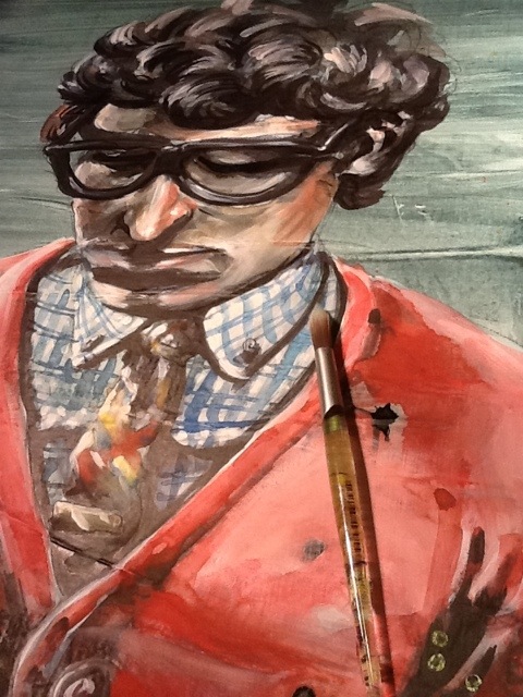
I must say that I am suddenly and properly honored to have done this little portrait of Paul Chelko. It was quite the accident that I came across his photograph on the cover of a 2007 edition of 'The Atlanta Magazine (which I could not find on their website- so it's possible I am confused as to the actual magazine).' Over and over I mentioned the character in his face. Sarah, my mentee, and I were practicing some techniques in painting at One Love Generation and I grabbed the magazine at the top of the towering pile for reference. As I walked over to our table where Sarah was eagerly awaiting the chance to paint. My eyes were trained on the photograph that was the cover of the magazine, analyzing the face we were about to use as practice. She exclaimed at the difficulty of drawing his face with a brush.
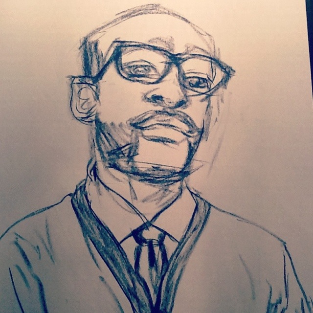
At the bottom of the post is an image of the portrait that Sarah did. She also painted an eye that would have been nice to grab a picture of. Her focus was a bit more centered on the painting of the eye than the portrait.
The following five images are the stages of the painting. It begins with an ink brush drawing, followed by washes of watercolor, highlights of white acrylic, dabbles of color in the cheeks and nose and retouching blacks with india ink.
Check it out. Enjoy. Share with your friends.


Sarah's version of Paul Chelko. I thought the line-work was brilliant and a beautiful image of what she is learning as she is becoming her own artist.
Fashion Illustration
Recently I have begun dabbling in the dandy world of men's fashion. It is really quite fantastic. Learning the differences between a quality tie and a quirky tie has been an adventure. Then remembering how to tie a 4 in hand vs. a Windsor vs. a Pratt has been down right awful. I have, this year, had my first trip to the cleaners to have a pair of vintage pants hemmed to my specifications. Overall the experience has been pleasant but in the future I will be heading to a professional tailor.
So it comes as no surprise that I have begun my very own series of fashion illustrations. My goal is to focus on men's fashion and the men that wear it. What are clothes if they are left on a rack?
First is a study I painted in watercolor and pastel on Masonite board with reference from one of the many fashion blogs hat I follow.
Below here is a focus on my favorite outfit at the time. This is the style and technique from which I will be modeling. It is a portraiture of the person and of what the person is wearing.
The shirt is Dinamit. The tie is Ralph Lauren. The cardigan is Old Navy.
Obviously the mush mash of brands is laughable from the list but the ensemble they create is vivid and strong.
The model here for one of my next paintings is my friend George Kamau. It will be painted in the same style and technique as the one above with watercolor, acrylic and ink.
Self Portraits...
I have been itching for a redesign on my business cards for a while. The old design ( found here ) is still nice, but definitely outdated. I received my first batch of them over a year ago. Back then I had consistently longer hair, and the card reflected this beautiful and untamed nature. There is also some outdated information that I cannot continue to keep tracking and using. Below is the sketch I did not too long ago of what I want. It's a quick sketch and I need to nail out more of the finer details, but the idea I believe is strong.
My good good friend Ruth Meharg suggested that I might print the cards on vellum so the portrait would show through on to the back side. I love this idea. I don't know how that would translate, especially with wanting information to be on printed on both sides. Also, the idea of creating a plate or woodcut for printing the type was thrown around. Any sort of print process is beautiful to me. What is likely to happen is a limited run of hand printed cards (for those very special people) and a mass printing from Zazzle to put up in shops and what not.

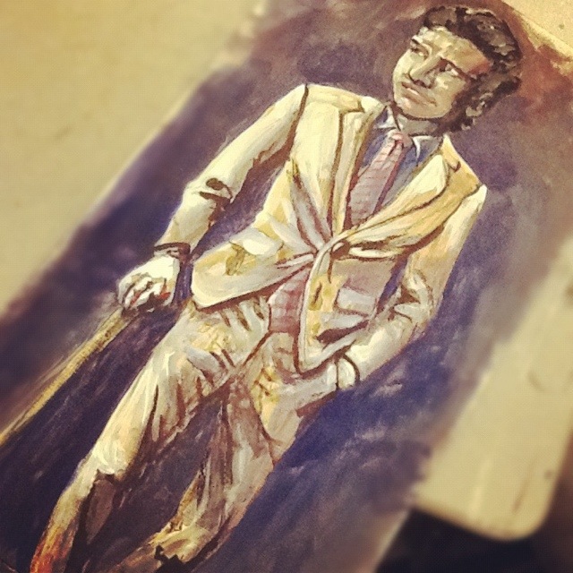
After developing the sketch I wanted to get some self-portrait ideas down to better visualize the final product. What followed is what you see below, in order that they were painted. They range in technique, but all contain some sort of mixture of watercolor and black ink. The first few also contain acrylic. None of these actually fulfill my desired look, but I think that I am getting close.

This first one was mostly acrylic and feels very patriotic… that darn red, white and blue...

Oooooo, what do I say about this one? It conveys a younger me-and the eyes are horribly offset from each other. I might as well toss this and never think of it again.

In spite of the odd nose, this is one of my favorites! It wouldn't work well for the business card, but bow ties get me every time…every time.

This is a success. A marvelous success! There is a hitch though, the colors are a bit moody. I was showing it to a few coworkers, and they started to tear...

Eyes are always aggravating me. The one on the right just started to run away. Blue made its way in again and sets an off mood to this self-portrait as well.