Caleb Morris Paints...
If you have ever heard a tall tale or seen someone paint a story in your mind then you have met Caleb Morris. He has a nack for tall tales and hyperbole. You might more accurately say that he has a unique ability to embellish, and I mean to share this with the utmost respect. A story woven by any other person is simply a reiteration of events gone by. When Caleb speaks stories are born. He gives life and character to moments that you or I would never experience outside of his recollection.
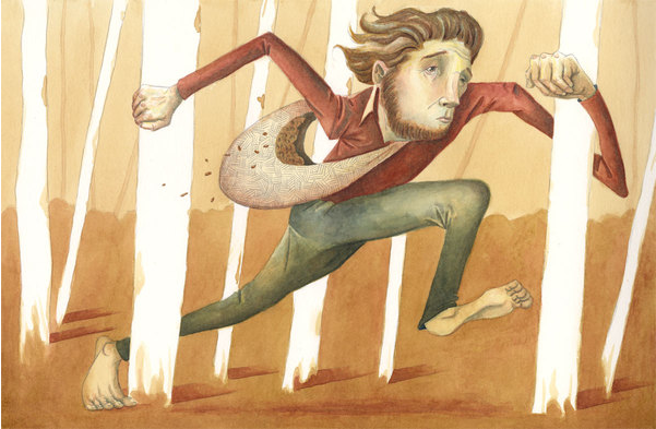
Beyond the imagination of his words is the imagination of his hands. Caleb is an illustrator. An illustrator in a world like Caleb's is a story teller. The same vivid drama that he speaks he also conjures as image.
When we decided to trade Illustrations I was elated. This was my chance to hold on to a story wrought by Caleb forever.
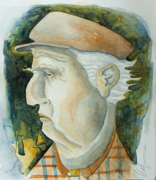
Below is the story that Caleb painted for me. Find his work here.
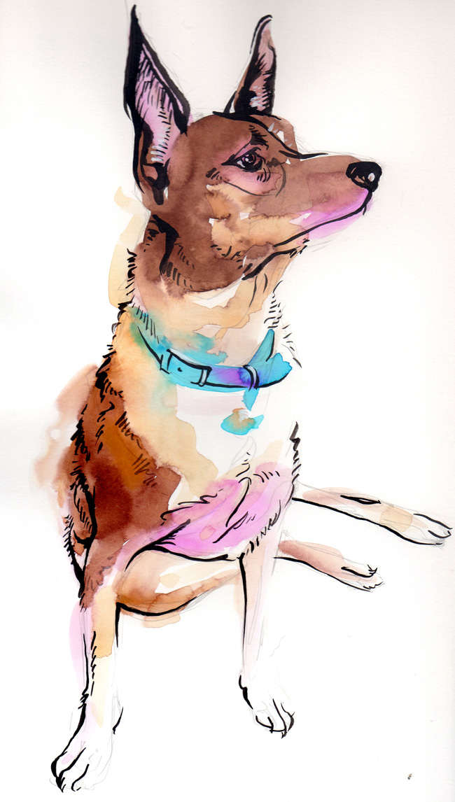
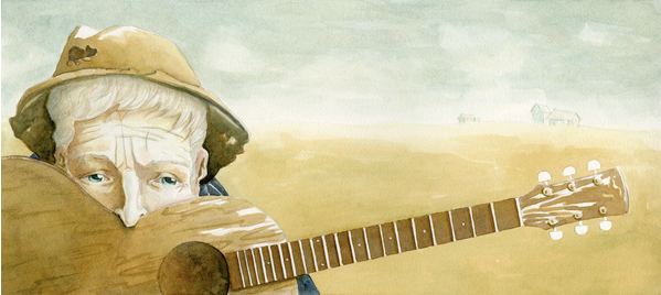
I thought that I would share my contribution as well. It was an honor to have the opportunity to paint this dog. Artie is not simply an old dog waning in life. He is an old man who thinks he can lay in the bed with ma and pa. He is full of mischief and tom-foolery and continually leads Caleb into trouble. His legs fail him, but his desires carry him. He is full of color and joy.
.
.
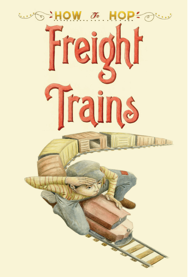
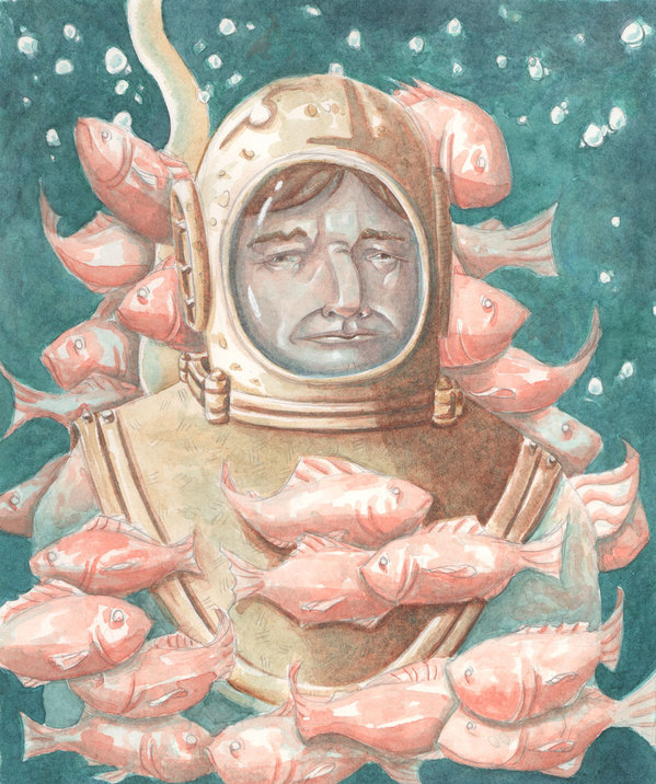
Other Works by Caleb Morris
..
Statement of Purpose...
I love brunch. I absolutely adore it. Brunch is a beautiful shared experience, a moment for communion with people. It is an opportunity to rest from the week, from the stress and responsibility. It is the delicious revelry of the senses that settles the soul. This too, is illustration. Illustration is the most beautiful shared experience. It is rest from the barrage of dull every-day artistry. Illustration is a sensual revelry of the soul.
Matt Miller
Sunflowerman
Mr. Miyagi...
So the Graveyard Tavern opening night was a hit! No it wasn't a firesale or anything of the sort, but by all means it was a success. We began setting up around 7 and were ready to go by 9- more or less. The support from friends was overwhelming but unfortunately there is no photographic evidence. The work will be up through the rest of the month so be sure to check it out. Buuut if you can't make it then pay attention to the blog in the coming weeks to see the works that debut the work of Sunflowerman on the Atlanta art scene.
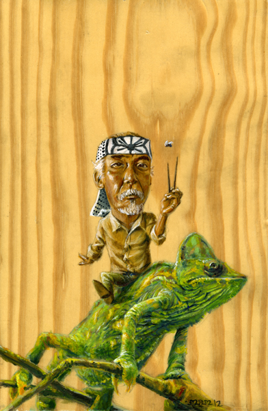
Mr Miyagi (already sold =] ) was the headliner of the show. If you haven't made it out then here is a taste of what you missed.
The Card...
It took me a while to actually decide to do this. Then it took me a while to get the design done. Now it's taking me a while to get it printed, but that's alright. The process is allowing me time to know that I truly do want and feel the need for this. It's my business card! woohoo. Now I guess this means that I am legit...hopefully...maybe...
Anyway, the time has come for me to advertise myself as a source of illustrative talents.
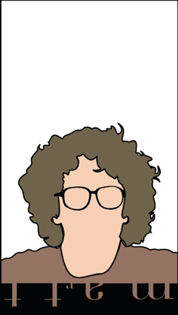
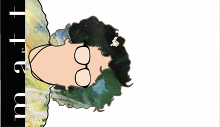
Above is the final product (still under construction, but ready for the initial invasion).
Below is some of the progression to this point.
Signage...
Here I have a series of 3X9 designs done for my Graphic Design 1 class. I'm not sure if these are going to be graded or not, they are not on the syllabus. They correspond to the assignments we have completed over the course of the semester- possibly to be used as signage for the projects posted from the semester. I am really excited about this sort of fake project because I have been able to play around with illustrator, which I now love.I admit that it-illustrator- did hold my deepest animosity at one point in time. Now I keep learning new uses for it, and how to manipulate it to my will mwahahaha.
'Graphic Design 1' is the second design I did of the series. I created the typeface, albeit not completely original, from scratch, and done specifically based on the shape of a circle, which is why the shape is repeated throughout the graphic.
These are the '5 Principles of Design-' Proportion, Unity, Emphasis, Balance, and Sequence. They are in no particular order other than what seemed to lend itself best to good composition. The colors are arranged in a way to try and trigger a response corresponding to each words meaning. Sequence is arranged in a rhythmic pattern, balance has the same weight of color on each side. Unity draws from each element in color and line weight. Emphasis is in the middle, and has red centering it directly in the middle of the word. Proportion was a difficult one, but each letter already lends itself to natural proportionality, and the colors are equally spaced and consistent in each letter of the word.
'Typeface' is probably my favorite out of the four designs. It is quite a bit different and unique in comparison, and is just plain more fun. Someone told me that it didn't look good, and I did another version of it that looked clean and neat and smooth, but boring and cold at the same time. The background is filled with the character of every typeface I used that each spells out 'typeface.' There is a lot of character in this design, pardon the pun.
 One of the final projects in the class was to do a 'Color Wheel.' Ironically, this was the first design I did for the signage series. This is where I first came up with the idea for the typeface, and was very proud of it from the beginning. The reflection was a joy to create, and the colors simply make me happy. It's super simple, and super sleek, it just works works works for me =]
After having typed all of this, I can't help but remember how much of this was not inspired by my creativity. God is the only one who inspires in truly creative and truly beautiful ways. Of course people can distort the creation God makes in man, but that's another discussion lol. There is nothing that I can do that is apart from God, and if it ever comes down to me being on my own, and doing things on my own, then nothing will be fresh or satisfying or enjoyable. Thank you Lord of Abraham, Isaac, and Jacob, for the blessings of your love and kindness.
