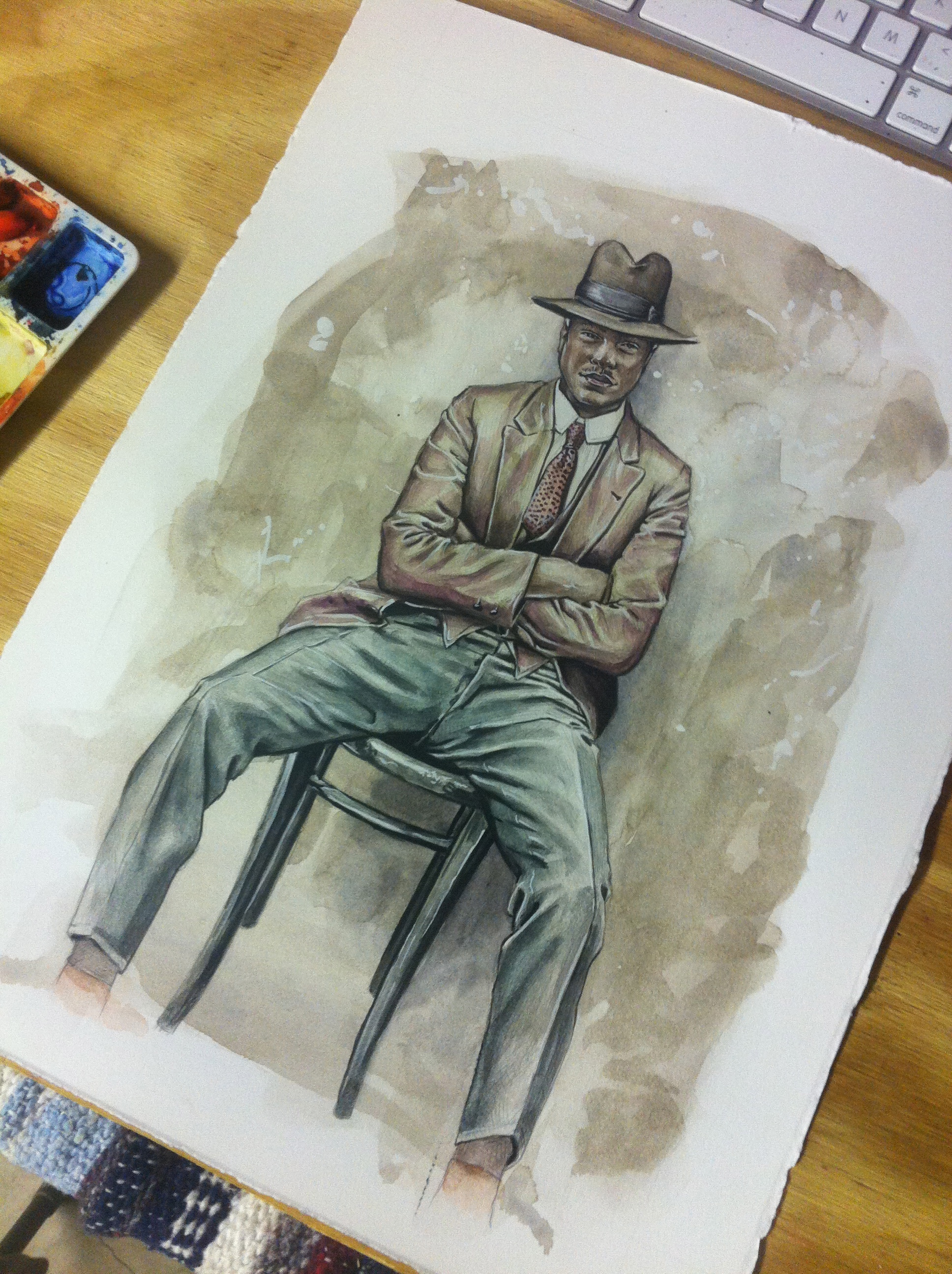
Menswear Illustration: Marcus Troy
Marcus Troy is a lifestyle creative from Montreal Canada. In the early 2000′s he began an online magazine with some friends and soon took his talents to blogging. His knowledge of the industry and savvy for social media has set Marcus on a path to becoming an influential voice for a fashion loving, media-centric generation. According to his own website Marcustroy.com 'is your connection to the new, fresh and dope.’
The Marcus Troy menswear fashion illustration was a fantastic opportunity. As men's fashion and culture is concerned- within the youth and street wear community- Marcus is the man.
The process began with a conversation. I sent Marcus an email and he replied shortly there after requesting a phone conversation.
After a bit of technical difficulty (i.e. user error on my end) we had a moment to chat. We talked for a short while and discussed how he might want to see himself.
Marcus hinted at nostalgia for an older time in fashion and menswear and of an inspiration he had recently come across.
I'm sure you've seen it by now, as the photographs have been circling the internet for a few years now and I had seen it first on twisted sifter.
The vintage, Sydney mugshots from the 1920's featuring criminals 'dressed to the nines'.
From the conversation then began the drawing.
I render a nearly complete image in graphite- usually with a heavy mechanical pencil- and seal with Workable Fixatif. This process stretched me nearly 6 hours.
There were several areas of confusion with the angle of the legs and the proportion of the shoulders that had to be worked out before the painting could begin.
This is the moment where I drop to my knees and beg God to let me stop! The rendering is always so beautiful and I cannot imagine the horror of destroying it with paint.
But as all art is prone to do it stretches my faith. When the art becomes more important than the process then all growing and joy cease to exist. I put my brush to the paper...
With some helpful critique from my wife the finished piece became gorgeous. I began with a very thin wash of copper-brown to tie the whole illustration together.
Slowly I added light washes to build up the pants, tie, jacket and hat. When I was comfortable with the direction the painting was headed I began layering in thin washes over the face.
The face is the most important part of the illustration. Fashion is only fashion because a person is wearing the clothes. Frightened during the entire process I was able to complete the painting with a touch of blacks and whites to make Marcus pop off the page.
I personally love to use white in any and all of my paintings. One way to make the process of adding darks and lights simpler is to begin with the mid-tone background.


