LOVE Again
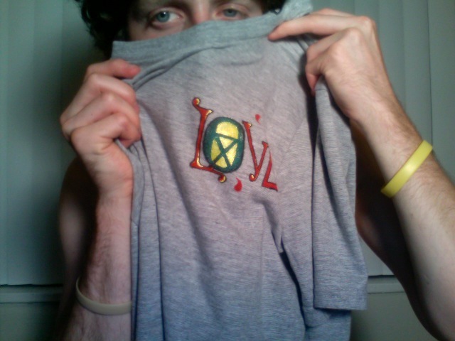
There once was a man. There once was a man with a shirt. There once was a man with a green shirt. There once was a man with a green shirt and an idea.
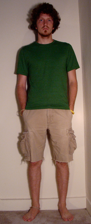
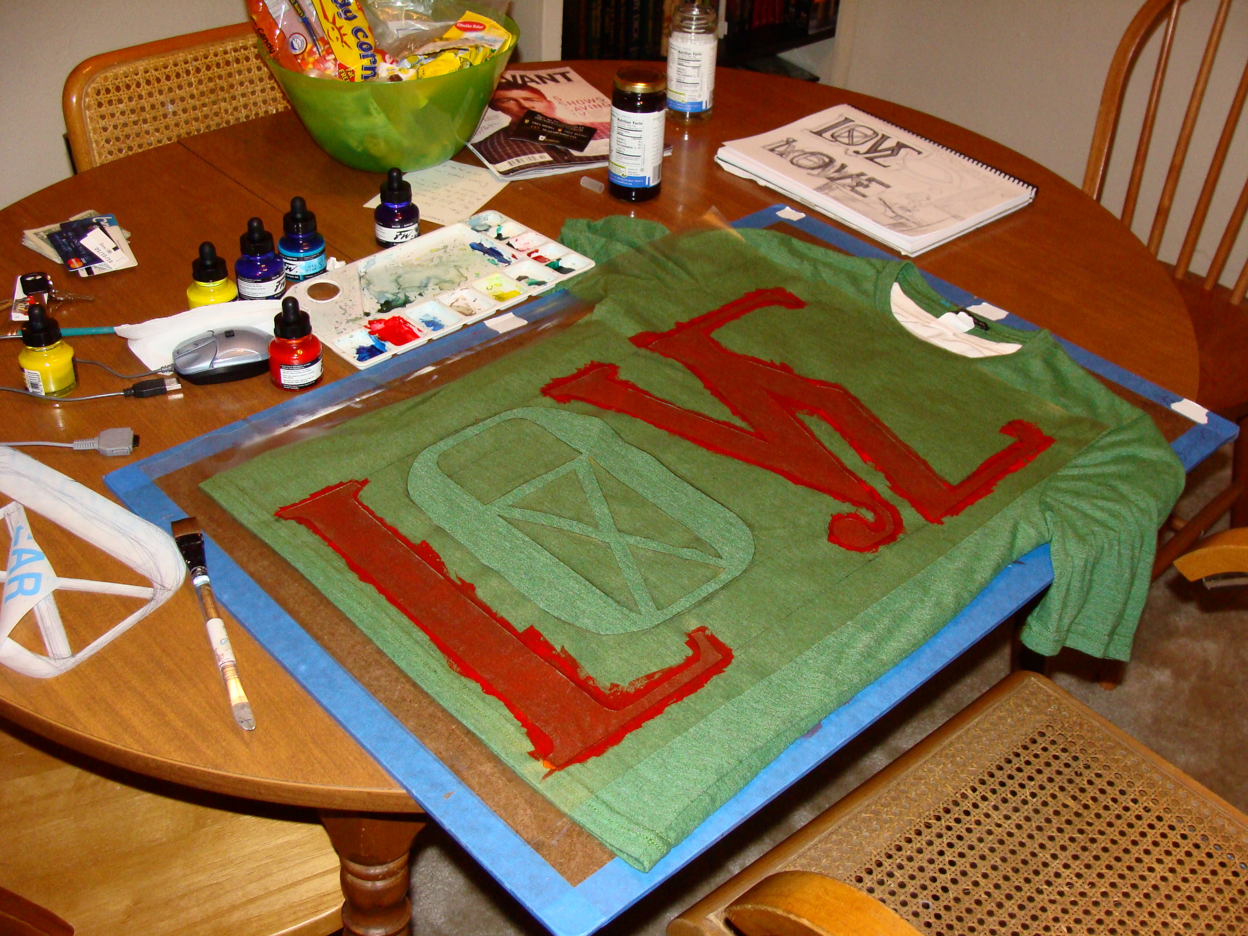
The idea he had was to make a shirt design by hand. He didn't have the resources to do screen printing. So he used acrylic ink and a contact paper stencil.
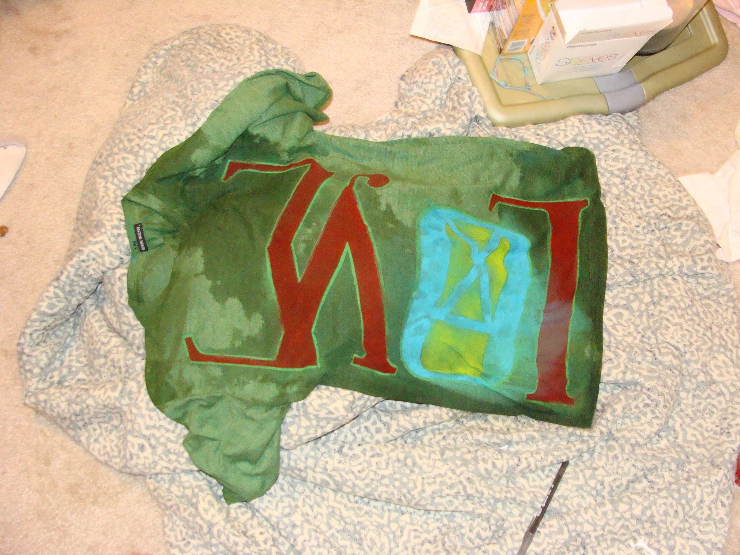
Then that amazing shirt got wet and the ink bleed all over the place, but he didn't care.
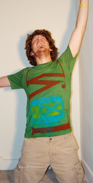
He wore that shirt anyway.
Eventually the paparazzi caught wind of its amazingness...
Love
So I was talking with my friend Evan, the guy for whom I am doing the musketeer shirt design. He was mulling over other shirt ideas, and we were discussing interesting ways of designing more than the image. That being said, he really inspired me to get down and do my own shirt design.
I stole the image that I worked so hard on in the christening of ichLOVEthys. To say I stole it is to say that it wasn't really mine in the first place, in full honesty I only took the initial concept and inspiration and ran with it, really really far. Thus, the image is mine to utilize how I will.
Right after work that evening I bought some acrylic ink from Binders and used the remaining balance from my Associate of the Quarter gift card from HomeGoods to buy a few shirts-one from TJMaxx and two from Marshalls.
On the way back to the apartment I stopped at Publix to purchase some amazingly awesome Sweet Leaf Green Tea with Mint & Honey. It's a must have in any sort of inspirational endeavor.
The remainder of the night, from about 8 in the evening to 1 in the morning- with one stop to eat din with my roomie and view an episode of the Mary Tyler Moore show via Hulu- I worked on the composition and application.
And the result is a truly creepy image of my holding the final product!...more or less.
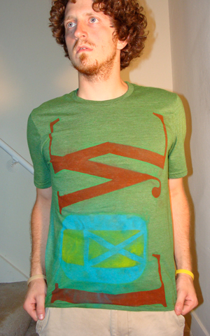
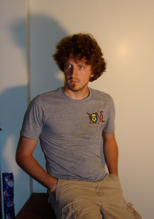
Here the shirt is being modeled by a very attractive man. I realize that it is probably stepping over some boundaries talking about a man like this, but what can I say, when I see an attractive man I can't hold it back.
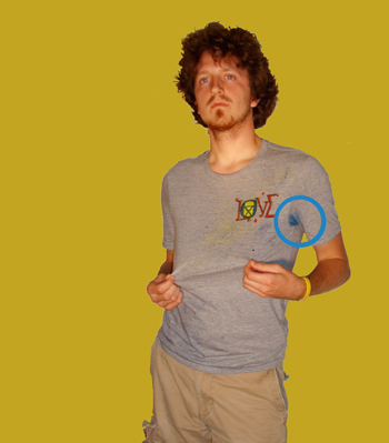
Come to find out that I need to find a way to set the ink in the shirt before I wear it. Let me say this without too much laughter... I sweat, I know, crazy right!? anyway, apparently my sweat caused the ink in the arm pit region to bleed into the adjacent shirt area.
I guess that experimenting means that you sometimes make mistakes, even when the overall project turns out great.
The Rad Dad of a Guitar Hero...
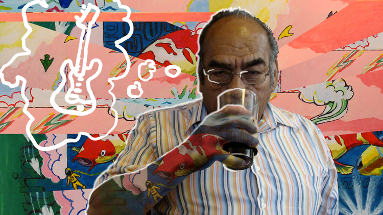
I painted an awesome (if I do say so myself) pick gaurd. I haven't found a decent enough printer yet to get the image on to the hp printable contact paper that was donated to me for experimentation. The painting was done for my friend Rigo, and I happened to have this rad pic of his dad drinking coffee out of a glass cup from the Sparrows Coffee Tea & News Stand.
This is an ode to Rigo and his Dad.
Perspectivegram
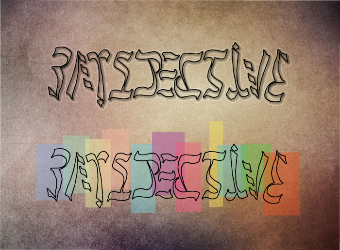
I have come to a relative resolution with my ambigram design. This is what I settled on. The whole project was full of distress and agaony. Ambigrams are not for the faint of heart. Not for pregnant women, or for those on blood pressure medication.
Hopefully the next attempt I make will turn out better, for now I shall be satisfied...
I Am Community...
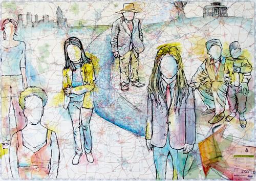
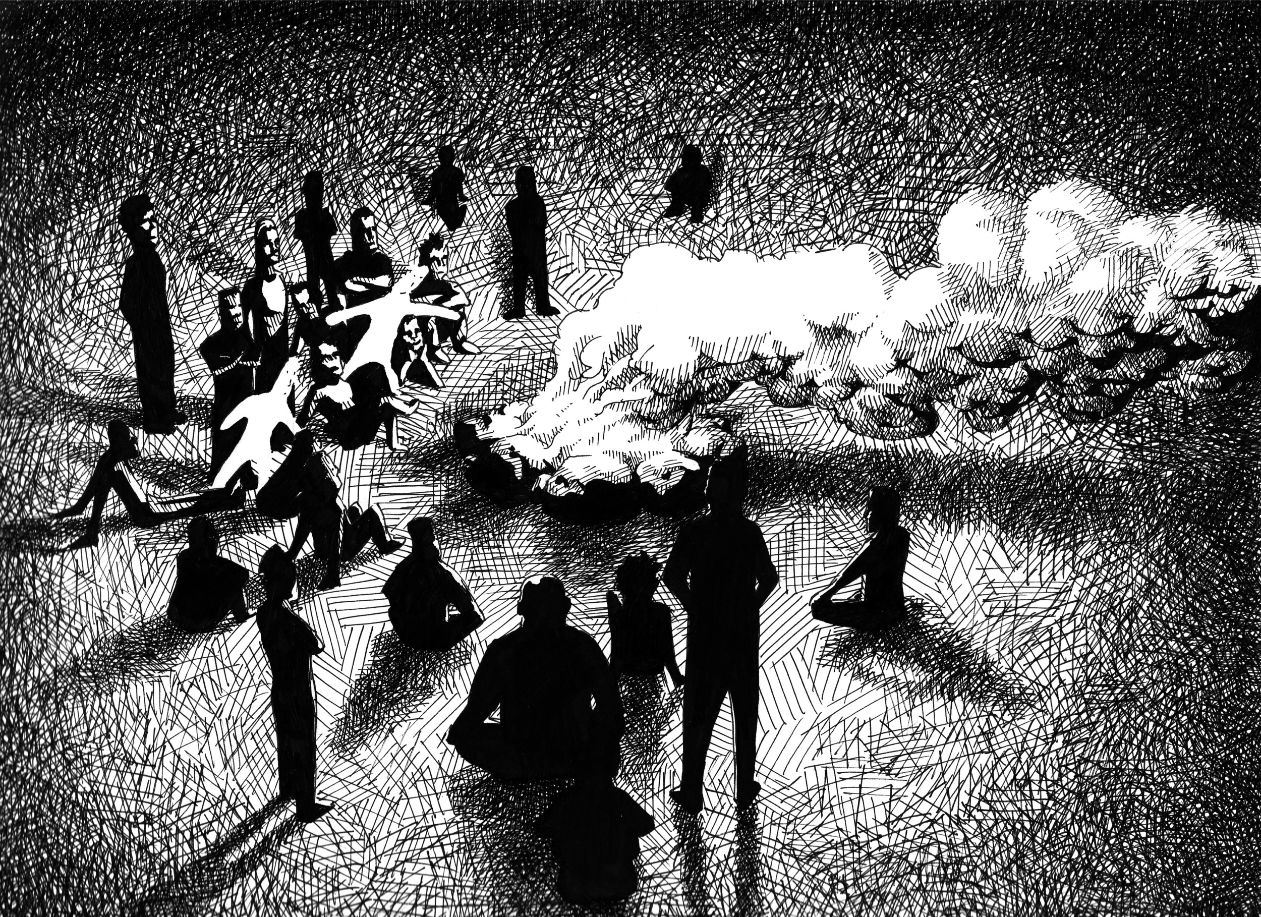
This is an illustration that I did in collaboration with Nate Ledbetter. He has a vision for community, and he wanted to represent the idea of community visually. We met several months ago through several mutual friends. Since then our friendship has grown little by little.
There is talk of further collaboration in the future with more ideas and thoughts on community. Stay tuned...
PerspectivevitcepsreP
A friend recently challenged me to create an ambigram out of the word perspective. An ambigram is a word that can be read forward and upside-down-backwards. Not unlike Hannah can be read front words and backwards, but flip the word 180˚.
The above work is not my own, it is simply a very good example of an ambigram.
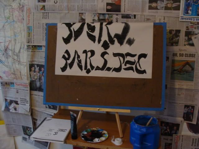
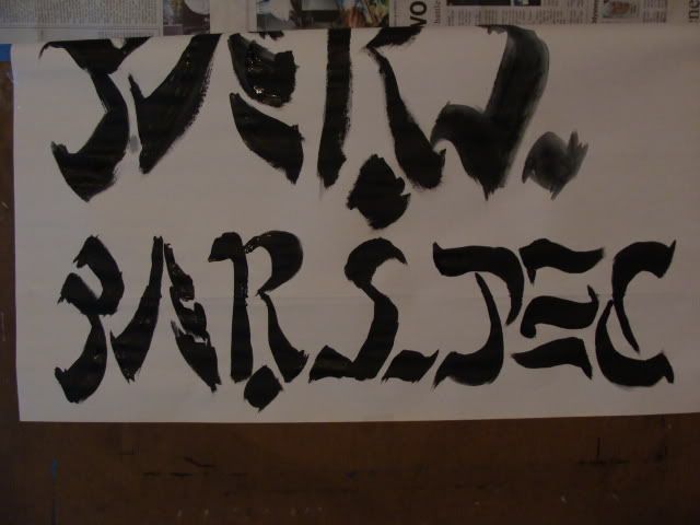
My work is still much in the progress stages. Here are a couple examples.
Portfolio
Here's a sample of what I want to include in my portfolio for SCAD. Yes I should have had this done about 2 months ago. But here we are, and this needs to get done, sooo, I was wondering if anyone wanted to help me out and tell me which ones you like best.
Some I am for sure using and others are kind of just a toss up.
The portfolio is supposed to be between 10 and 20 images, but I want to limit it to 15. I also have one last drawing that I am currently working on, which will be added to the final portfolio.
Jeanne (Jee-nee)
I flew up to Michigan for the third time in 3 months last weekend. Not gonna lie, it costs a pretty penny to continue to do that. Anywho, my flight was on AirtTran Airways. For some reason I thought that they had free WiFi, but I should have known better. I popped out the puter and up came the sign that says, 'only $9.95 for all day!' Needless to say, but i'ma say it anyway, that is outrageous!
The good thing was that I got to sit next to a very nice lady. We had both ended up in first class for different reasons (for me it was all they had left, awwww yeah). Jeanne was traveling to another of the midwest states (whichever one it was is escaping me right now), to visit her wealthy cousins. It was nice to chat with her for the duration of the trip.
AirTran Airways is still a nice way to go though. The flight was deece, and it was the largest plane I had ever been on, so that was cool.
My Church is Pretty Sweet...
We buy Gold! lol
The funny thing about it all is that when the property was built (not by CCB) it would seem that our church building, and the such smaller building across the yard were under the same ownership. Now things are different, the gold people own the smaller building right on the corner, and we-I say we as an invested member of the congregation- own the building with the lawn.
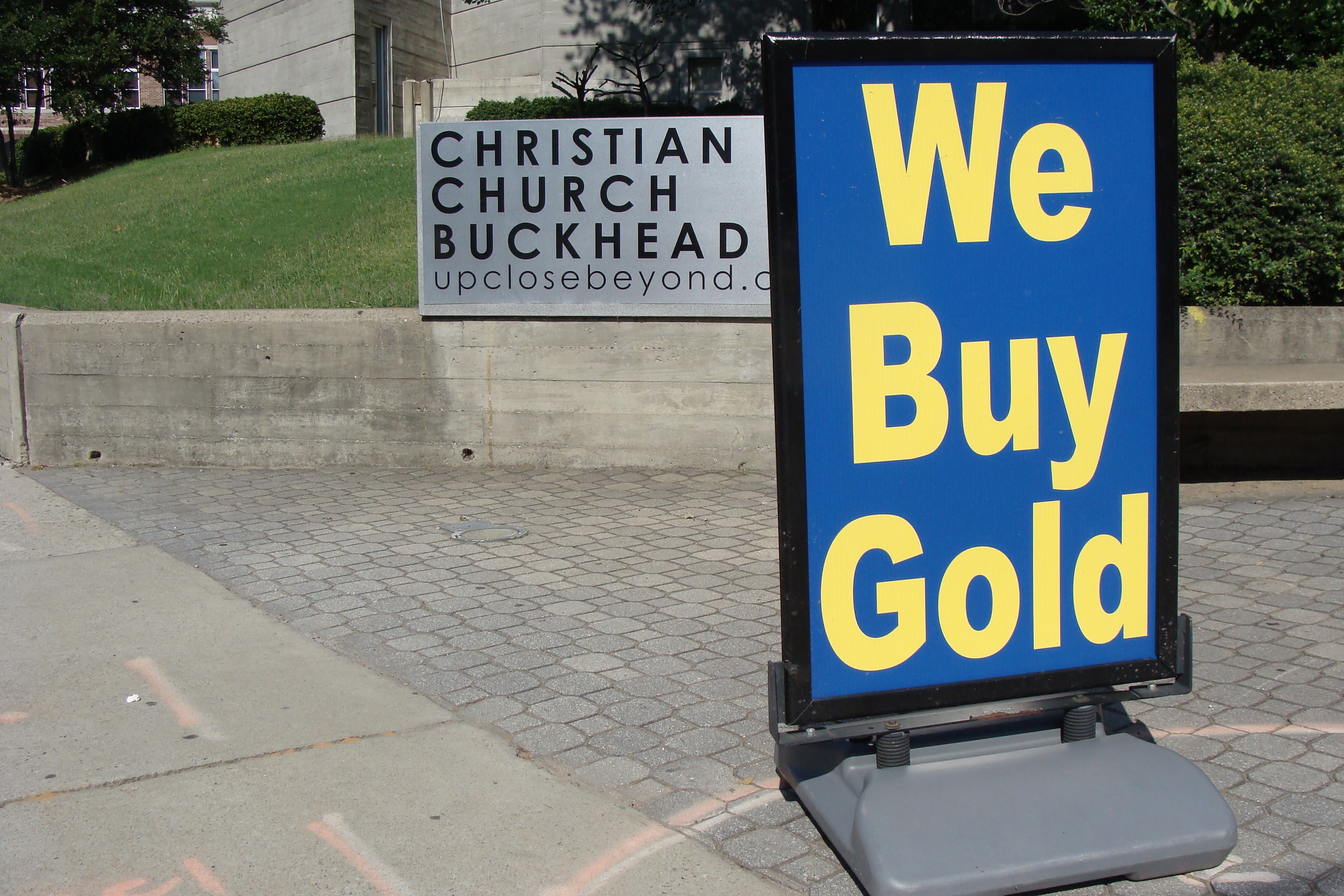 Christian Church Buckhead-Serving the Lord, and buying Gold
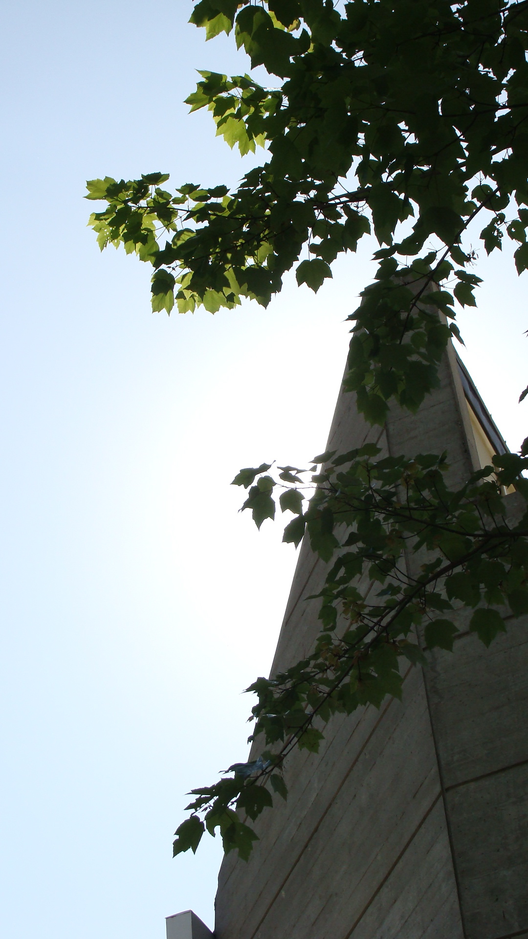 an image of the top of the church (with heavenly light shining down =])
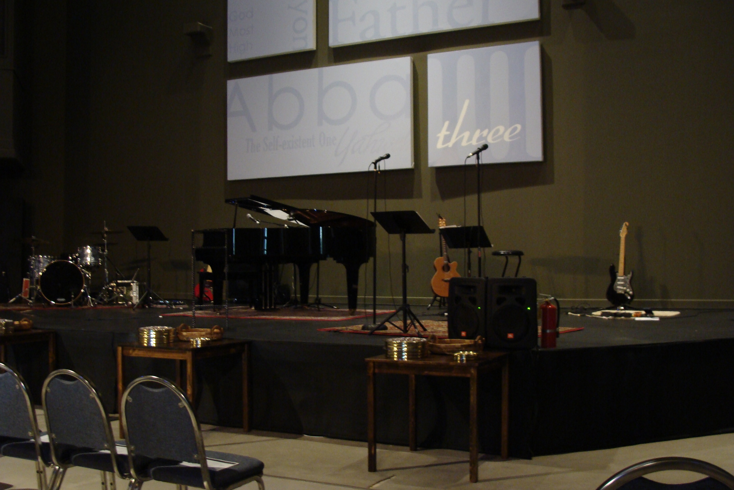 look upon our guts and know we're alive
 our butt-from the parking lot-which is shared with Maggianos
So you got a little taste o' what I do... pretty dang exciting huh?
My Roomies' Girlfriend's Comic..
..which is hilariously awesome! and just so happens to feature you know who in the most recent weeks' edition.
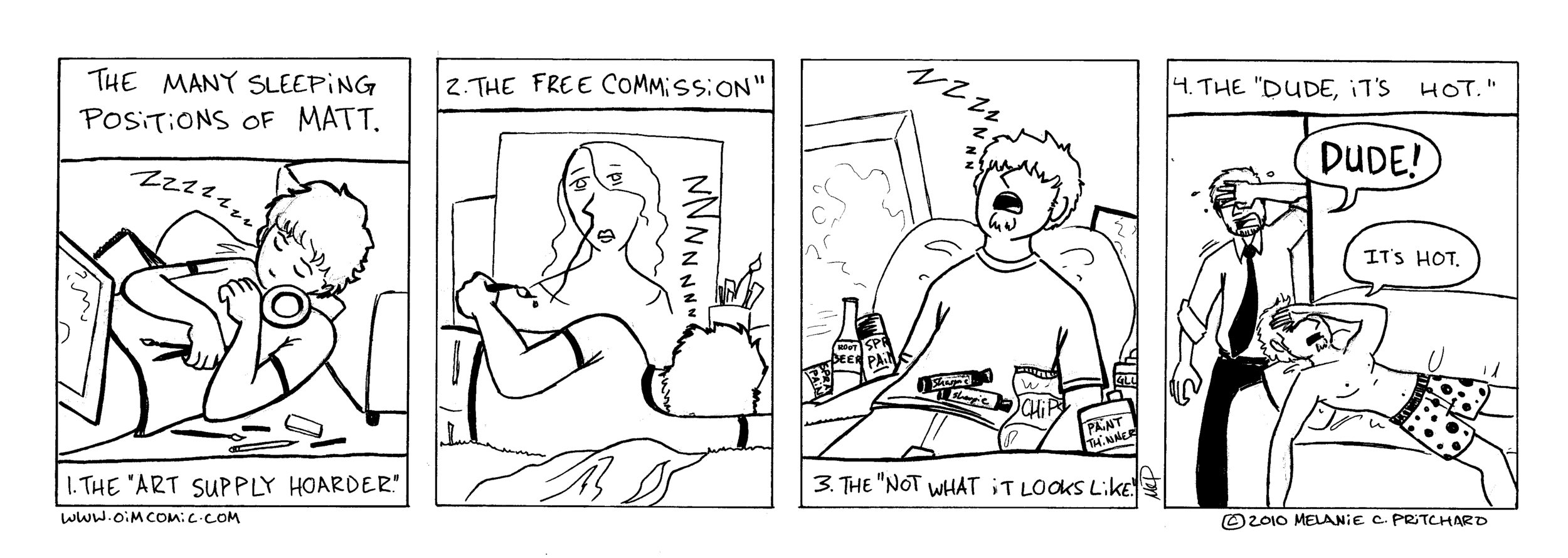
Over the past few months we have gotten to know each other, Andrew's gf Melanie and I, by telephone proxy. In as much as we can here each other's voices and the frequent relaying of conversation through Andrew, I believe that we have become friends.
Somehow, though never actually meeting, and talking only directly be phone for about 30 seconds, she has me pegged...I guess that says something about a person.
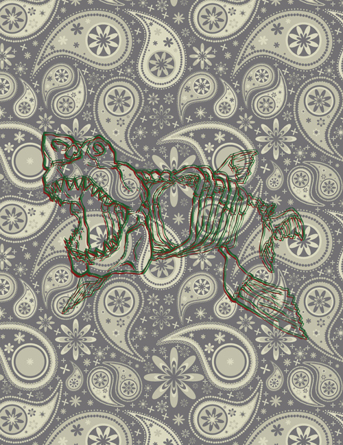
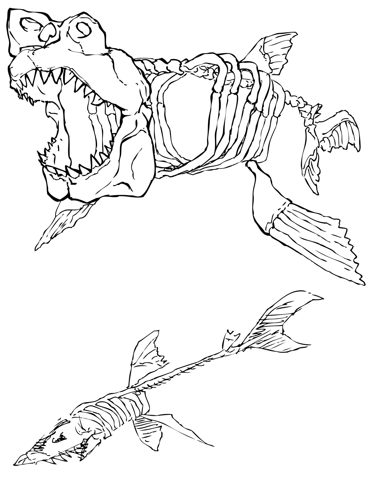
The Shark That Ate Atlanta...
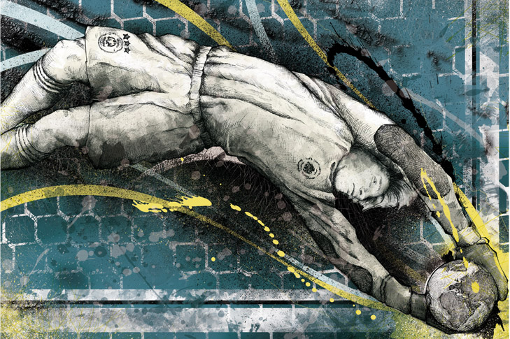
My friend Adam has a jet ski that he was planning on painting. He wanted to include a sweet shark, so I drew him this...
New Pants...
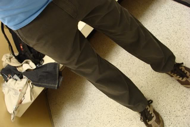
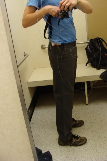
I bought these jeans from the Ross on the same strip mall as my Homegoods the other day, and I was absolutely in love with them-ignore shoe color. They are Calvin Klein blue frost jeans, which really has little meaning to me, but they were just awesome. The break in the pant seemed adequate to me, not too little or too much. But here's the problem, as can be seen in the second image, the top of the pants were low. In the image, where the bottom of the shirt sits is essentially where the top of the pant rose.
If I had the urge to tuck in my shirt it would look goofily low, and if I decided that I should raise my pants, then the break in the pant would have disappeared and major flooding would have happened.
I debated whether to keep them and deal with my insecurity, or to return them.
The final decision came with some advice from my roomie Andrew. He mentioned that if I felt comfortable and liked them then I should keep them. He told me that they looked fine, which is an opinion I was holding myself, but I just didn't feel right in those pants.
So I did what needed to be done, and I returned those pants...I feel that I made the right decision. Thank you Michael M. for your insight on fashion and your suggestions on fashion blogs and such. It helped in my decision to make the right decision.
A Heavenly Bee...
It came upon me that life is short. Not a new idea by any means, but an idea that holds precious meaning in certain and precious circumstances. It came upon me in mid-afternoon. It wasn't the first time, and it wasn't the last, but it was memorable.
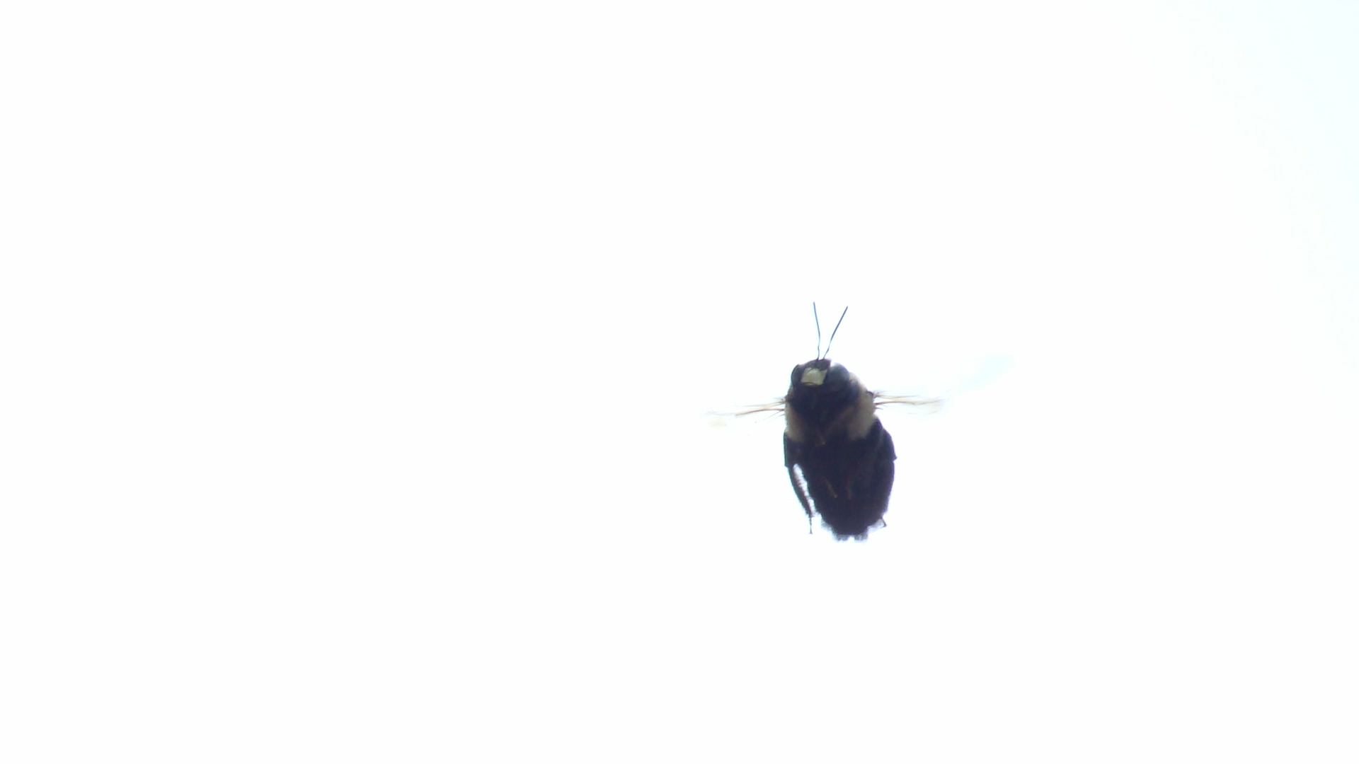
This beast of insignificant size spent most of its time, from what I surmised, buzzing around the front door of my apartment. Every day for a week or so it would be there to greet me and see me off.
It came upon me to record this gentle musician for posterity's sake.
So I grabbed my camera and began the process of capturing the elusive bee. Capturing, mind you, in a purely photographic sense
It danced in the air as if it were posing. But its poses were playful and prancing. There were few moments in which it actually stayed long enough for a decent view.
Slowly it began to disappear. Off into the distance. A soft glow of the afternoon sun enveloping the bee.
As the last moments of its presence waned I sensed that it was not going to be around much longer.
Such a small creature didn't seem to have long to spend buzzing for my enjoyment.
The bee must have had responsibilities to the hive, and many more plans to fill the short time of its existence.
 It came upon me that life is short. By all means a new idea to be discovered by everyone.
Signage...
Here I have a series of 3X9 designs done for my Graphic Design 1 class. I'm not sure if these are going to be graded or not, they are not on the syllabus. They correspond to the assignments we have completed over the course of the semester- possibly to be used as signage for the projects posted from the semester. I am really excited about this sort of fake project because I have been able to play around with illustrator, which I now love.I admit that it-illustrator- did hold my deepest animosity at one point in time. Now I keep learning new uses for it, and how to manipulate it to my will mwahahaha.
'Graphic Design 1' is the second design I did of the series. I created the typeface, albeit not completely original, from scratch, and done specifically based on the shape of a circle, which is why the shape is repeated throughout the graphic.
These are the '5 Principles of Design-' Proportion, Unity, Emphasis, Balance, and Sequence. They are in no particular order other than what seemed to lend itself best to good composition. The colors are arranged in a way to try and trigger a response corresponding to each words meaning. Sequence is arranged in a rhythmic pattern, balance has the same weight of color on each side. Unity draws from each element in color and line weight. Emphasis is in the middle, and has red centering it directly in the middle of the word. Proportion was a difficult one, but each letter already lends itself to natural proportionality, and the colors are equally spaced and consistent in each letter of the word.
'Typeface' is probably my favorite out of the four designs. It is quite a bit different and unique in comparison, and is just plain more fun. Someone told me that it didn't look good, and I did another version of it that looked clean and neat and smooth, but boring and cold at the same time. The background is filled with the character of every typeface I used that each spells out 'typeface.' There is a lot of character in this design, pardon the pun.
 One of the final projects in the class was to do a 'Color Wheel.' Ironically, this was the first design I did for the signage series. This is where I first came up with the idea for the typeface, and was very proud of it from the beginning. The reflection was a joy to create, and the colors simply make me happy. It's super simple, and super sleek, it just works works works for me =]
After having typed all of this, I can't help but remember how much of this was not inspired by my creativity. God is the only one who inspires in truly creative and truly beautiful ways. Of course people can distort the creation God makes in man, but that's another discussion lol. There is nothing that I can do that is apart from God, and if it ever comes down to me being on my own, and doing things on my own, then nothing will be fresh or satisfying or enjoyable. Thank you Lord of Abraham, Isaac, and Jacob, for the blessings of your love and kindness.
