Fashion Portrait… Brandon Sadler and the Black Goldfish
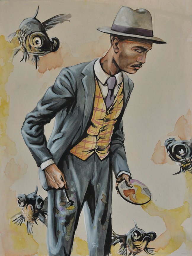
I did this Fashion Portrait of a friend of mine a while back now. I have mixed feelings about this piece. There is so much great about it and a few things that irk me. Things such as my lack of thought about the background. Overall the painting showcases the character and the clothes very well. Featured here is Brandon Sadler. He is a painter based in Atlanta, GA. He has been involved in the growing street art scene with a mural near the Studioplex in the Old Fourth Ward and has shown his work all over the city including work at the ABV gallery.
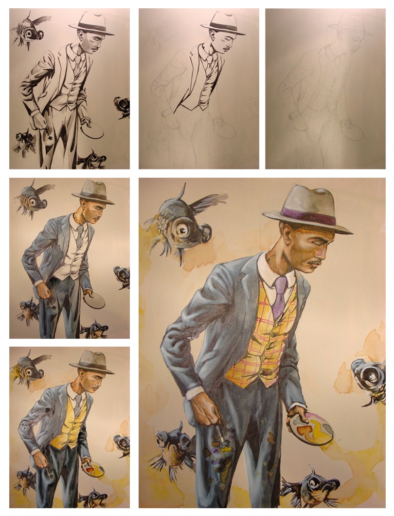
Brandon allowed me to photograph him while he was painting so I could capture the moment as it would be in real life. I went home and compiled a series of images of him painting and several images of suits from the 1920's. I love the idea that someone would always dress so dapper even when painting and not give a second thought to where the paint might end up. Several compositional drawings later I began. I struggled with the placement of Brandon in relation to the fish and probably drew at least 15 18x24'' sketches to get it exactly right.
This piece was so much fun to work on. Despite my reservations about the background it came together beautifully and it is part of a progressive process in my own work.
Brandon Sadler. 18x24". Acrylic, watercolor and india ink on hardwood board.
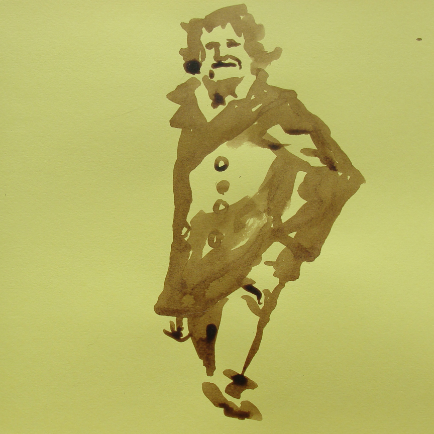
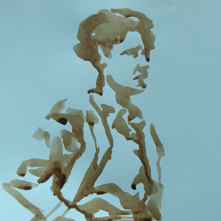
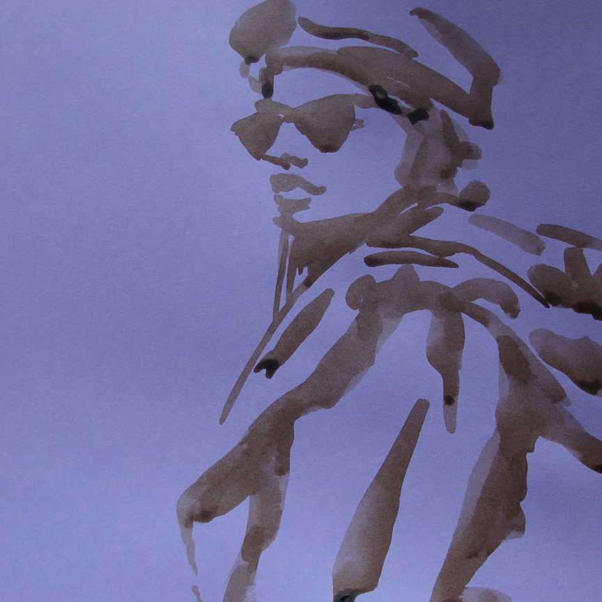
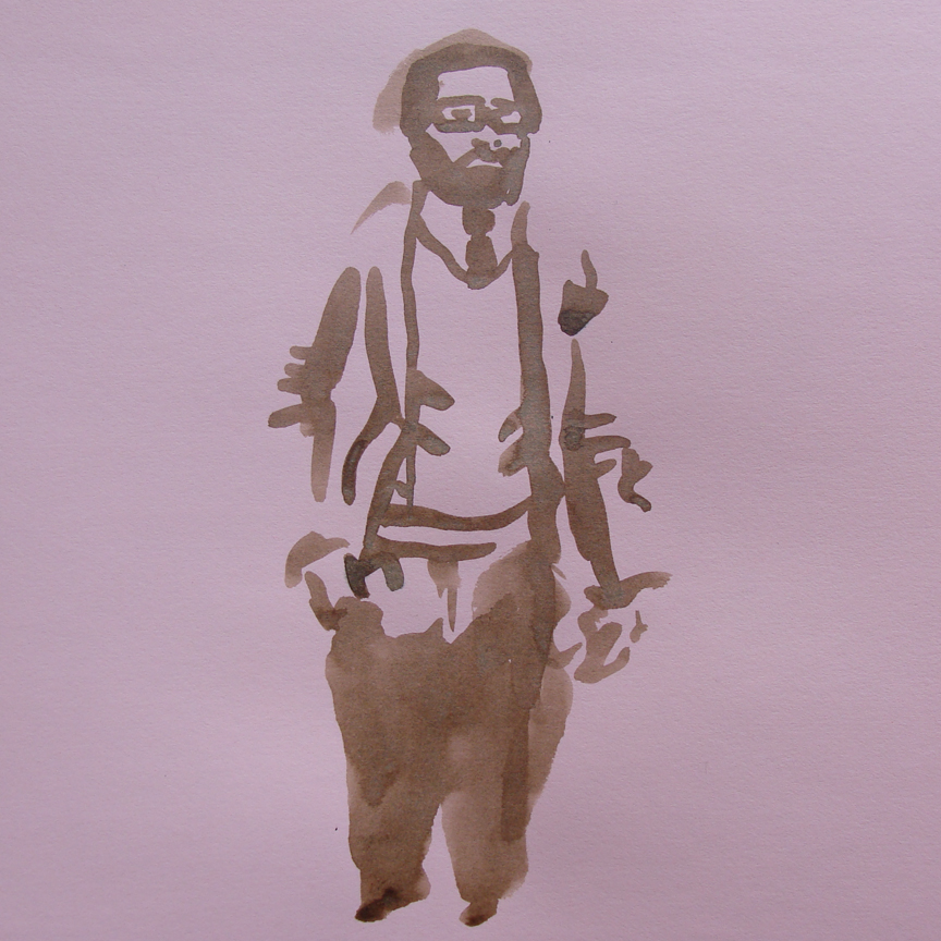
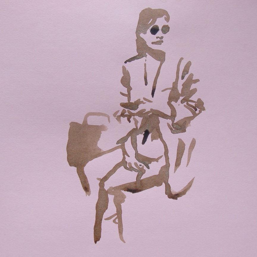
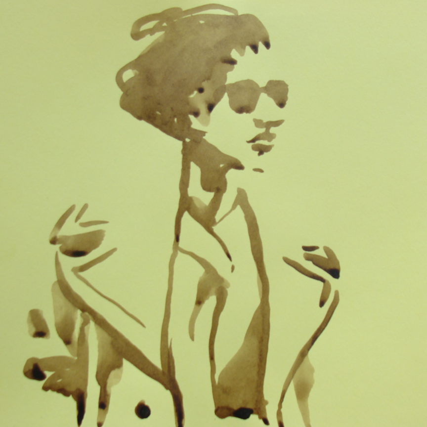
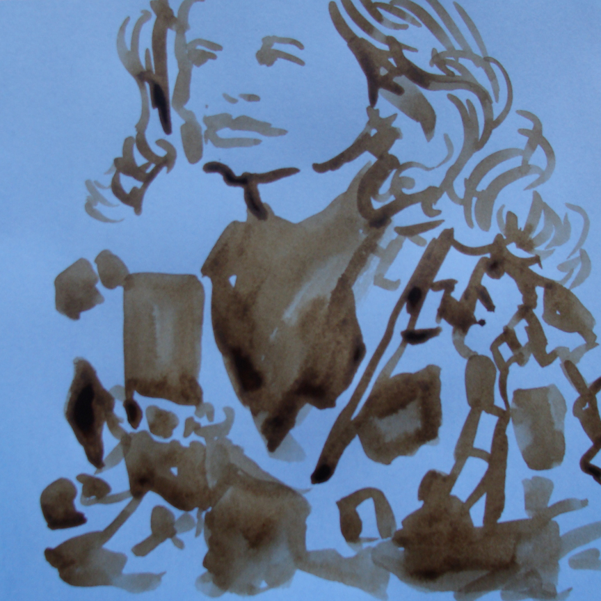
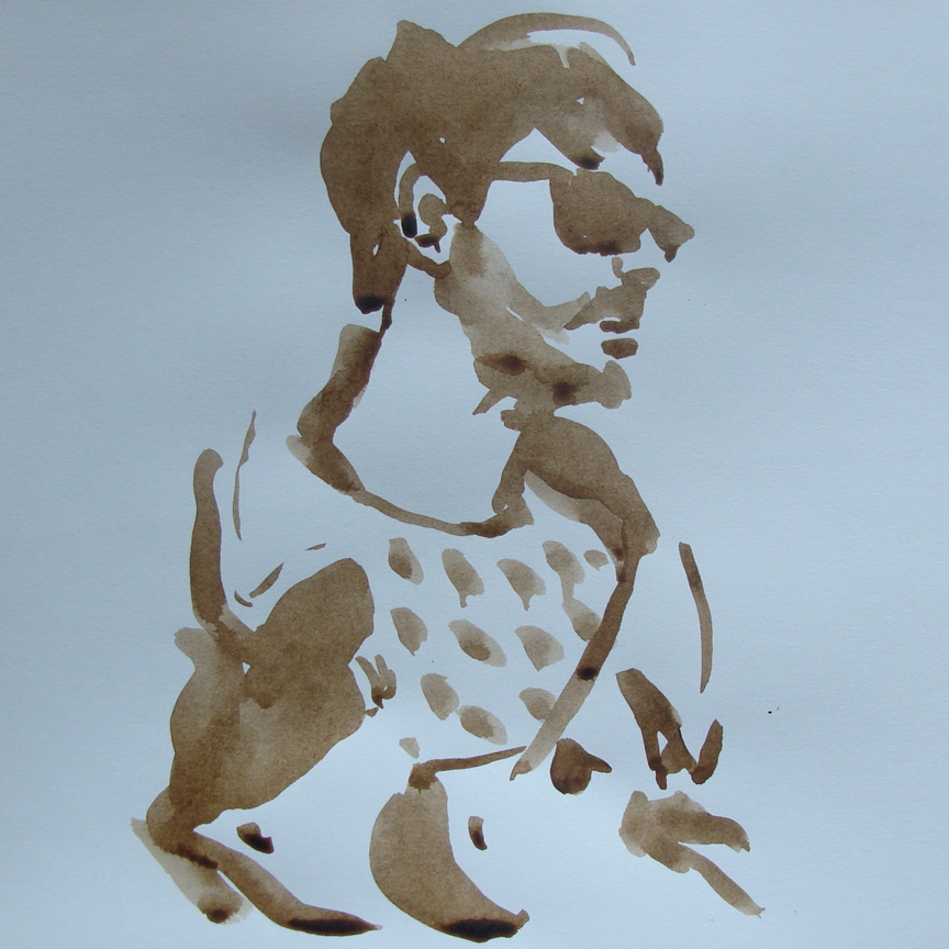
Fashion Illustrations through the Sartorialist...
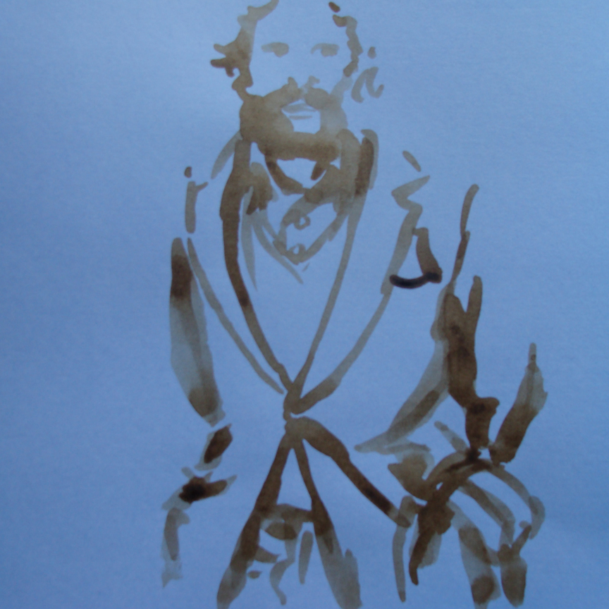
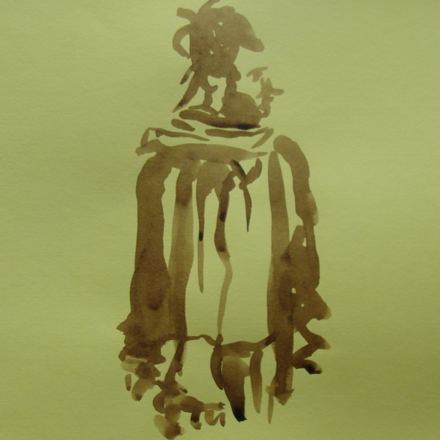
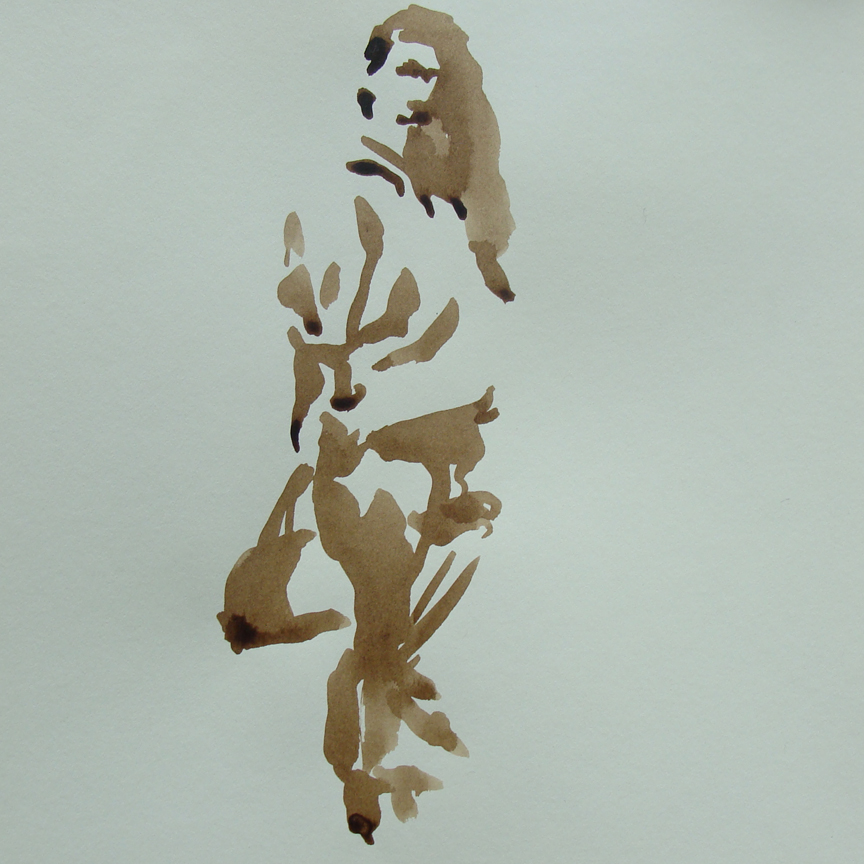
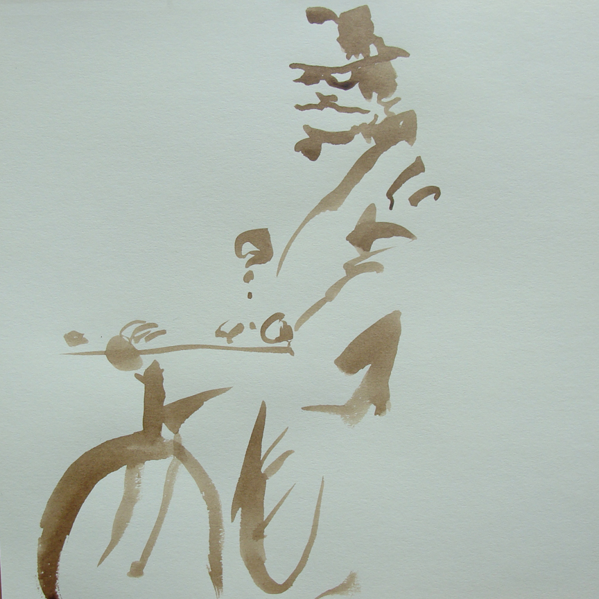
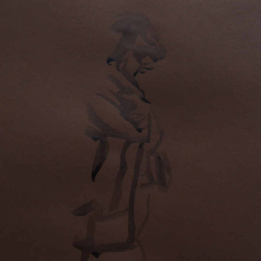
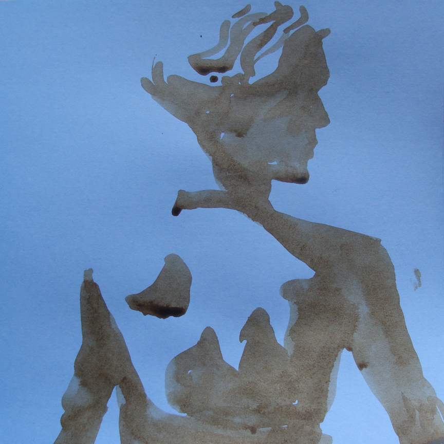
I have some new brown 'walnut' ink and I had an artist moment this afternoon. Ravaging my room, looking for some paper to transform I remembered an assortment of colored card stock under scraps of forgotten paper. The movement to create was stirring within me while I was scrolling through one of my favorite blogs. Among the sites I peruse now and again The Sartorialist is always one I return to. The Sartorialist is an amazing source of inspiration for any individual craving a dose of the greatest modern street fashion. Looks from the streets of New York and Paris grace the selection of images on the blog.
This selection of Fashion sketches is inspired directly from The Sartorialist and is an homage to a great source of beauty.
Statement of Purpose...
I love brunch. I absolutely adore it. Brunch is a beautiful shared experience, a moment for communion with people. It is an opportunity to rest from the week, from the stress and responsibility. It is the delicious revelry of the senses that settles the soul. This too, is illustration. Illustration is the most beautiful shared experience. It is rest from the barrage of dull every-day artistry. Illustration is a sensual revelry of the soul.
Matt Miller
Sunflowerman
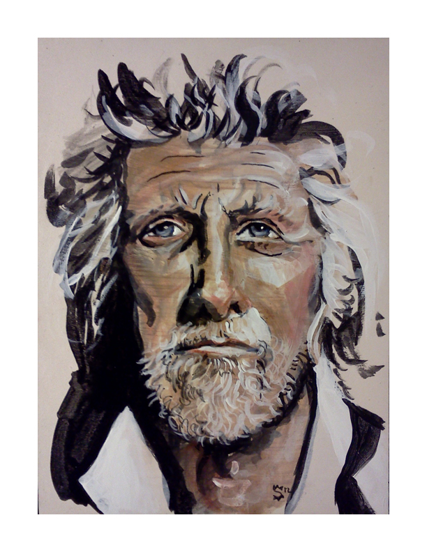
Paul Chelko…Portrait
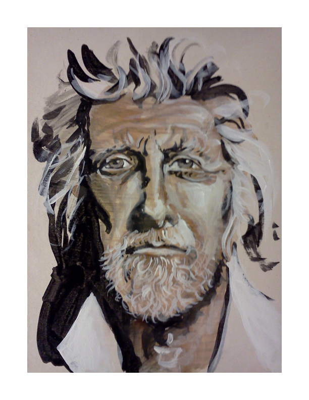
I must say that I am suddenly and properly honored to have done this little portrait of Paul Chelko. It was quite the accident that I came across his photograph on the cover of a 2007 edition of 'The Atlanta Magazine (which I could not find on their website- so it's possible I am confused as to the actual magazine).' Over and over I mentioned the character in his face. Sarah, my mentee, and I were practicing some techniques in painting at One Love Generation and I grabbed the magazine at the top of the towering pile for reference. As I walked over to our table where Sarah was eagerly awaiting the chance to paint. My eyes were trained on the photograph that was the cover of the magazine, analyzing the face we were about to use as practice. She exclaimed at the difficulty of drawing his face with a brush.
At the bottom of the post is an image of the portrait that Sarah did. She also painted an eye that would have been nice to grab a picture of. Her focus was a bit more centered on the painting of the eye than the portrait.
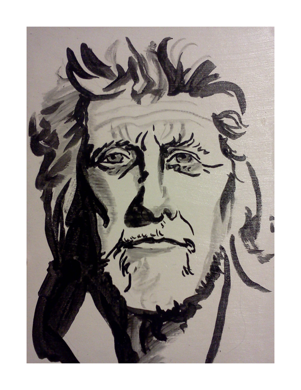
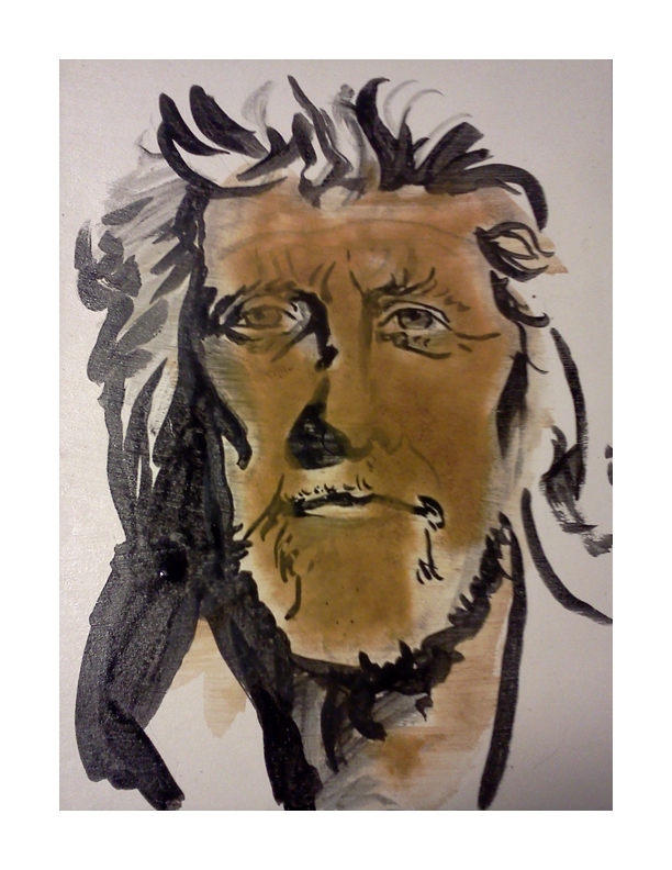
The following five images are the stages of the painting. It begins with an ink brush drawing, followed by washes of watercolor, highlights of white acrylic, dabbles of color in the cheeks and nose and retouching blacks with india ink.
Check it out. Enjoy. Share with your friends.
Sarah's version of Paul Chelko. I thought the line-work was brilliant and a beautiful image of what she is learning as she is becoming her own artist.
Fashion Illustration…Mikey
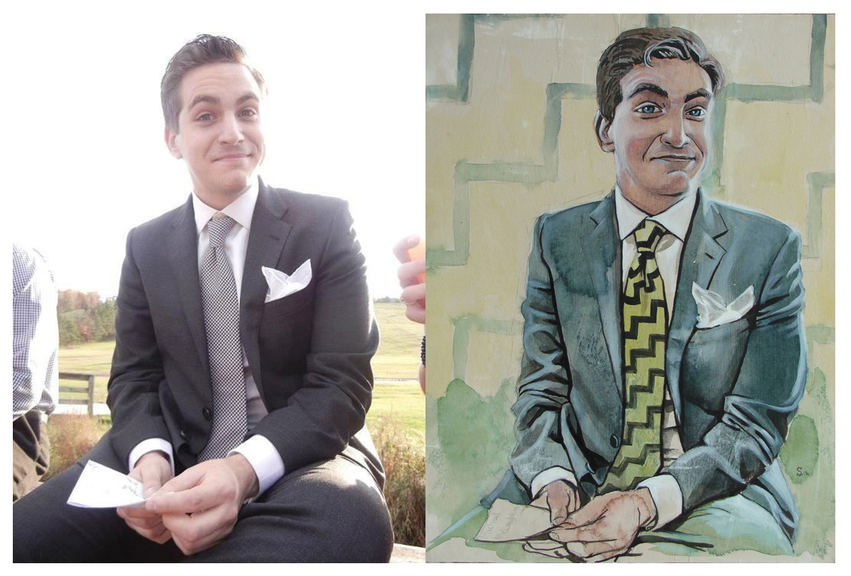
The next piece in the fashion series. This is my good friend Michael McLaughlin. He is a dapper fellow and a good good friend. Check out his tumblr here. He allowed me the use of his visage and his style. Thank you Michael.
Below is the process of the illustration. Check it out and enjoy. Share it with your friends.
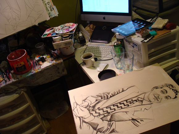
And here is a look into my studio.
Commission Portrait
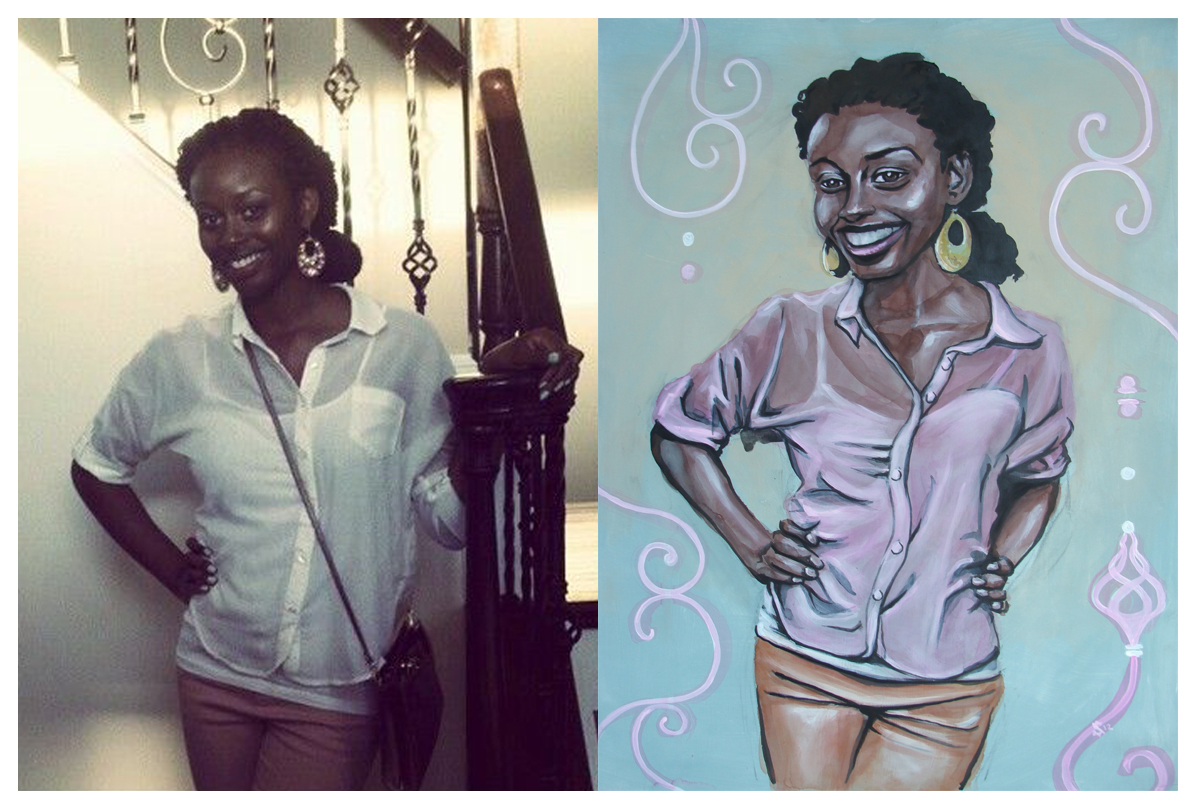
Recently I was commissioned to do this portrait. On the left is the reference photo I was given to work from and on the right is the resulting image. I was told that her favorite colors are pink and fall colors. I think pink stuck in my head. It doesn't hurt that it is one of my favorite colors. Looking back on it I see this as a great learning experience in technique. I have been experimenting with watercolor, india ink and acrylic.
Below is a series of images that walk through the process. The preparation of the surface is the most crucial part of the process so far. It will be apparent in the next fashion illustration how the watercolor reacts differently to the substrate.
The painting is on gessoed 1/8th inch masonite board (hard-board). I buy the board from Home Depot in 48x96" sheets and have them cut down to 18x24.
Fashion Illustration… George Kamau
Special thanks to George Kamau for allowing me to use him as model for this illustration.
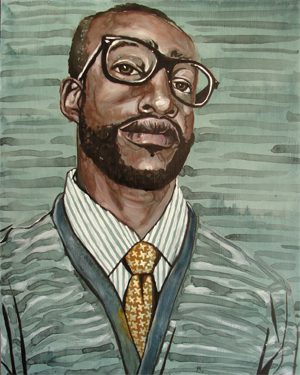
This is the second in the series of my new passion- though this calls for a drumroll I will not wait for your hands to start slapping your knees-
Fashion Illustration!
The process is one I stole from a verbal explanation of the artist Sterling Hundley's process (his outlandishly fantastic and award winning work here). There was an appropriate amount of hand waving and gesticulating so I was able to get the gist of it all. My good friend Caleb Morris (his amazing and ground-breaking work found here) was fortunate to receive a portrait of himself done by Mr. Hundley in demonstration.
I gleaned all that I could from Caleb's exuberant explanations and adapted what I learned to what I could make my hands comprehend.
It begins with a glaze of Acrylic for the foundation.
Afterward I draw a sketch with pencil.
Over the pencil drawing I ink in the appropriate amount of black with waterproof india ink.
Then comes the exciting part- and where the process pictures begin below-, I cover large areas with washes of watercolor. Since the base of the substrate is acrylic the water has nothing in which to soak. This leaves the wash open to perpetual changes. Also the pigment in the watercolor is searching for a place to settle while the water is evaporating, creating beautiful iterations and watermarks.
Highlights are pulled out by applying white acrylics over the watercolor.
Lastly I will go back into the black areas with fresh india ink to re-establish the darkest darks.
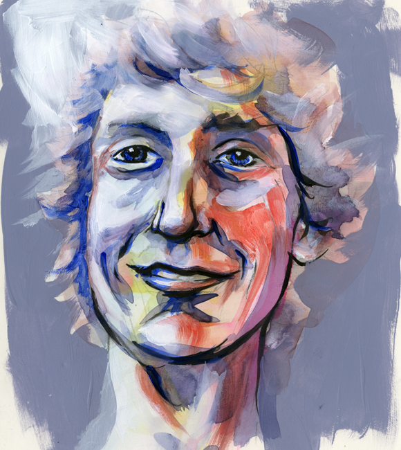
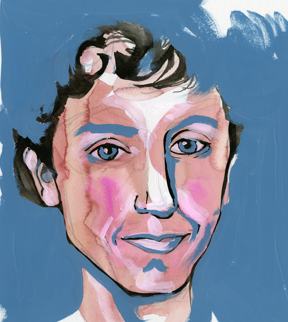
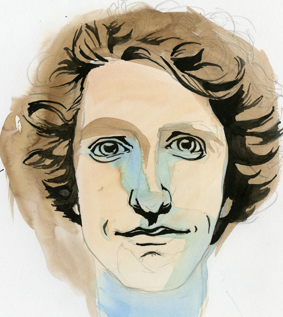
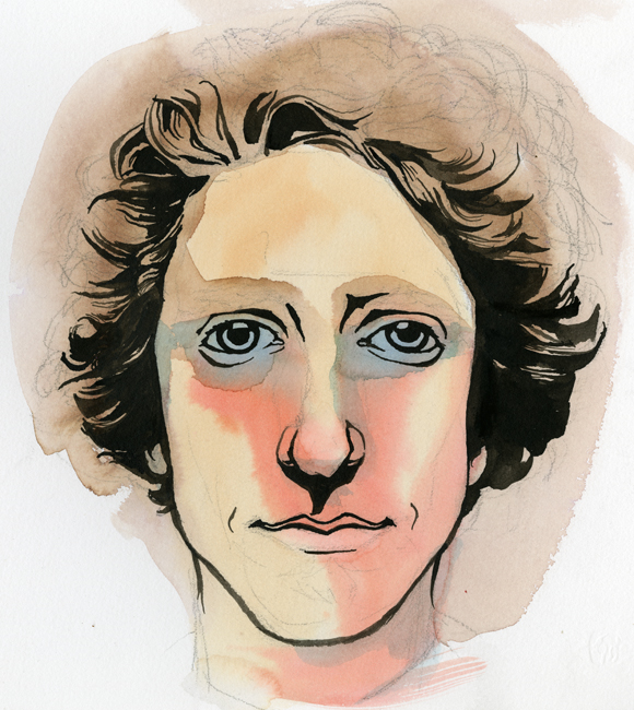
Self Portraits...
I have been itching for a redesign on my business cards for a while. The old design ( found here ) is still nice, but definitely outdated. I received my first batch of them over a year ago. Back then I had consistently longer hair, and the card reflected this beautiful and untamed nature. There is also some outdated information that I cannot continue to keep tracking and using. Below is the sketch I did not too long ago of what I want. It's a quick sketch and I need to nail out more of the finer details, but the idea I believe is strong.
My good good friend Ruth Meharg suggested that I might print the cards on vellum so the portrait would show through on to the back side. I love this idea. I don't know how that would translate, especially with wanting information to be on printed on both sides. Also, the idea of creating a plate or woodcut for printing the type was thrown around. Any sort of print process is beautiful to me. What is likely to happen is a limited run of hand printed cards (for those very special people) and a mass printing from Zazzle to put up in shops and what not.
After developing the sketch I wanted to get some self-portrait ideas down to better visualize the final product. What followed is what you see below, in order that they were painted. They range in technique, but all contain some sort of mixture of watercolor and black ink. The first few also contain acrylic. None of these actually fulfill my desired look, but I think that I am getting close.
This first one was mostly acrylic and feels very patriotic… that darn red, white and blue...
Oooooo, what do I say about this one? It conveys a younger me-and the eyes are horribly offset from each other. I might as well toss this and never think of it again.
In spite of the odd nose, this is one of my favorites! It wouldn't work well for the business card, but bow ties get me every time…every time.
This is a success. A marvelous success! There is a hitch though, the colors are a bit moody. I was showing it to a few coworkers, and they started to tear...
Eyes are always aggravating me. The one on the right just started to run away. Blue made its way in again and sets an off mood to this self-portrait as well.
The Urban Animal Scientist...
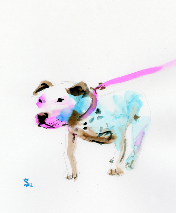
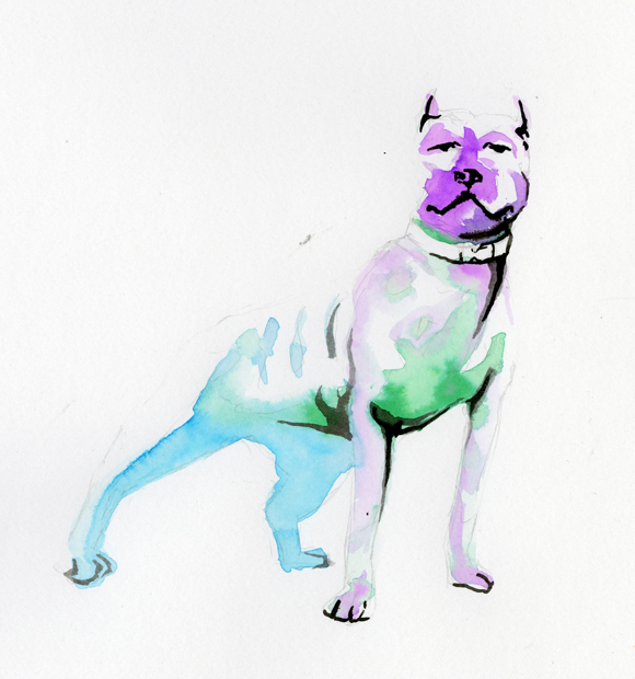
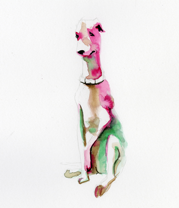
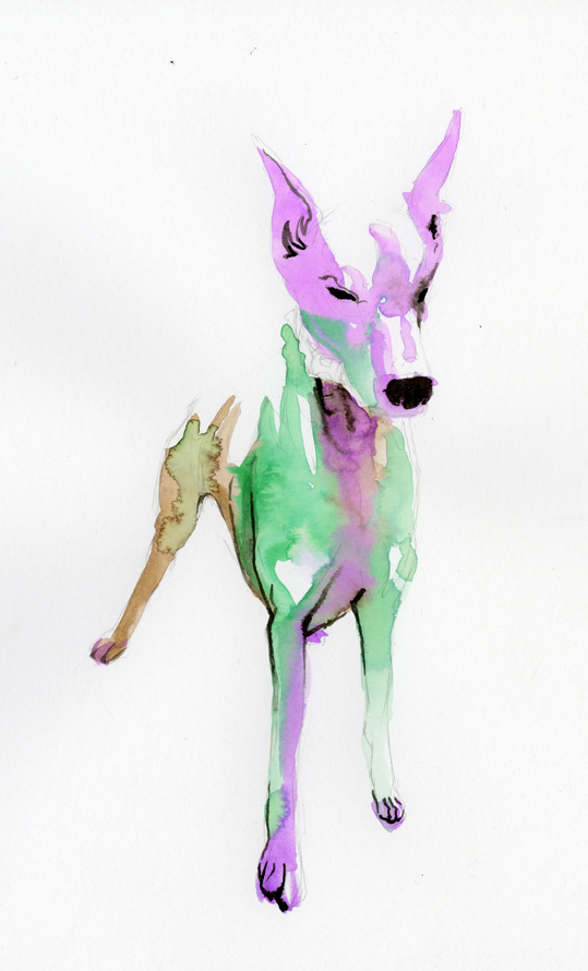
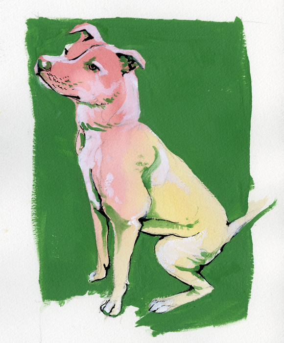
I have been experimenting with different imagery in collaboration with my friend The Urban Animal Scientist. The Urban Animal Scientist is an urban brand of dog collars, soaps, and now concrete dog bowls. Handmade right here in Atlanta these oversized collars are crafted to match the owner and the dog together in perfect fashion harmony. What started out a couple years ago as an idea and a passion has burgeoned into a great brand, a How Magazine featured website, and a hub for great collaboration to take place. Below is a sampling of my work in collaboration with The Urban Animal Scientist.
My goal was to leave a large portion of white space and to utilize simple bright colors to define the form of the dogs.
The main focus was on the collars and the leads. I wanted the dog to be the subject while using the color to lead the eye through image ending at the collars and leads. I used black india ink sparingly and purposefully. Marking the eyes, ears, nose and mouth.
On these last two the process changed slightly. Instead of leaving a mass of white space I decided to fill in everything with color. Everything began the same with the pencil drawing, the light washes of watercolor and the india ink for definition. This time though I did not leave any white space I instead filled in the white space with Titanium White gouache. Finally I would finish the painting with a mid tone acrylic to frame the dog and to add value within the form.
Vultures...
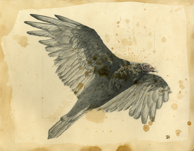
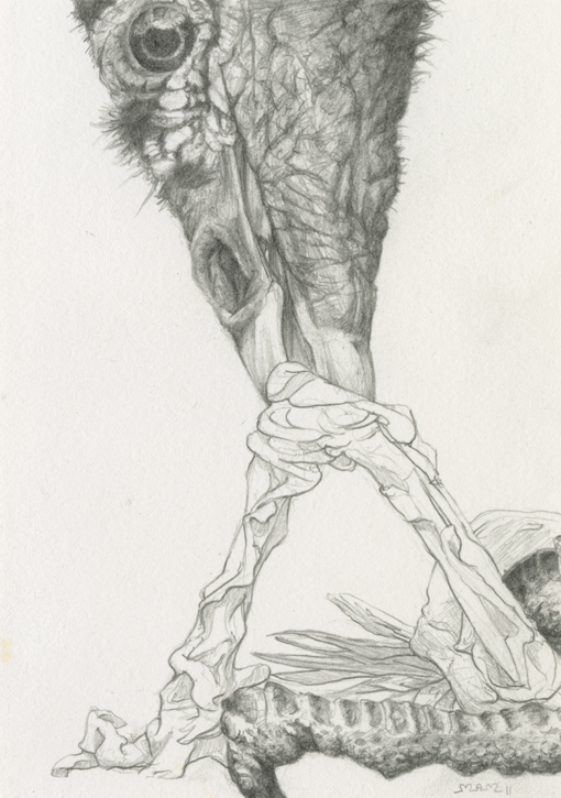 In High School I fell in love with the works of Edgar Allen Poe. I realize that's not particularly unique as many high schoolers identify with his sort of reality. Somewhere in me that same sort of intrigue exists. The vultures are testament to Poe's influence on me. To look at things that are dark and relay them to the world. And the hope that is within that is not to shock people, but to engage people and challenge culture.
I was writing a Poe-esque fiction to follow along my vulture theme and to co-habit a space with this image above. Like Poe I wanted to create a space that drew the audience out of the words and into the story. To feel the talons of the bird, and smell the stench dripping from the end of its face. Unlike Poe I have a tendency to be contrived and reaching. Poe had an ability to over embellish and yet simply tell his story.
Vultures are shadows in the sky. Searching for the dead. Coveting the diseased.
Vultures are death-eaters and life-bringers.
Cathartidae...
Think about the the thoughts that are associated with the imagery and name of vultures.
Are they majestic?
Are they noble?
Are they beautiful?
It is common to view vultures with contempt. They are symbols of death. How could they not be with their writhing, red, balding heads. The sunken eyes are the vision of their teetering between the living and dead. When there is a vulture over-head then death is near-by. What high praise can be given to a bird that seeks out death?
John Mayer expresses this view plainly in his characterization of vultures in the aptly titled track 'Vultures.'
All of these vultures hiding Right outside my door I hear them whisperin They're tryin to ride it out Cause they've never gone this long Without a kill before
I might just go ahead and posit another thought here. Perhaps the nature of vultures is not about death, but about life?
It is about more than the vital role that they play in the environment. Vultures represent a specific moment in the transitional times of life. Their lives transcend the simple but lead us to the sublime. In certain cultures the vulture is revered. It is called a death-eater, a cleanser, a purifier. Imagine the beauty of life. Imagine a life being lived and filled with the joy of existence. When that joy has turned then death enters. Note that this is not when the vulture enters. Death takes what it wants and leaves nothing but a token of what once had lived. In the midst of the tragedy of death comes the vulture to eat what death has left behind. In this death the vulture finds life. The vulture redeems the act of death to an act of life.
The vulture's life is all about redemption!
The vulture's life is about renewal!
Ponder that idea. Wrestle with a new understanding.
Gimli and the iPhone
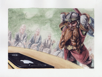
It's the next in the series! The council of Elrond is one of my favorite chapters in the books and I could not pass up the opportunity to illustrate an image in the series from such a pivotal and cinematic moment. Gimli, in his great impatience is too eager to destroy the thing that is causing the whispers of war throughout Middle Earth.
This iPhone is too powerful to be destroyed by a simple passionate movement of a short-tempered dwarf.
This is a 9×12 inch watercolor painting on multi-purpose illustration paper. Stylistically different from many of my detailed and highly rendered paintings this watercolor series will capture an emotion of gritty reality.
Come back in a while to see how Gollum feels about this great power.
Frodo and the iPhone
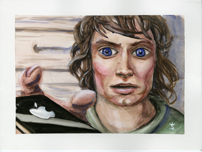
Part of a new series I am working on. It consists of combining to of my favorite loves- Lord of the Rings and Apple products. The main focus in these will be replacing the 'one ring' with Apple's iPhone 4 and placing it in situations that we have seen in the cinematic representation of Tolkien's beloved books. My hope is that by juxtaposing these iconic images together that the viewers will be intrigued by their relationship.
This is a 9x12 inch watercolor painting on multi-purpose illustration paper. Stylistically different from many of my detailed and highly rendered paintings this watercolor series will capture an emotion of gritty reality.
Prints available for purchase here.
Be looking for the Gimli painting coming next!
Angry Bird
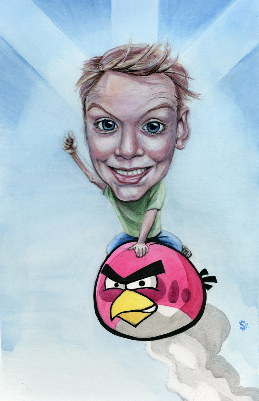
My bossed asked me if I wanted to do a painting for him. Of course I said yes. I mean, I can't pass up an opportunity to at least attempt to show off. Brian, my boss, wanted a picture of his son riding an 'Angry Bird'. This became a chance to try my hand at something new- vector images.
One of the biggest issues of painting something like 'Angry Birds' is the thick black lines that surround every form. With this I have no chance to fudge a line and say that it is because 'the light is hitting it just so…'. No sir, no ma'am I had to try something new.
It just so happens that the very same day I got the call from Brian I had purchased some liner brushes from Sam Flax after seeing Atlanta artist Sam Parker painting in store. As I was walking up to his work space he was outlining a form on the canvas. The newness and brilliance of his technique swept over my artistic sensibilities and nearly on the spot I purchased my new and awesome brushes.
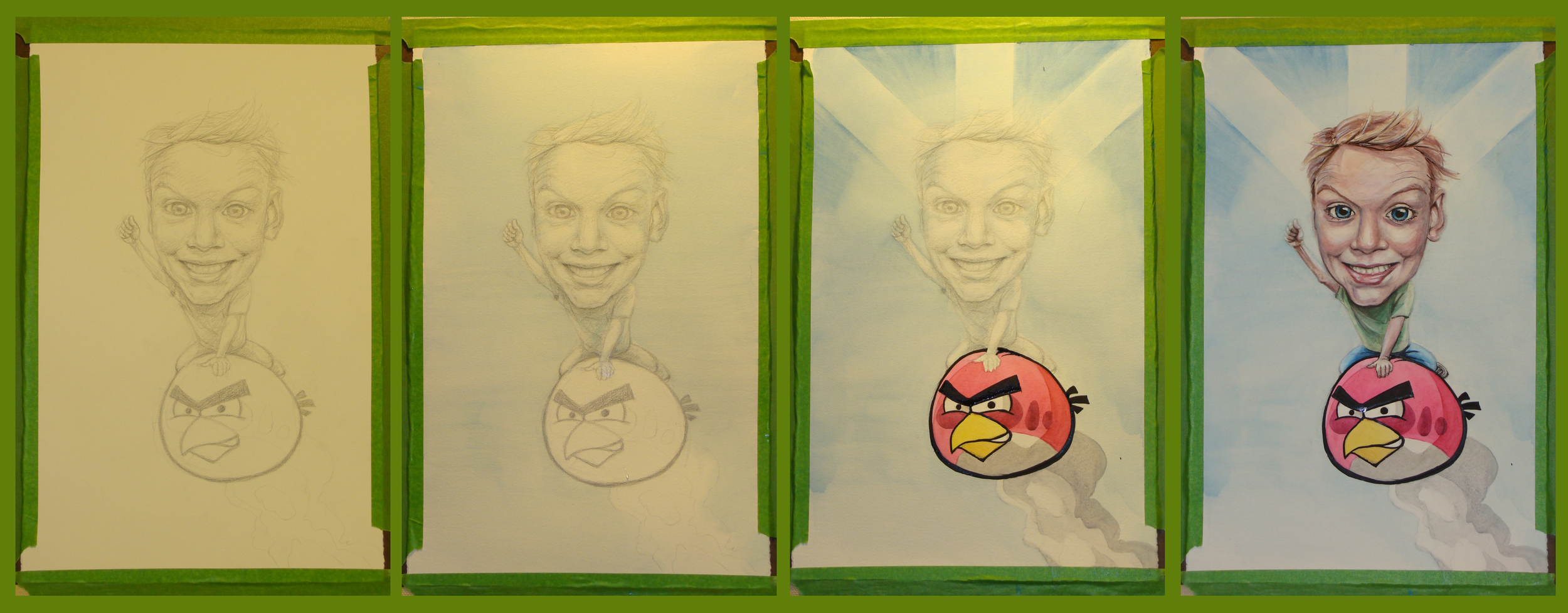
Below is the progression of the painting. It is the four main stages from drawing, to watercolor wash to finished painting.
-When painting in watercolors I almost always will start with a pencil drawing that defines my shapes and general values.
-Next I do a wash over the entire painting then pull out the color from specific highlight areas. Areas such as the nob of the nose, the eyes, the bottom lip and forehead.
-The angry bird is made of 4 layers of color, one on top of the other. For the 'starburst' effect I used frog tape to mask the paper and allow for more freedom in my brushwork.
-Finally I went into the details in the face and we are at the end. Enjoy!
Yoda's Burden
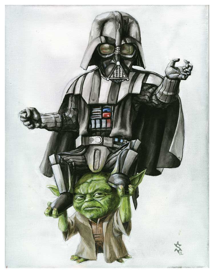
Here it is. I hope that the title is description enough. If there is anything about this story that you would like to discuss please hit me up!
If you would like to purchase this item please follow the link to my etsy or just click on the image.
Cute, cute Whale. Now on Sale!
Check it out! Now on sale for 25 dollars.
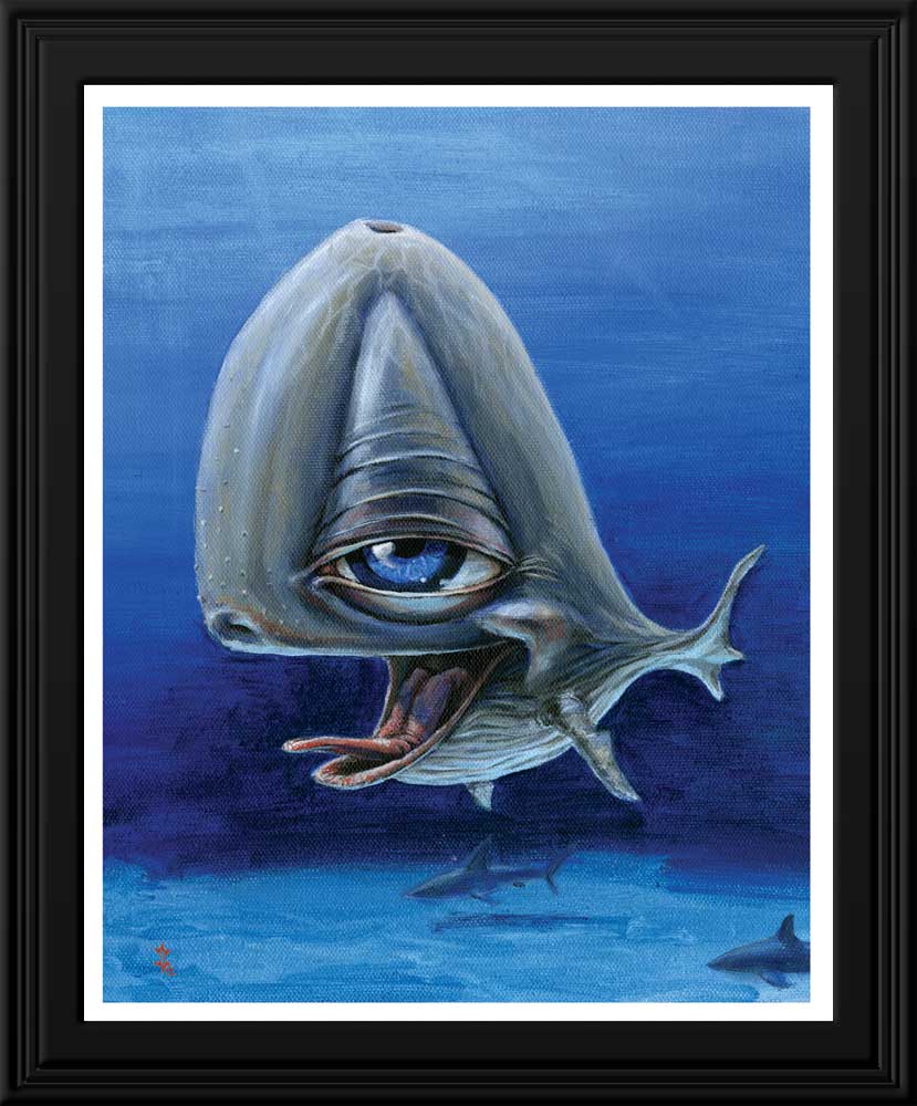
This 8x10 print is the perfect gift for your best friend! Or all of your best friends. Or even just a regular joe you meet on the street.
Your beautiful beautiful Whale will be printed on E-Surface Photo Paper (matte finish). As a professional paper, it boasts rich, sharp color that won't fade or yellow, creating beautiful prints that will last for years to come.
Trogdor, Robot Unicorn, Dolphin...
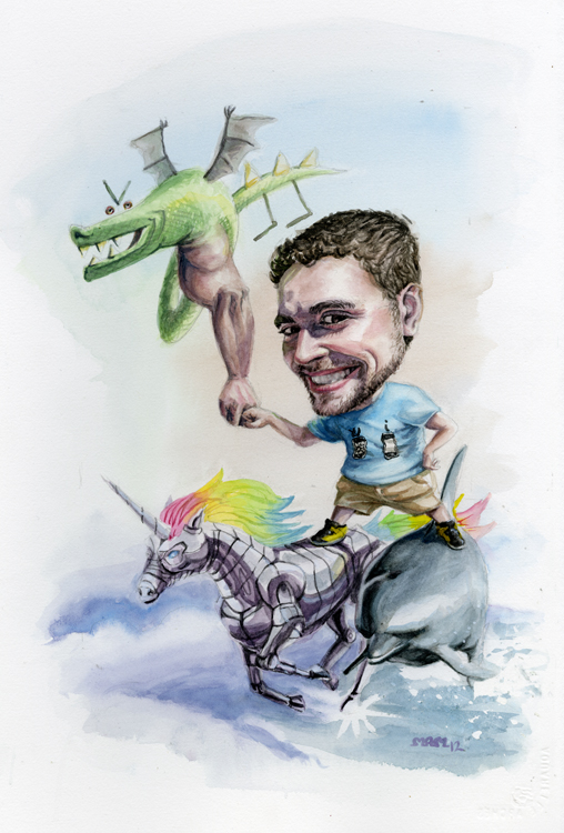
I was so so pleased to get this commission. It started out with just a man riding a dolphin. As it progressed it became so outrageous and so amazing that it has been one of the best experiences I have ever had. Before this commission I had actually never heard of trogdor. This creature was a fantastic creature of a brilliant mind. Robot Unicorn Go!! Again, this is something about which I knew nothing and now I'm in love.
Among the joy was a plethora of knowledge and new experiences. Now that you have read through my story of this painting enjoy the beautiful painting.
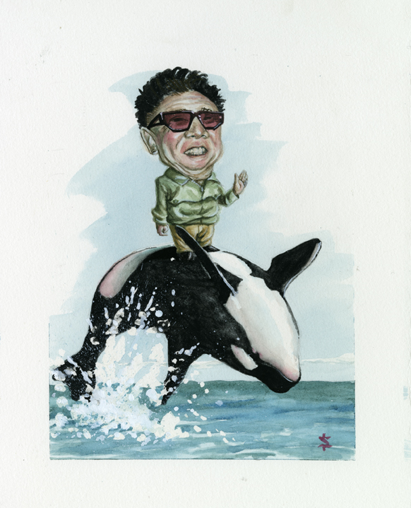
Kim Jong Il and Orca
After my recent show I received an email about a new commission piece. It mentioned something about a fascination with Kim Jong Il. When I read that tidbit of information I was taken aback. To what degree of fascination I'm not sure but nevertheless my intrigue was captured and my hands trembled with anticipation. The sketches were simple and straightforward and I moved right into the painting.
What came of it is shown below.
Mr. Miyagi...
So the Graveyard Tavern opening night was a hit! No it wasn't a firesale or anything of the sort, but by all means it was a success. We began setting up around 7 and were ready to go by 9- more or less. The support from friends was overwhelming but unfortunately there is no photographic evidence. The work will be up through the rest of the month so be sure to check it out. Buuut if you can't make it then pay attention to the blog in the coming weeks to see the works that debut the work of Sunflowerman on the Atlanta art scene.
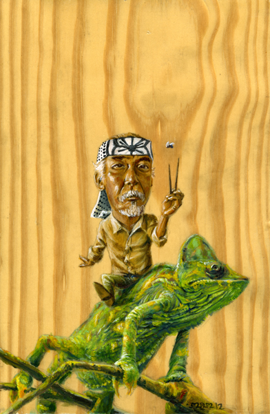
Mr Miyagi (already sold =] ) was the headliner of the show. If you haven't made it out then here is a taste of what you missed.
