Self Portraits...
I have been itching for a redesign on my business cards for a while. The old design ( found here ) is still nice, but definitely outdated. I received my first batch of them over a year ago. Back then I had consistently longer hair, and the card reflected this beautiful and untamed nature. There is also some outdated information that I cannot continue to keep tracking and using. Below is the sketch I did not too long ago of what I want. It's a quick sketch and I need to nail out more of the finer details, but the idea I believe is strong.
My good good friend Ruth Meharg suggested that I might print the cards on vellum so the portrait would show through on to the back side. I love this idea. I don't know how that would translate, especially with wanting information to be on printed on both sides. Also, the idea of creating a plate or woodcut for printing the type was thrown around. Any sort of print process is beautiful to me. What is likely to happen is a limited run of hand printed cards (for those very special people) and a mass printing from Zazzle to put up in shops and what not.
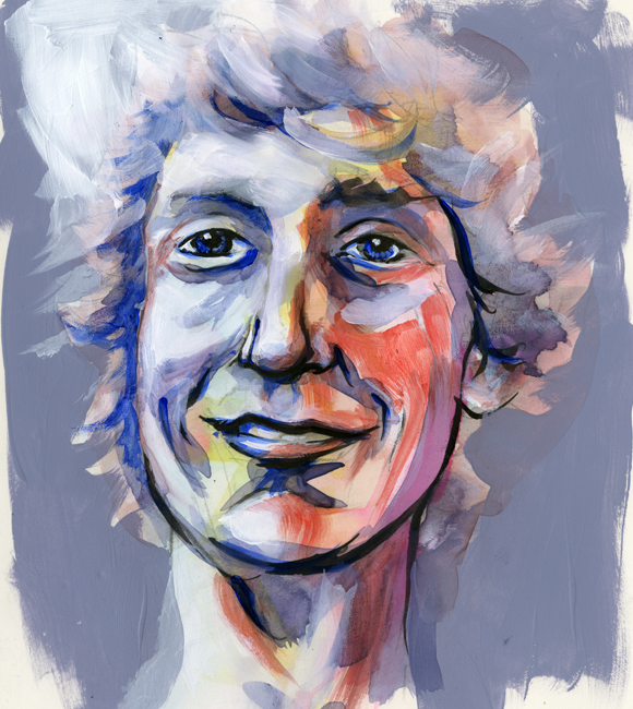
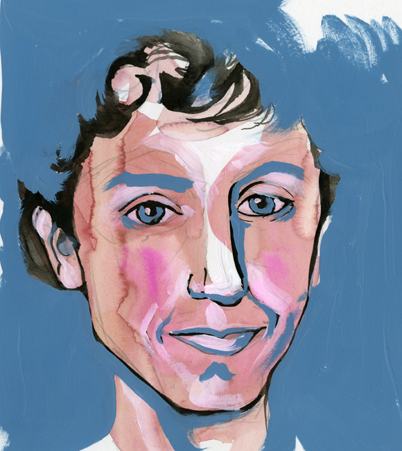
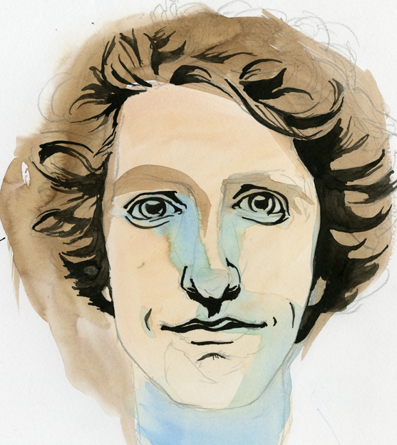
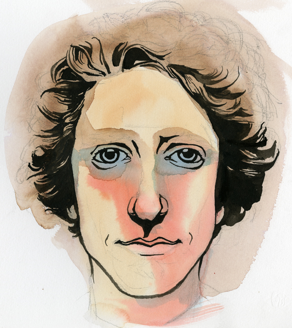
After developing the sketch I wanted to get some self-portrait ideas down to better visualize the final product. What followed is what you see below, in order that they were painted. They range in technique, but all contain some sort of mixture of watercolor and black ink. The first few also contain acrylic. None of these actually fulfill my desired look, but I think that I am getting close.
This first one was mostly acrylic and feels very patriotic… that darn red, white and blue...
Oooooo, what do I say about this one? It conveys a younger me-and the eyes are horribly offset from each other. I might as well toss this and never think of it again.
In spite of the odd nose, this is one of my favorites! It wouldn't work well for the business card, but bow ties get me every time…every time.
This is a success. A marvelous success! There is a hitch though, the colors are a bit moody. I was showing it to a few coworkers, and they started to tear...
Eyes are always aggravating me. The one on the right just started to run away. Blue made its way in again and sets an off mood to this self-portrait as well.
An Arthurian Portrait
Here is work that I did back in the good 'ol Kendall days. This is actually one of my favoritest works that I have ev done. The drawing is done in prisma color pencil with the background of the matte board showing through. The style is different than most all of my other works, and I would love to explore this direction more.
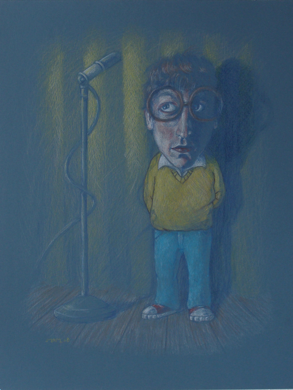
The theme is sort of a self portrait of me as Arthur- from the famed Marc Brown books named Arthur, also the PBS kids show (which I love by the way). This is based off a book cover of a said Marc Brown book.
