Women's Fashion Illustration… Book Pages
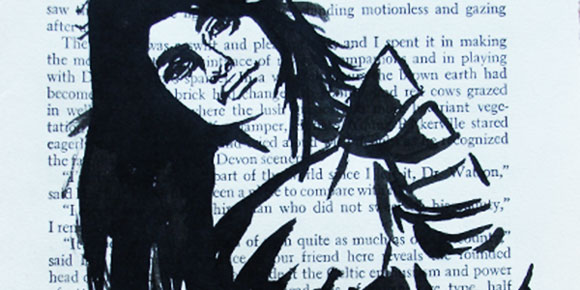
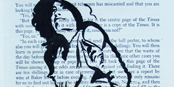
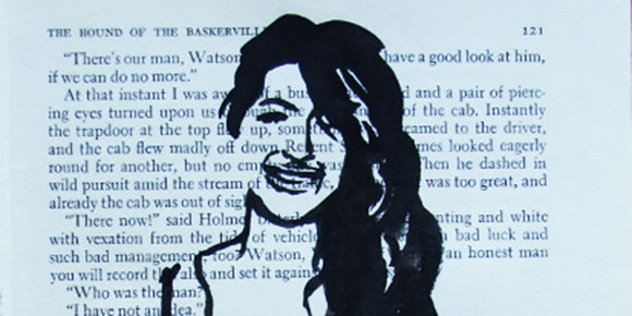
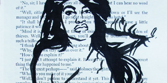
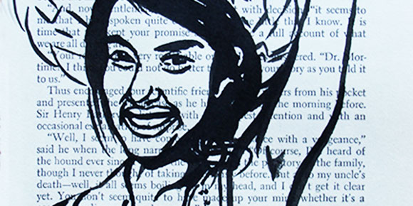
Recently I was commissioned to do this series of women's fashion illustration on the book pages. I have stayed away from women's fashion quite purposefully. It is such a highly saturated genre with little variety. Though illustrating the female form is much more interesting than the male form. One could understand the saturation of the women's fashion market after having the opportunity to work in it.
My heavy handed approach with varying thicknesses of bold blacks carried over to the traditionally delicate and fluid line work of women's fashion illustration makes for a stronger figure. With my signature book page background these illustrations maintain the sunflowerman 'look.'
.
.
.
Fashion Illustration… D.R.E.S and GQ
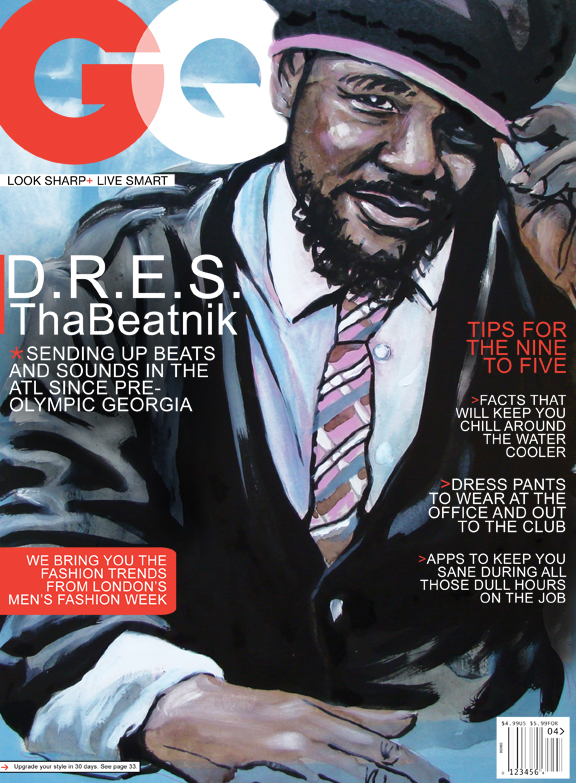
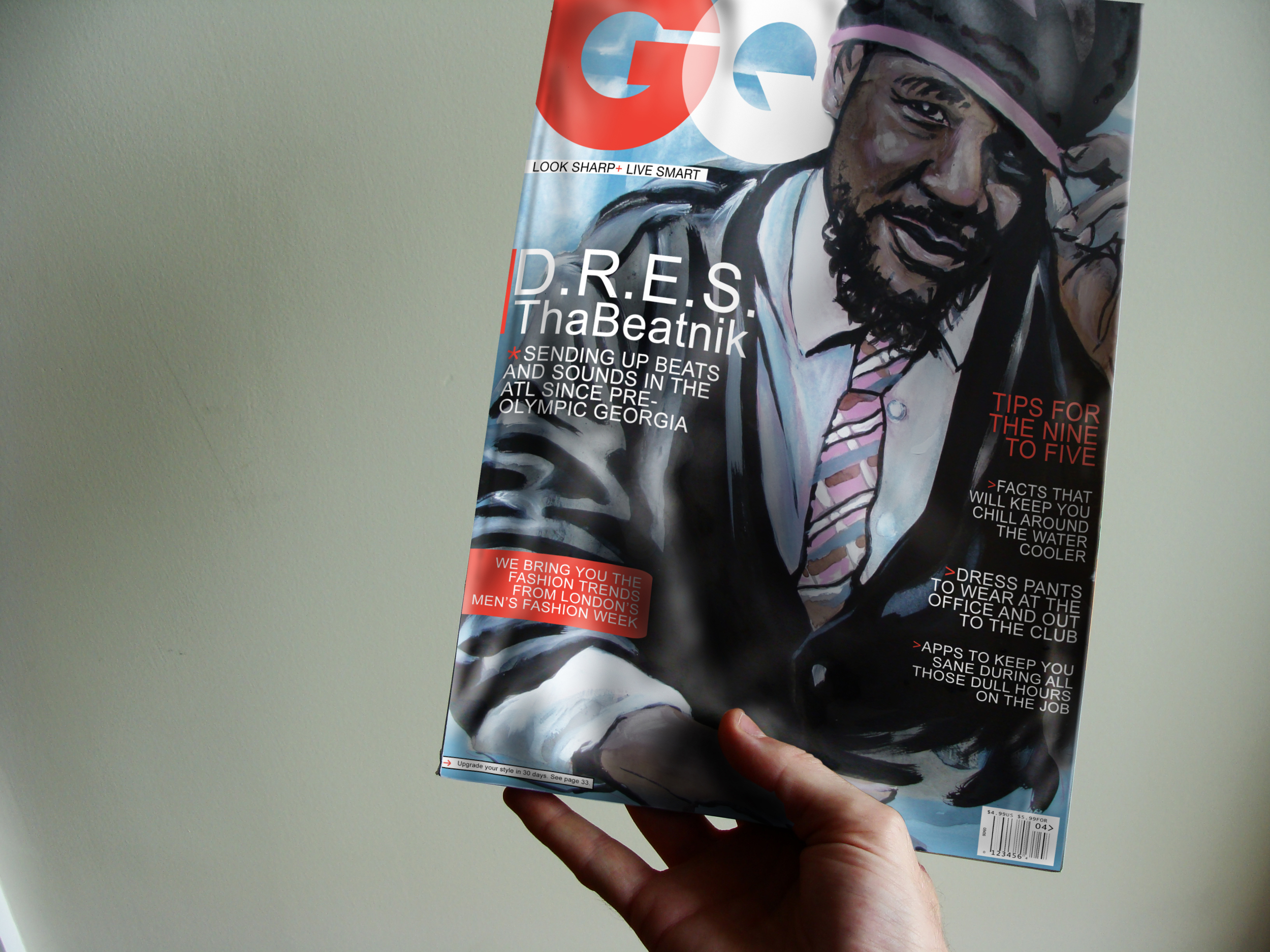
Since the very last post prior to this one is about the original illustration I will not go on for long. This is the sixth GQ cover in the series so far (the rest found here). I might say I am actually getting quite good at this. So step down this way and take a look at the newest edition of the illustrated GQ with D.R.E.S. ThaBeatnik.
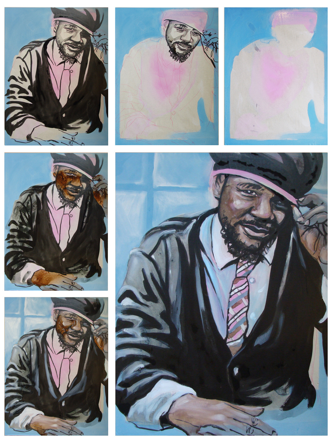
Fashion Illustration… Dres Tha Beatnik
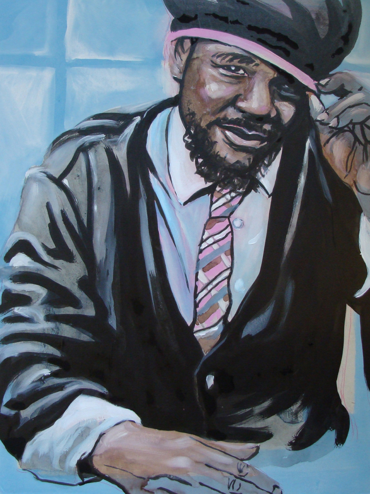
I was walking through Starbucks to see a friend. As I was walking this gentleman caught my eye. He was dressed very well and had this character about himself that was quite attractive. After grabbing my coffee I walked over to where he was seated and asked if I could use him as a part of my fashion portrait series. His name is Dres D-R-E-S (dr-ah-s). Can't lie, I struggled pronouncing Dres correctly.
It turns out that he is a local Atlanta musician, perhaps even a local celebrity. He handed me a copy of his recent album, I snapped a pic on my phone and we parted ways.
This is what came of that interaction. Also, check out his myspace and enjoy the mix.
.
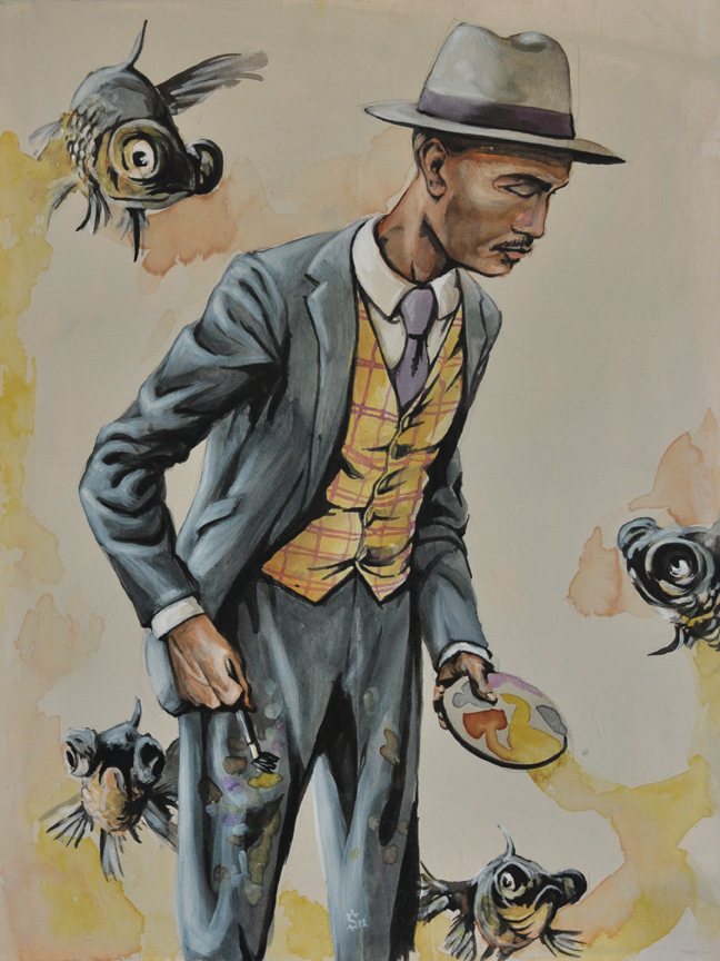
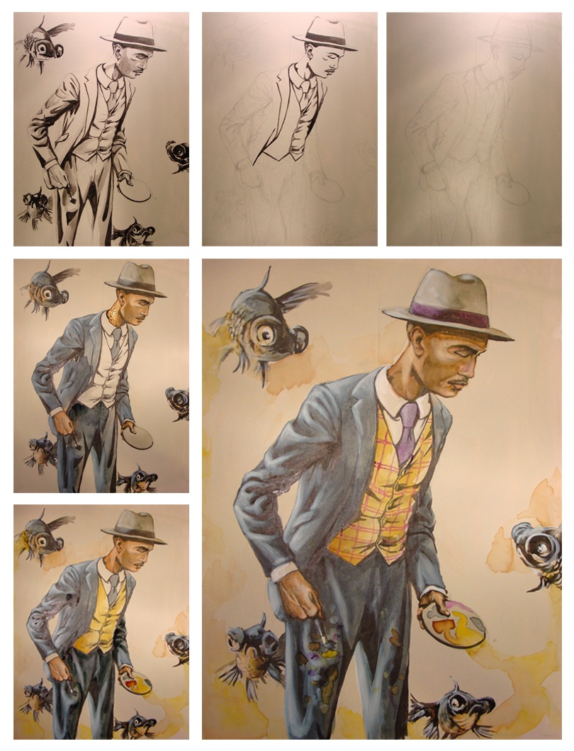
Fashion Portrait… Brandon Sadler and the Black Goldfish
I did this Fashion Portrait of a friend of mine a while back now. I have mixed feelings about this piece. There is so much great about it and a few things that irk me. Things such as my lack of thought about the background. Overall the painting showcases the character and the clothes very well. Featured here is Brandon Sadler. He is a painter based in Atlanta, GA. He has been involved in the growing street art scene with a mural near the Studioplex in the Old Fourth Ward and has shown his work all over the city including work at the ABV gallery.
Brandon allowed me to photograph him while he was painting so I could capture the moment as it would be in real life. I went home and compiled a series of images of him painting and several images of suits from the 1920's. I love the idea that someone would always dress so dapper even when painting and not give a second thought to where the paint might end up. Several compositional drawings later I began. I struggled with the placement of Brandon in relation to the fish and probably drew at least 15 18x24'' sketches to get it exactly right.
This piece was so much fun to work on. Despite my reservations about the background it came together beautifully and it is part of a progressive process in my own work.
Brandon Sadler. 18x24". Acrylic, watercolor and india ink on hardwood board.
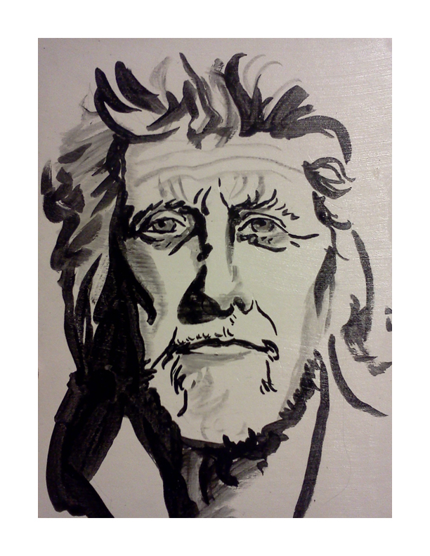
Paul Chelko…Portrait
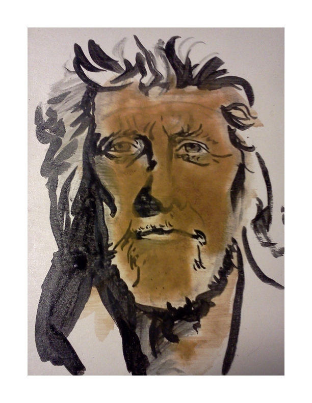
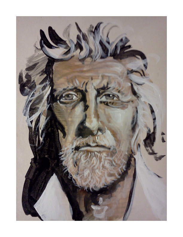
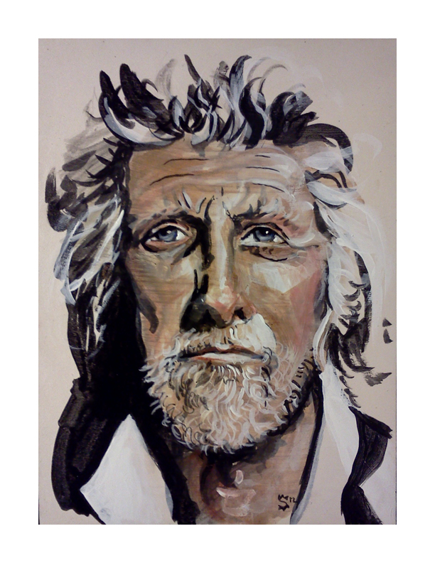
I must say that I am suddenly and properly honored to have done this little portrait of Paul Chelko. It was quite the accident that I came across his photograph on the cover of a 2007 edition of 'The Atlanta Magazine (which I could not find on their website- so it's possible I am confused as to the actual magazine).' Over and over I mentioned the character in his face. Sarah, my mentee, and I were practicing some techniques in painting at One Love Generation and I grabbed the magazine at the top of the towering pile for reference. As I walked over to our table where Sarah was eagerly awaiting the chance to paint. My eyes were trained on the photograph that was the cover of the magazine, analyzing the face we were about to use as practice. She exclaimed at the difficulty of drawing his face with a brush.
At the bottom of the post is an image of the portrait that Sarah did. She also painted an eye that would have been nice to grab a picture of. Her focus was a bit more centered on the painting of the eye than the portrait.
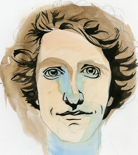
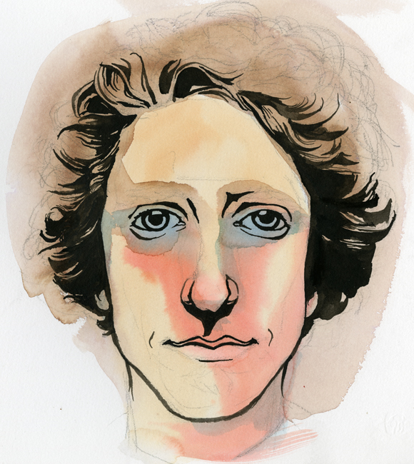
The following five images are the stages of the painting. It begins with an ink brush drawing, followed by washes of watercolor, highlights of white acrylic, dabbles of color in the cheeks and nose and retouching blacks with india ink.
Check it out. Enjoy. Share with your friends.
Sarah's version of Paul Chelko. I thought the line-work was brilliant and a beautiful image of what she is learning as she is becoming her own artist.
Commission Portrait
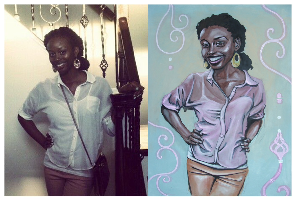
Recently I was commissioned to do this portrait. On the left is the reference photo I was given to work from and on the right is the resulting image. I was told that her favorite colors are pink and fall colors. I think pink stuck in my head. It doesn't hurt that it is one of my favorite colors. Looking back on it I see this as a great learning experience in technique. I have been experimenting with watercolor, india ink and acrylic.
Below is a series of images that walk through the process. The preparation of the surface is the most crucial part of the process so far. It will be apparent in the next fashion illustration how the watercolor reacts differently to the substrate.
The painting is on gessoed 1/8th inch masonite board (hard-board). I buy the board from Home Depot in 48x96" sheets and have them cut down to 18x24.
Self Portraits...
I have been itching for a redesign on my business cards for a while. The old design ( found here ) is still nice, but definitely outdated. I received my first batch of them over a year ago. Back then I had consistently longer hair, and the card reflected this beautiful and untamed nature. There is also some outdated information that I cannot continue to keep tracking and using. Below is the sketch I did not too long ago of what I want. It's a quick sketch and I need to nail out more of the finer details, but the idea I believe is strong.
My good good friend Ruth Meharg suggested that I might print the cards on vellum so the portrait would show through on to the back side. I love this idea. I don't know how that would translate, especially with wanting information to be on printed on both sides. Also, the idea of creating a plate or woodcut for printing the type was thrown around. Any sort of print process is beautiful to me. What is likely to happen is a limited run of hand printed cards (for those very special people) and a mass printing from Zazzle to put up in shops and what not.
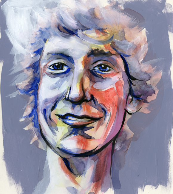
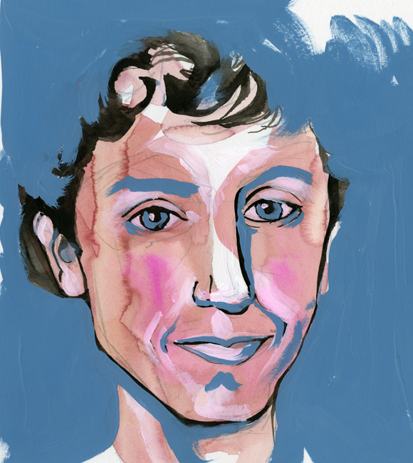
After developing the sketch I wanted to get some self-portrait ideas down to better visualize the final product. What followed is what you see below, in order that they were painted. They range in technique, but all contain some sort of mixture of watercolor and black ink. The first few also contain acrylic. None of these actually fulfill my desired look, but I think that I am getting close.
This first one was mostly acrylic and feels very patriotic… that darn red, white and blue...
Oooooo, what do I say about this one? It conveys a younger me-and the eyes are horribly offset from each other. I might as well toss this and never think of it again.
In spite of the odd nose, this is one of my favorites! It wouldn't work well for the business card, but bow ties get me every time…every time.
This is a success. A marvelous success! There is a hitch though, the colors are a bit moody. I was showing it to a few coworkers, and they started to tear...
Eyes are always aggravating me. The one on the right just started to run away. Blue made its way in again and sets an off mood to this self-portrait as well.
Angry Bird
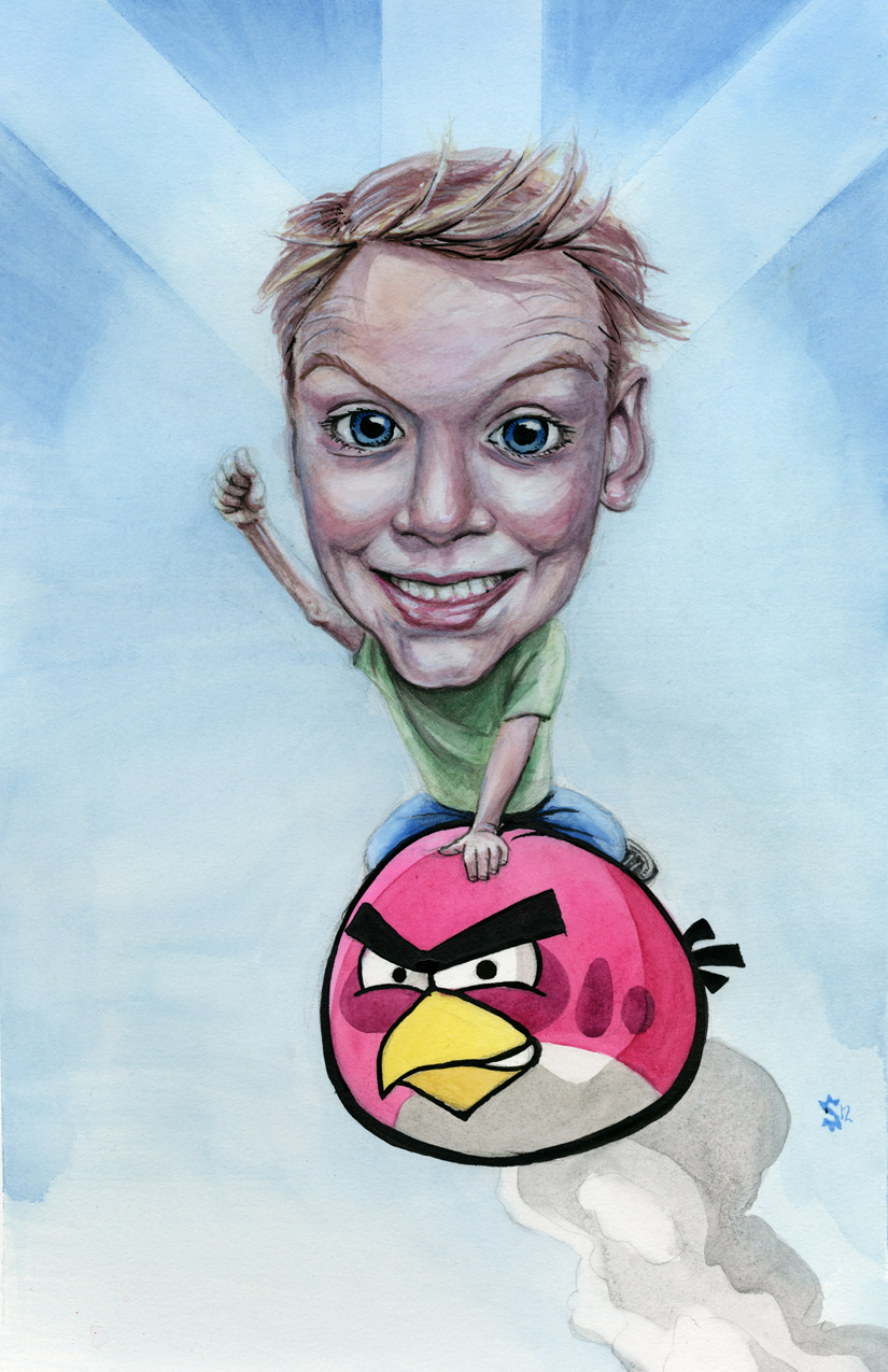
My bossed asked me if I wanted to do a painting for him. Of course I said yes. I mean, I can't pass up an opportunity to at least attempt to show off. Brian, my boss, wanted a picture of his son riding an 'Angry Bird'. This became a chance to try my hand at something new- vector images.
One of the biggest issues of painting something like 'Angry Birds' is the thick black lines that surround every form. With this I have no chance to fudge a line and say that it is because 'the light is hitting it just so…'. No sir, no ma'am I had to try something new.
It just so happens that the very same day I got the call from Brian I had purchased some liner brushes from Sam Flax after seeing Atlanta artist Sam Parker painting in store. As I was walking up to his work space he was outlining a form on the canvas. The newness and brilliance of his technique swept over my artistic sensibilities and nearly on the spot I purchased my new and awesome brushes.
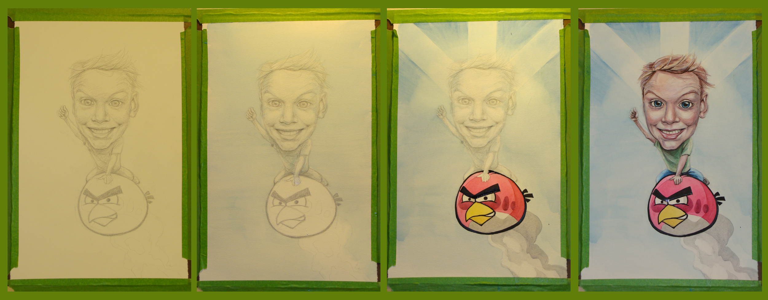
Below is the progression of the painting. It is the four main stages from drawing, to watercolor wash to finished painting.
-When painting in watercolors I almost always will start with a pencil drawing that defines my shapes and general values.
-Next I do a wash over the entire painting then pull out the color from specific highlight areas. Areas such as the nob of the nose, the eyes, the bottom lip and forehead.
-The angry bird is made of 4 layers of color, one on top of the other. For the 'starburst' effect I used frog tape to mask the paper and allow for more freedom in my brushwork.
-Finally I went into the details in the face and we are at the end. Enjoy!
Rob Bell...the Heretic
Love Wins. That's what they say, and that's what they hate.I haven't actually read the book, yet. Though, I had attended Mars Hill for nearly a year when I lived in the great state of Michigan.
I hated Mars, and I loved Mars. I was challenged, and I grew. I was offended, and I found truth.
This is my response to the 'controversy' surrounding Rob Bell, especially with the advent of his new book "Love Wins."
Playing on the great iconography of older traditions of christianity, I have begun a new iconography. Hopefully this will be read as a play on the tradition, and a play on the controversy.' Rob Bell as saint, and his objectors as saints.
I'm pretty sure it's safe to say that Rob Bell hasn't performed any miracles, that he has his short-comings, and that he even makes mistakes. But dang it, what makes him worthy of being hated so much?
Anyway... the fire represents condemnation, not of God, but of man. The Gold Leaf represents holiness- not of righteousness, but of the Love of God. The halos are the sanctification of man through the nature of the Love of the Creator. The blue skies are the 'gateway' to heaven. It is narrow, but as God's love is infinite, the gateway to heaven is certainly large enough to accept the whole of humanity. The earth, as seen in the imagery, is of a size that fits through the gates of heaven. The Love of God is big enough for the world, the world just has to accept it.
