New Collaboration…Sunflowerman and the Urban Animal Scientist
Last night I got to team up with The Urban Animal Scientist again! It is always a pleasure to be in such a creative space. He had an idea, I had a image and we brought them together with seamless ingenuity. Below is the product of the collaboration. Check it out and enjoy!
[youtube http://www.youtube.com/watch?v=7myquPcqrsU&w=560&h=315]
You may remember seeing something similar a while back. Check out the link here to refresh the memory
Self Portraits...
I have been itching for a redesign on my business cards for a while. The old design ( found here ) is still nice, but definitely outdated. I received my first batch of them over a year ago. Back then I had consistently longer hair, and the card reflected this beautiful and untamed nature. There is also some outdated information that I cannot continue to keep tracking and using. Below is the sketch I did not too long ago of what I want. It's a quick sketch and I need to nail out more of the finer details, but the idea I believe is strong.
My good good friend Ruth Meharg suggested that I might print the cards on vellum so the portrait would show through on to the back side. I love this idea. I don't know how that would translate, especially with wanting information to be on printed on both sides. Also, the idea of creating a plate or woodcut for printing the type was thrown around. Any sort of print process is beautiful to me. What is likely to happen is a limited run of hand printed cards (for those very special people) and a mass printing from Zazzle to put up in shops and what not.
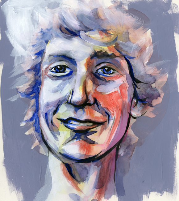
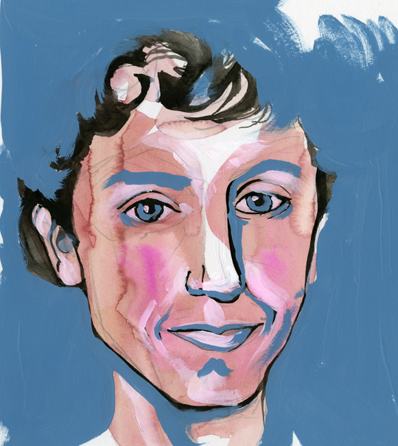
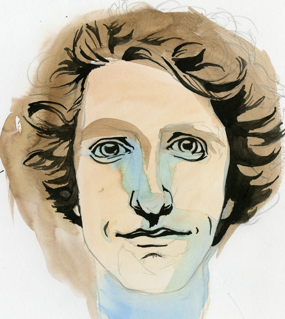
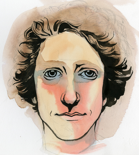
After developing the sketch I wanted to get some self-portrait ideas down to better visualize the final product. What followed is what you see below, in order that they were painted. They range in technique, but all contain some sort of mixture of watercolor and black ink. The first few also contain acrylic. None of these actually fulfill my desired look, but I think that I am getting close.
This first one was mostly acrylic and feels very patriotic… that darn red, white and blue...
Oooooo, what do I say about this one? It conveys a younger me-and the eyes are horribly offset from each other. I might as well toss this and never think of it again.
In spite of the odd nose, this is one of my favorites! It wouldn't work well for the business card, but bow ties get me every time…every time.
This is a success. A marvelous success! There is a hitch though, the colors are a bit moody. I was showing it to a few coworkers, and they started to tear...
Eyes are always aggravating me. The one on the right just started to run away. Blue made its way in again and sets an off mood to this self-portrait as well.
The Urban Animal Scientist...
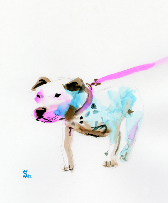
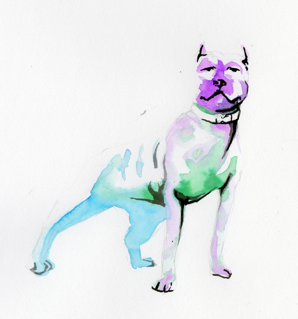
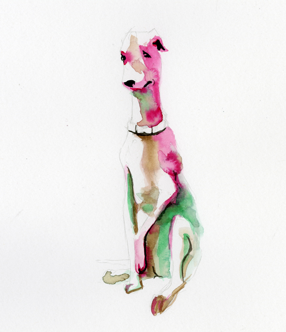
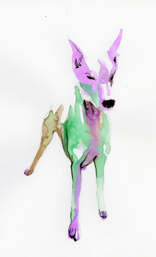
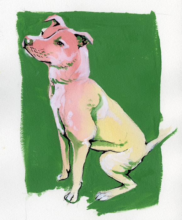
I have been experimenting with different imagery in collaboration with my friend The Urban Animal Scientist. The Urban Animal Scientist is an urban brand of dog collars, soaps, and now concrete dog bowls. Handmade right here in Atlanta these oversized collars are crafted to match the owner and the dog together in perfect fashion harmony. What started out a couple years ago as an idea and a passion has burgeoned into a great brand, a How Magazine featured website, and a hub for great collaboration to take place. Below is a sampling of my work in collaboration with The Urban Animal Scientist.
My goal was to leave a large portion of white space and to utilize simple bright colors to define the form of the dogs.
The main focus was on the collars and the leads. I wanted the dog to be the subject while using the color to lead the eye through image ending at the collars and leads. I used black india ink sparingly and purposefully. Marking the eyes, ears, nose and mouth.
On these last two the process changed slightly. Instead of leaving a mass of white space I decided to fill in everything with color. Everything began the same with the pencil drawing, the light washes of watercolor and the india ink for definition. This time though I did not leave any white space I instead filled in the white space with Titanium White gouache. Finally I would finish the painting with a mid tone acrylic to frame the dog and to add value within the form.
Beer and Wine
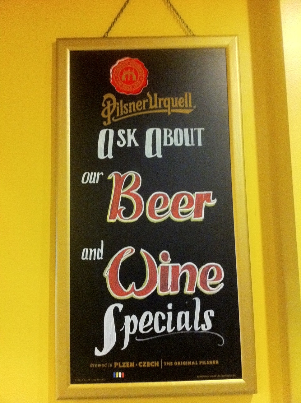
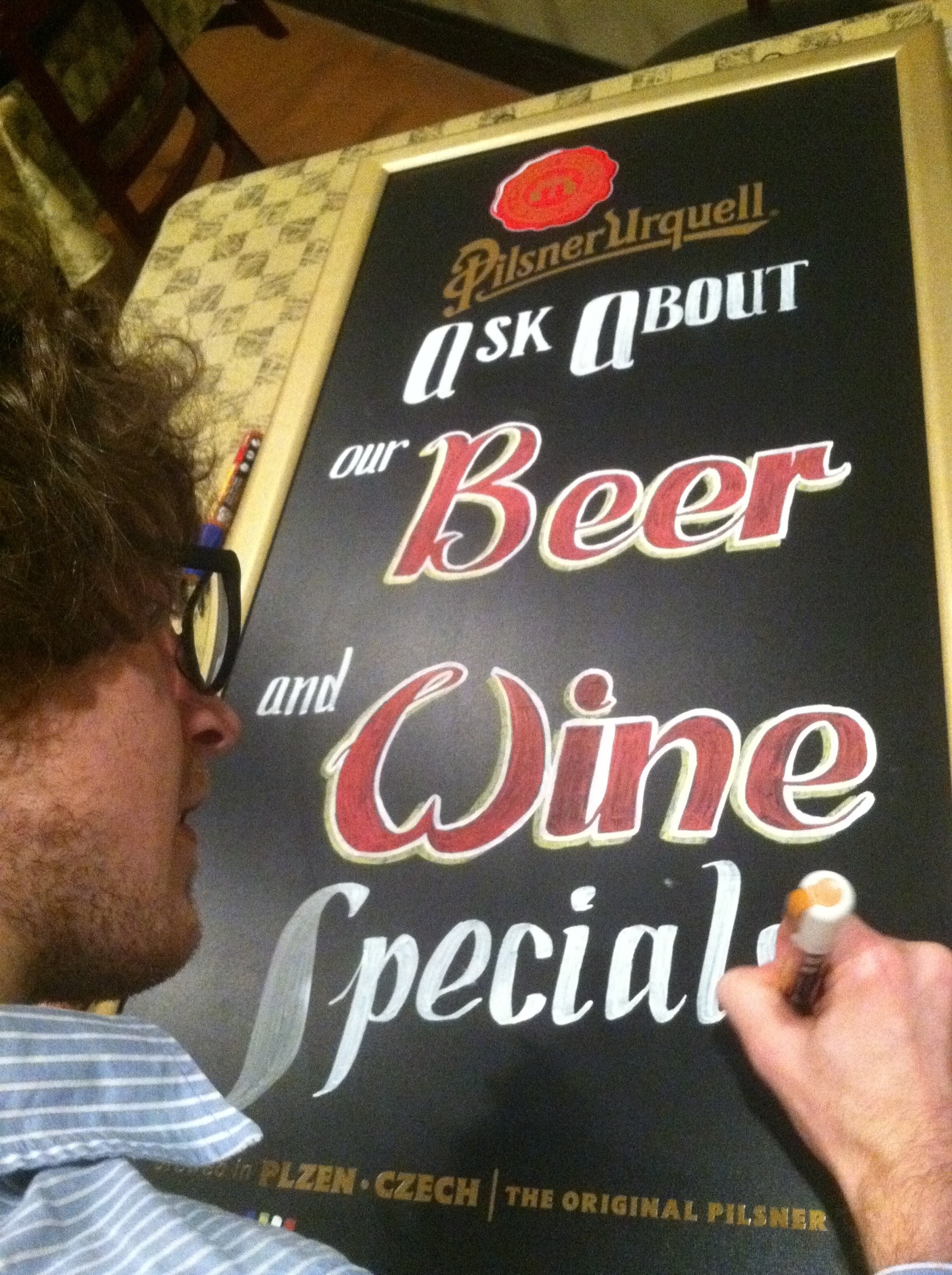
So, as I do on occasion, I came to the call of my amazing bosses (for a fee of course). Some designing needed to be done and as the resident artist I was obviously the man for the job. Recently the restaurant had acquired a nice chalkboard that Terry (affectionately T-Wayne) decided would be good for some advertisements of alcohol. I picked up some very nice chalk-paint at Sam Flax and went to work. The images below describe what followed...
On the Wings of an Eagle...
I hope there is little explanation needed for this painting. It developed while eating brunch at Radial Cafe in Atlanta with my roommate. We were discussing some of the ideas I was working on and after some discussion back and forth this imagery came about. The Chinese man riding an eagle. There is so much going on in this painting so if you have any questions feel free to ask.
