Fashion Illustration Web Headers
I began developing some Web-Header illustrations a while back that never were used. Hope is still strong within me that they will find a purpose one day. Today though, these fine illustrations are nice enough to share themselves as examples of my process. When I am illustrating there is an overall process that guides the work I do. Not everything is done the same way, but almost always there is a similar strategy to them. The Web-Headers have been the most straight-forward and will hopefully provide a bit of knowledge and maybe a bit of joy as well.
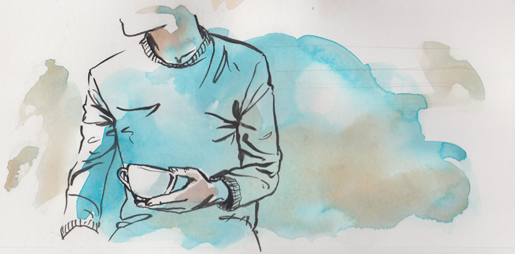
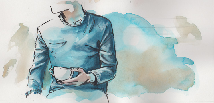
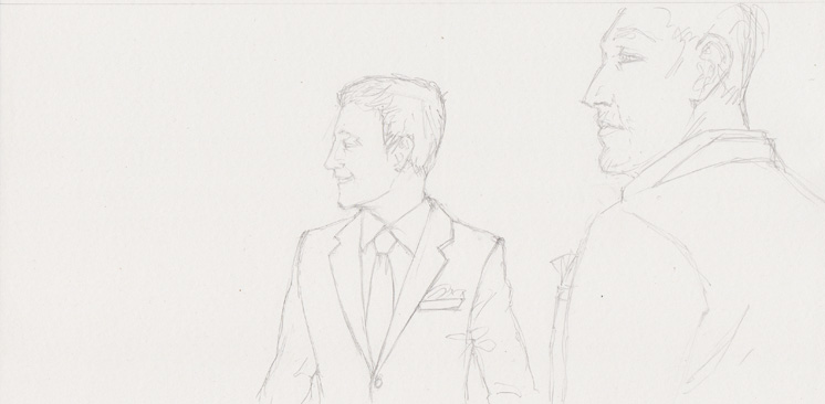
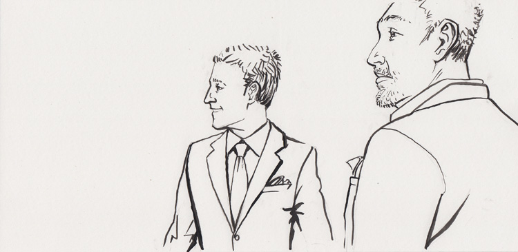
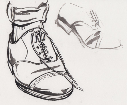
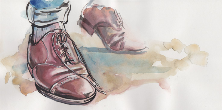
With this controlled style I start with a pencil sketch and follow it with an ink outline (I use a round brush from sizes 1-6 and black india ink, usually Dr. Ph. Martins).
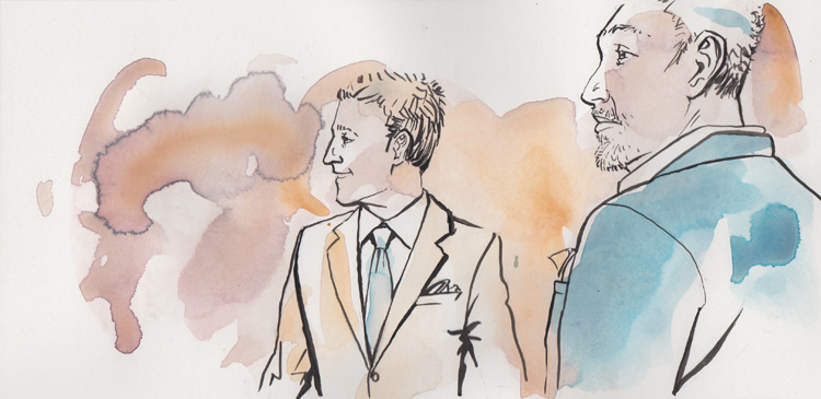
When the ink dries I do a heavy wash of base colors in watercolor to cover most of the work space (This is mostly water and a little bit of watercolor to create a unique ethereal background).
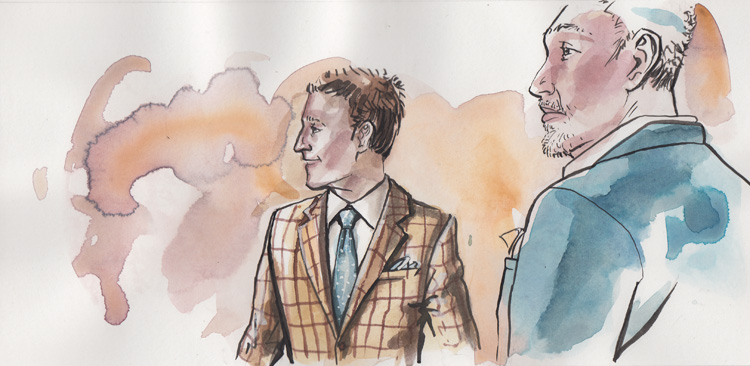
Finally all that's left is filling in the details of lights and darks to pull the form of the figures from off the page (personally I feel that it is ok to use white gouache over watercolor to create some highlights and not to just leave the white of the background, where many watercolor purists would smack me in the face at the mention of it).
Bow Tie, How-to...
 [gallery type="rectangular" ids="2042,2041,2040,2039,2038,2037,2036,2034,2033,2032,2035"]
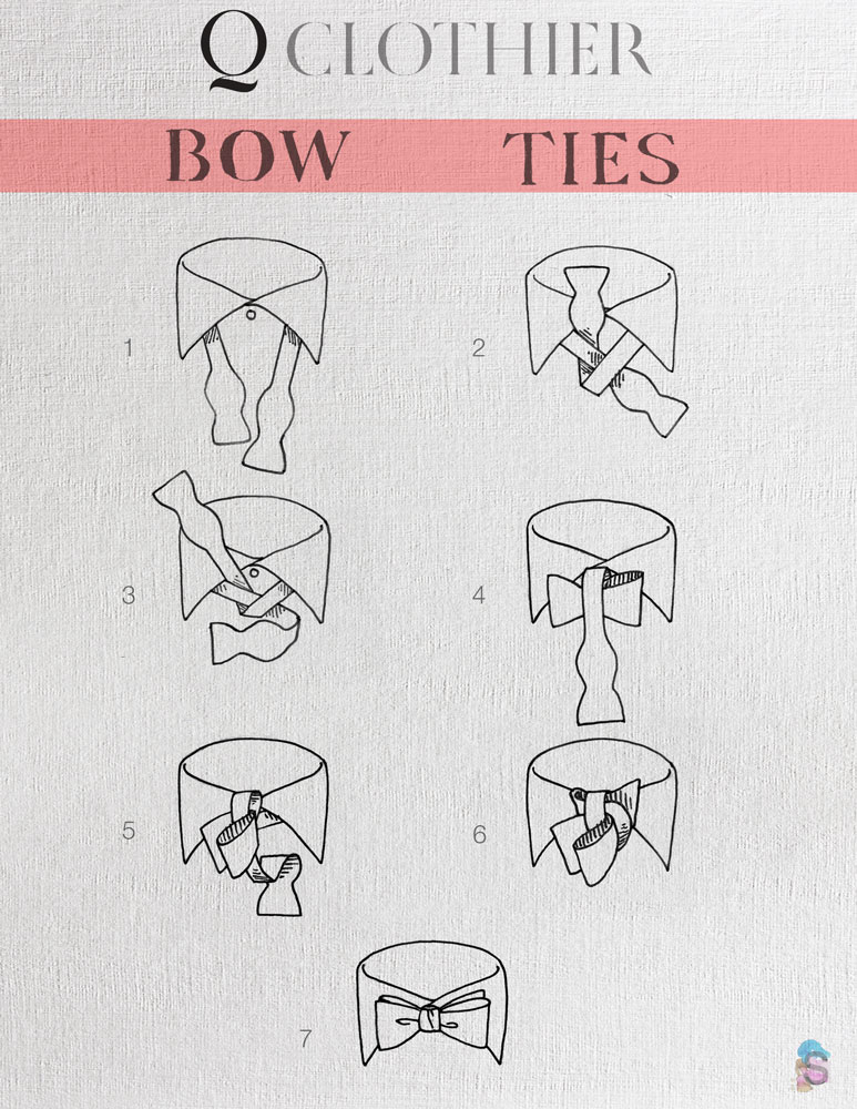
A few months ago I was approached by Q Custom Clothier in Dallas, Texas to do a Bow Tie info-graphic. As I am an avid Bow Tie wearer I jumped at the chance.
I began with some preliminary sketches and rough draft. From there I found some unsuspecting souls to test the usability of the graphic. There were several issues to work out and what came of it is what you see here.
Enjoy, thank the folks at Q Clothier, (qcustomclothier.com) and let me know if this works for you.
