Live Painting… Medieval TImes
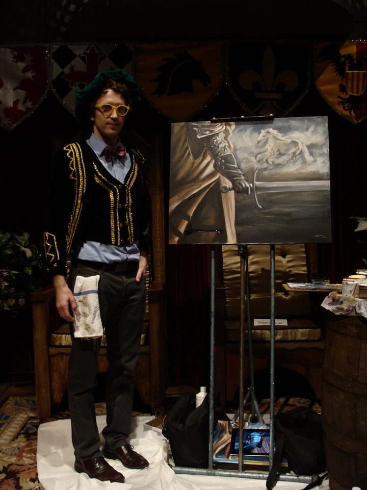
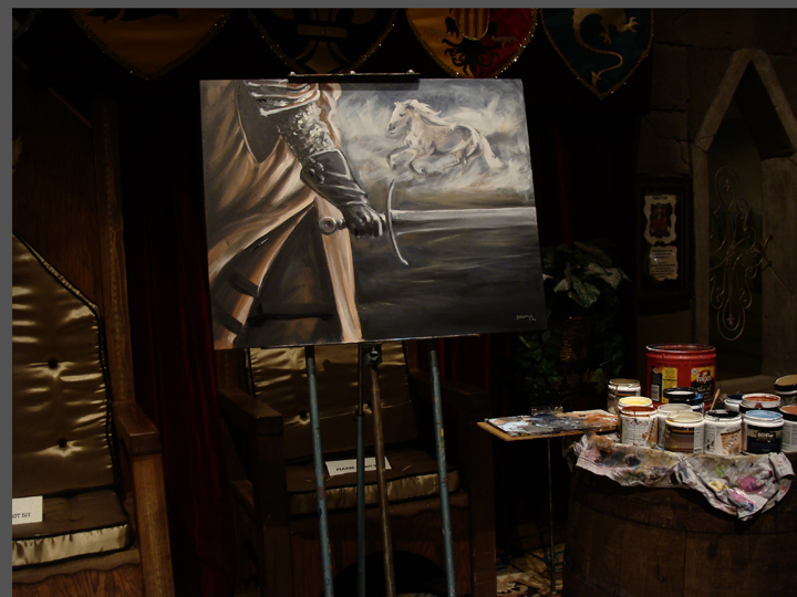
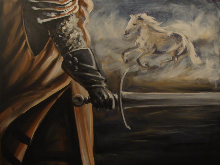
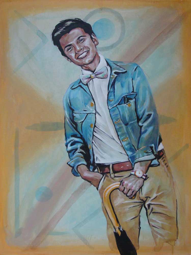
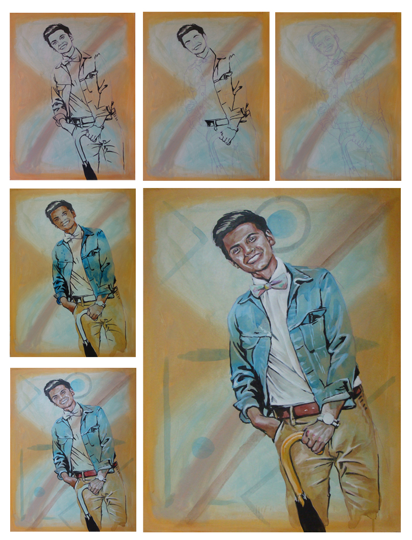
The other day I had the pleasure of spending my time at the Medieval Times in Atlanta. It was time for the newest show, which I am told only happens every four years or so. I was invited in to paint during the VIP reception. Katrina was my contact at Medieval Times and found me a great Medieval jacket and vest to go along perfectly with my yellow glasses and red paisley bow tie. I arrived, set up and three hours later a masterpiece was born!
It was made known to me during the reception that the story I was telling with the painting happened to coincide with the theme of the new show where a horse opens the evening in a routine galloping naked around the arena. I guess that just goes to prove that when I do it, I do it right.
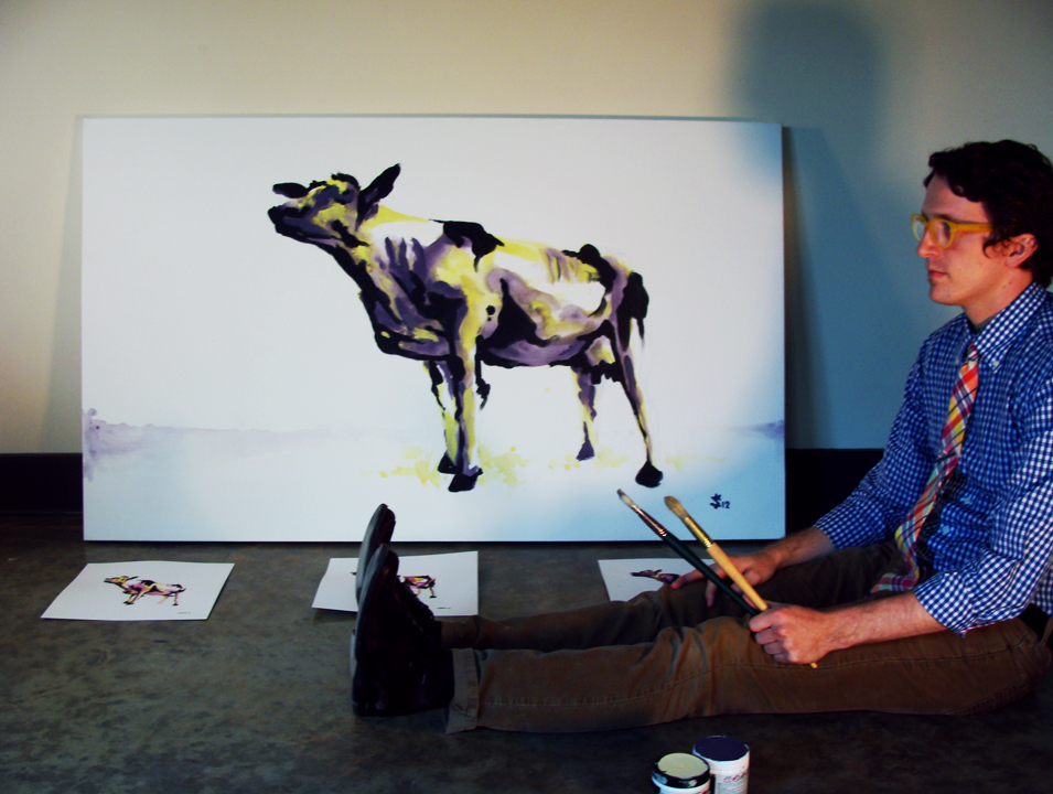
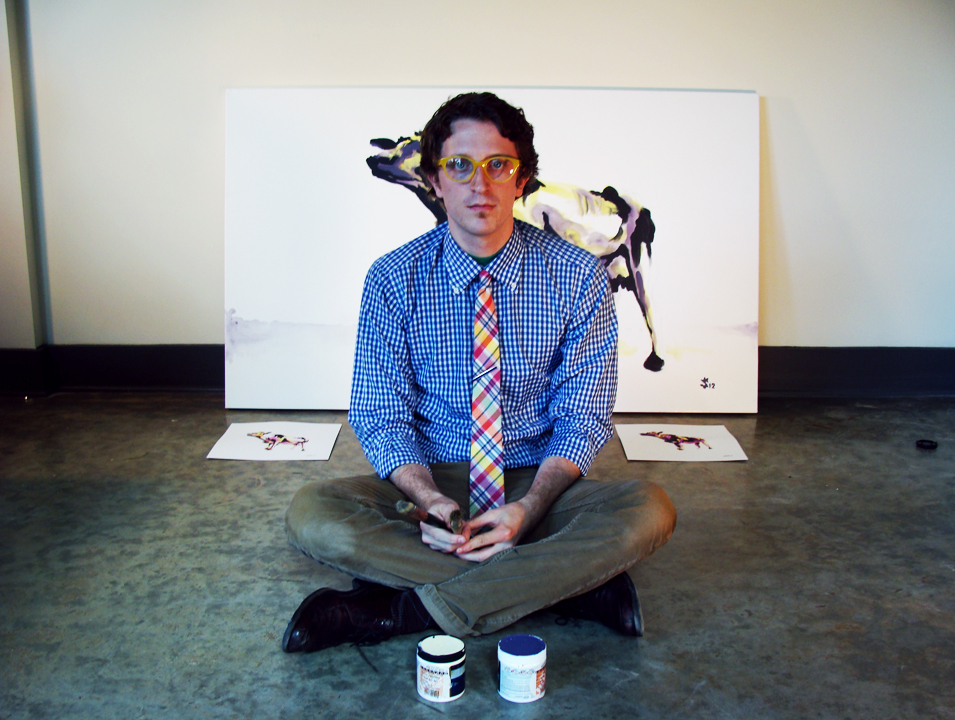
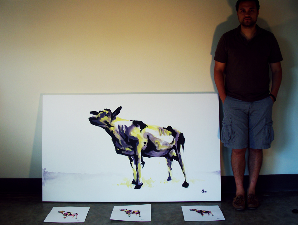
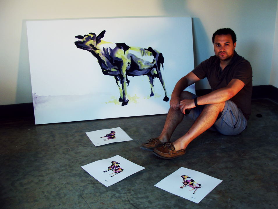
Williams' Cow...
By now you know about the collaboration between Sunflowerman and The Urban Animal Scientist. The beautiful and ethereal watercolor illustrations and the amazing quality of the hand crafted collars are perfect compliments in the commercial field. The collaboration has led to the contemporary dog-portrait illustration that now graces the home of the The Urban Animal Scientist (see here). The Urban Animal Scientists' brother Bryant has rolled into town and is continuing the collaborative process.
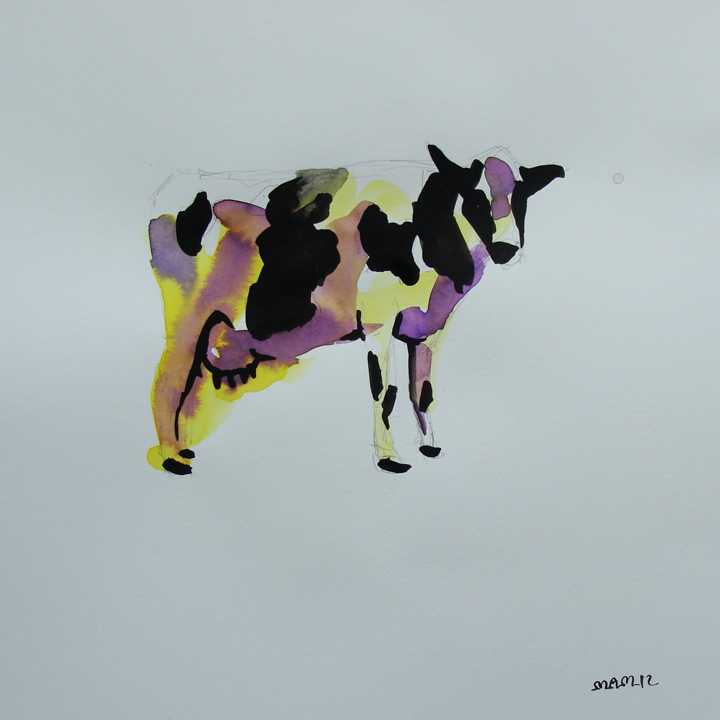
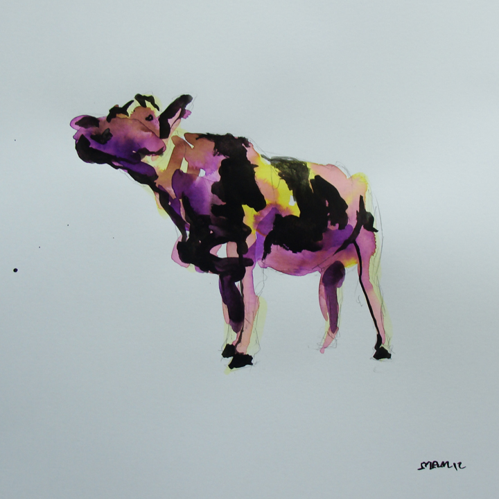
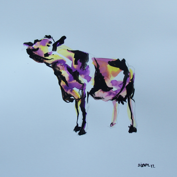
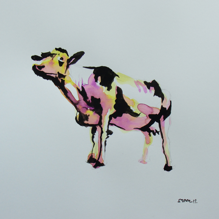
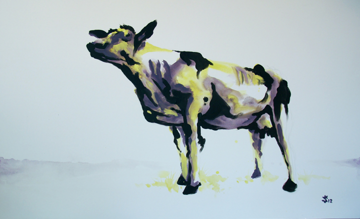
Initially the request to paint a cow from a man who was educated in economics seemed so abstract and quite frankly, odd. Perhaps a bull or a bear would have been more appropriate. What I didn't know at the time is having received his undergrad from Williams College in Williamstown, Massachusetts Bryant has a deep appreciation for the arts and for purple cows.
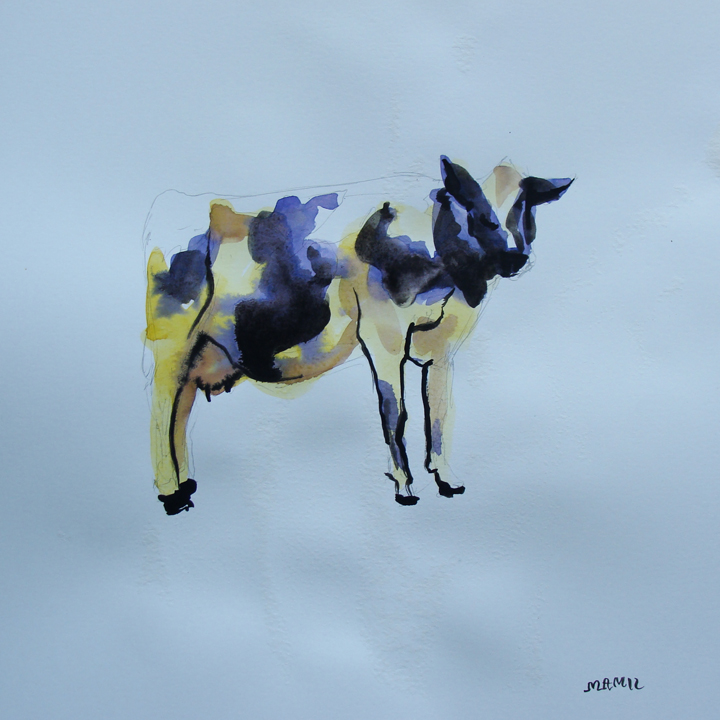
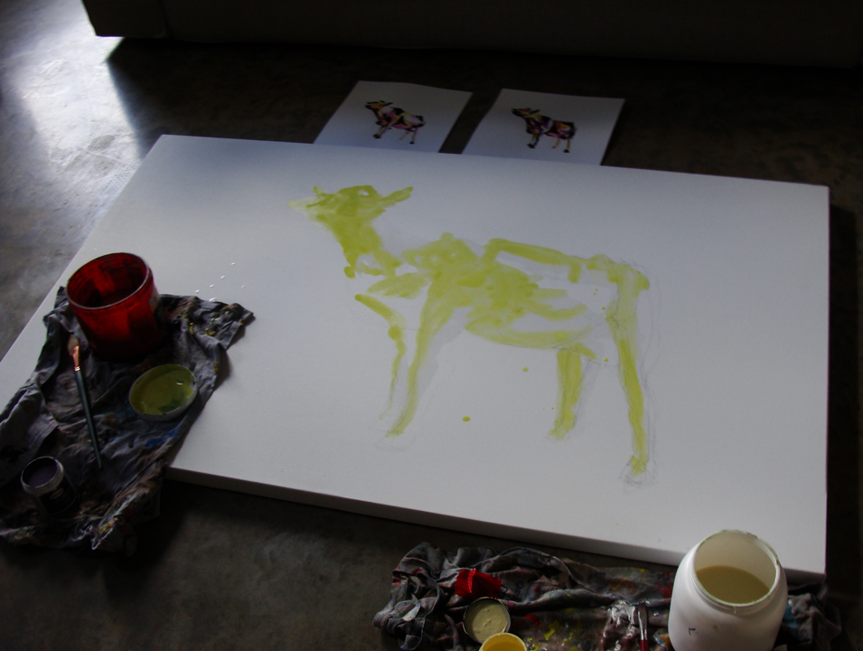
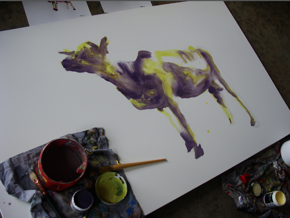
Having the experience of the large dog painting under my belt I got right to work. What I thought would be as simple as a quick sketch turned itself over to 5 quick sketches. As you are witness of the images below, the first two images are quite deplorable. As I developed the idea further the perspective, color and brush strokes set themselves in place.
The process was beautiful. With the idea worked out and the excitement of the project still fresh from the three days before, I got right to work and within two hours the painting was complete.
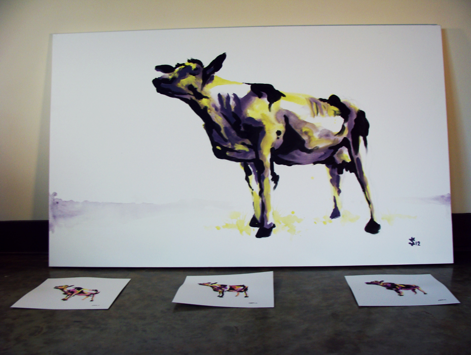
Afterwards we saw it fit to do a little photoshoot with the painting.
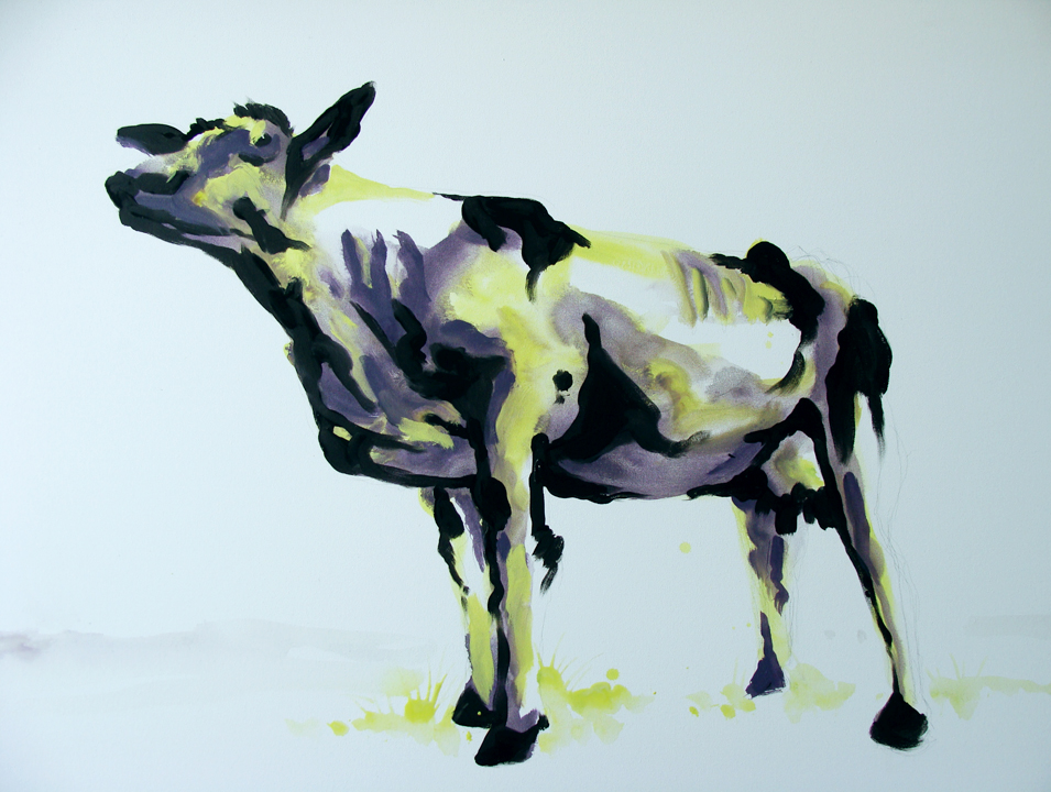
And here's the final 3x5' painting of the Williams College Purple Cow.
Fashion Illustration… Giambattista Valli
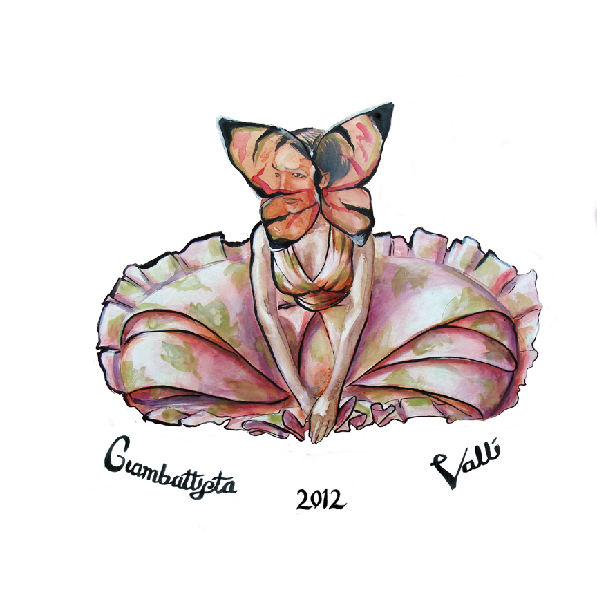
I was contacted by the wonderful people at D2G Apparel to do some illustrations based on the Paris Fashion week that ended on the 4th of this past month. While I have been focusing on mens' fashion lately I thought that it might be a nice diversion from the normal. Also, women are just much more fun to draw. The week was full of amazing projects and designs. The first day kicked off with the always lovely Versace, but what really peaked my interest was the work of Giambattista Valli. There was a yearning for nature and beauty together that conjugated in the floral arrangements adorned by the women of the runway. Flowers and butterflies and floral prints were all a rather literal interpretation, but powerful nonetheless.
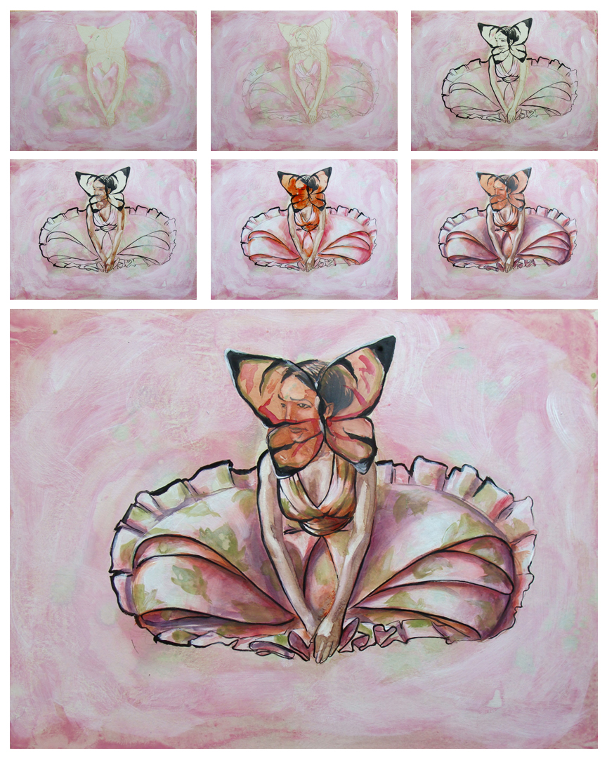
I identified several aspects from the Valli line that would work there way into my interpretive illustration.
-nature -light reds and greens -floral print -controlled hair, pulled back and tight
Included below are the final illustration and the process of the painting.
Look to D2G Apparel in the next several weeks to where this image on a shirt.
Fashion Illustration… Mikey and GQ
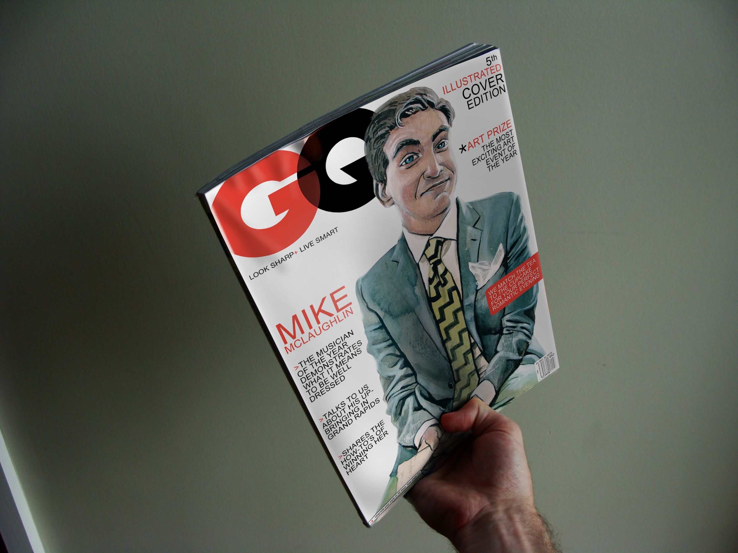
Mike McLaughlin is a good friend of mine. We graduated high school together and I saw him evolve in a way. I can't say that I have ever dressed 'better' than Mr. McLaughlin- No, he has always been at least one step ahead as far as fashion is concerned- but I did get to see a bit of a transformation. After High School Mike began to see this dapper man emerging, not a different person but a different image. It was a more polished image, stylish one might say. Whereas before he was simply aware of his presence he was now taking command of it. This is something that will take him far when he is touring the world and orchestrating symphonies.
Mike is a good friend and well dressed fellow.
Here are a couple good links relating to this article Mikey Illustration Behance
.
New Collaboration…Sunflowerman and the Urban Animal Scientist
Last night I got to team up with The Urban Animal Scientist again! It is always a pleasure to be in such a creative space. He had an idea, I had a image and we brought them together with seamless ingenuity. Below is the product of the collaboration. Check it out and enjoy!
[youtube http://www.youtube.com/watch?v=7myquPcqrsU&w=560&h=315]
You may remember seeing something similar a while back. Check out the link here to refresh the memory
Illustration Friday… Shiny
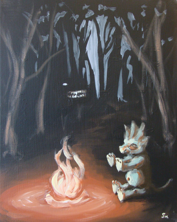
When little dinos go out at night and recall scary stories in bright fire-light
they shiver and stir and move in toward the heat
to warm their spirits and their feet.
They remember the ghouls that cause a fright
and giant baby worms that like to bite
but forget to watch out for things that are shiny
because in the distance they look so so tiny.
Fashion Portrait… Brandon Sadler and the Black Goldfish
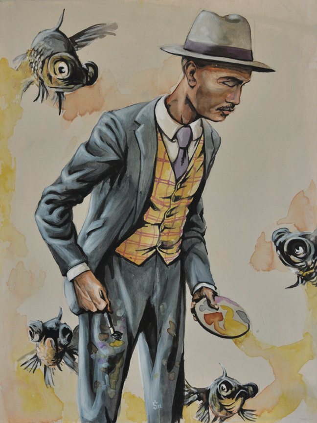
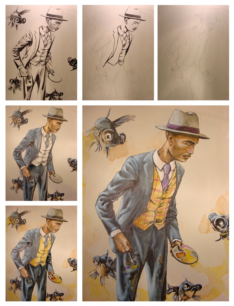
I did this Fashion Portrait of a friend of mine a while back now. I have mixed feelings about this piece. There is so much great about it and a few things that irk me. Things such as my lack of thought about the background. Overall the painting showcases the character and the clothes very well. Featured here is Brandon Sadler. He is a painter based in Atlanta, GA. He has been involved in the growing street art scene with a mural near the Studioplex in the Old Fourth Ward and has shown his work all over the city including work at the ABV gallery.
Brandon allowed me to photograph him while he was painting so I could capture the moment as it would be in real life. I went home and compiled a series of images of him painting and several images of suits from the 1920's. I love the idea that someone would always dress so dapper even when painting and not give a second thought to where the paint might end up. Several compositional drawings later I began. I struggled with the placement of Brandon in relation to the fish and probably drew at least 15 18x24'' sketches to get it exactly right.
This piece was so much fun to work on. Despite my reservations about the background it came together beautifully and it is part of a progressive process in my own work.
Brandon Sadler. 18x24". Acrylic, watercolor and india ink on hardwood board.
Fashion Illustration… Featuring Lushlife
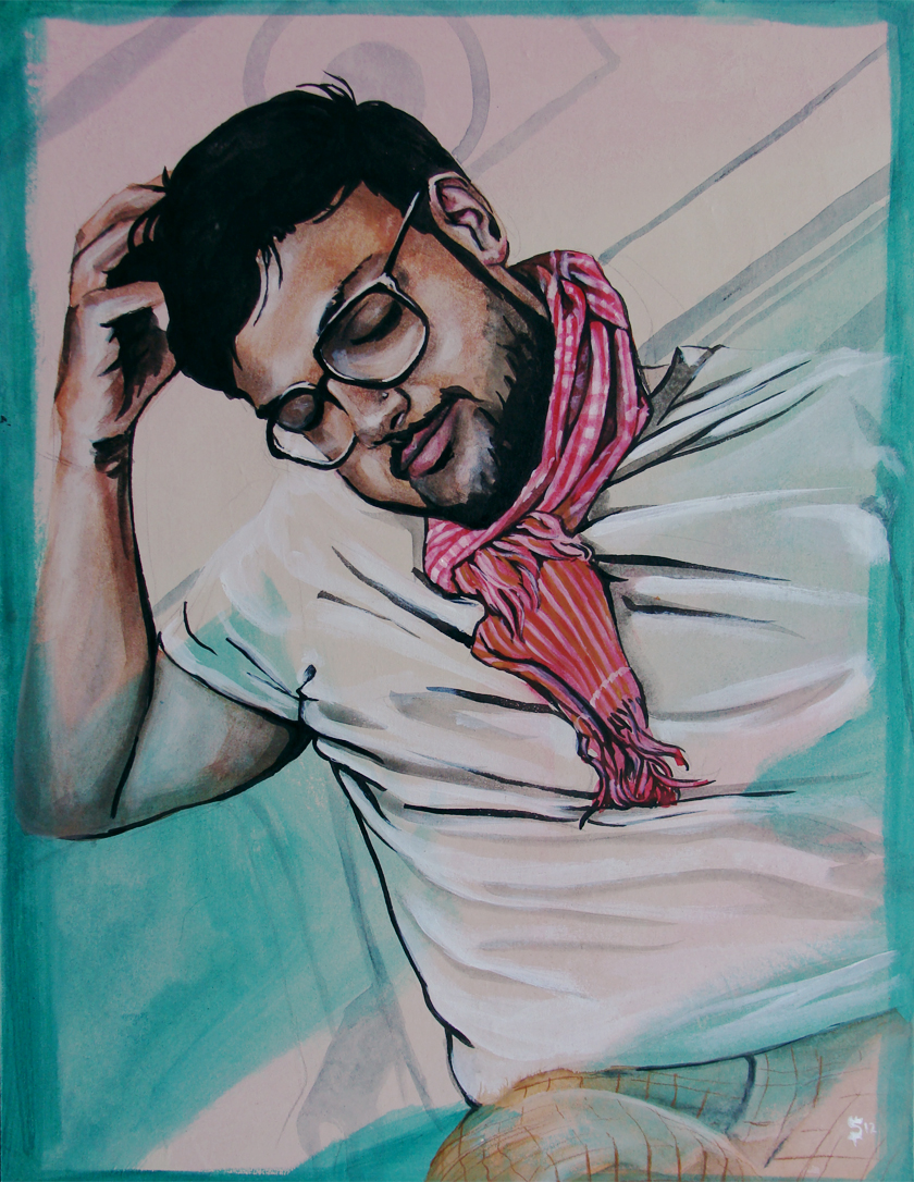
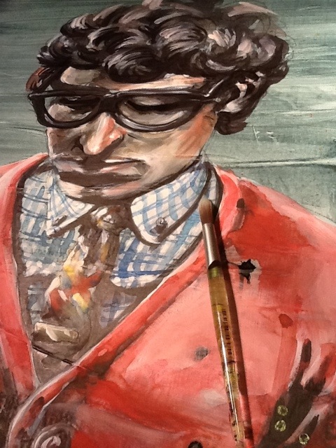
My friend and I were at Java Jive on Ponce de Leon in Atlanta for brunch the other morning on the suggestion of a friend. The food ran the usual gamut of brunch and the atmosphere took on the nature of the 50's. They specialized in their homemade biscuits which were the defining note on the meal. As we were cleaning the debris on our plates and lightly sipping what remained of our coffee the corner of my eye spied something unique. I turned my head to see a gentleman wearing a red scarf and large hipster glasses. The ensemble was basic with a white tee and blue jeans, but the sense was that this carried character beyond early morning dress apathy. I knew that I had to illustrate this look, and not just the look because it was so simple, but the person who made it work. My friend Ruth had to be the courageous one and ask this gentleman if I could photograph him as I am much too shy.
He was gracious and soft spoken. As I was photographing, which lasted maybe 60 seconds, I was describing my work and the fashion series that has been progressing. We exchanged information and it turns out this gentleman had just played a show at the Masquerade the night before, promoting his latest album.
Raj (aka Lushlife) is a hip hop artist from Philly and you can find a great review of his latest release here.
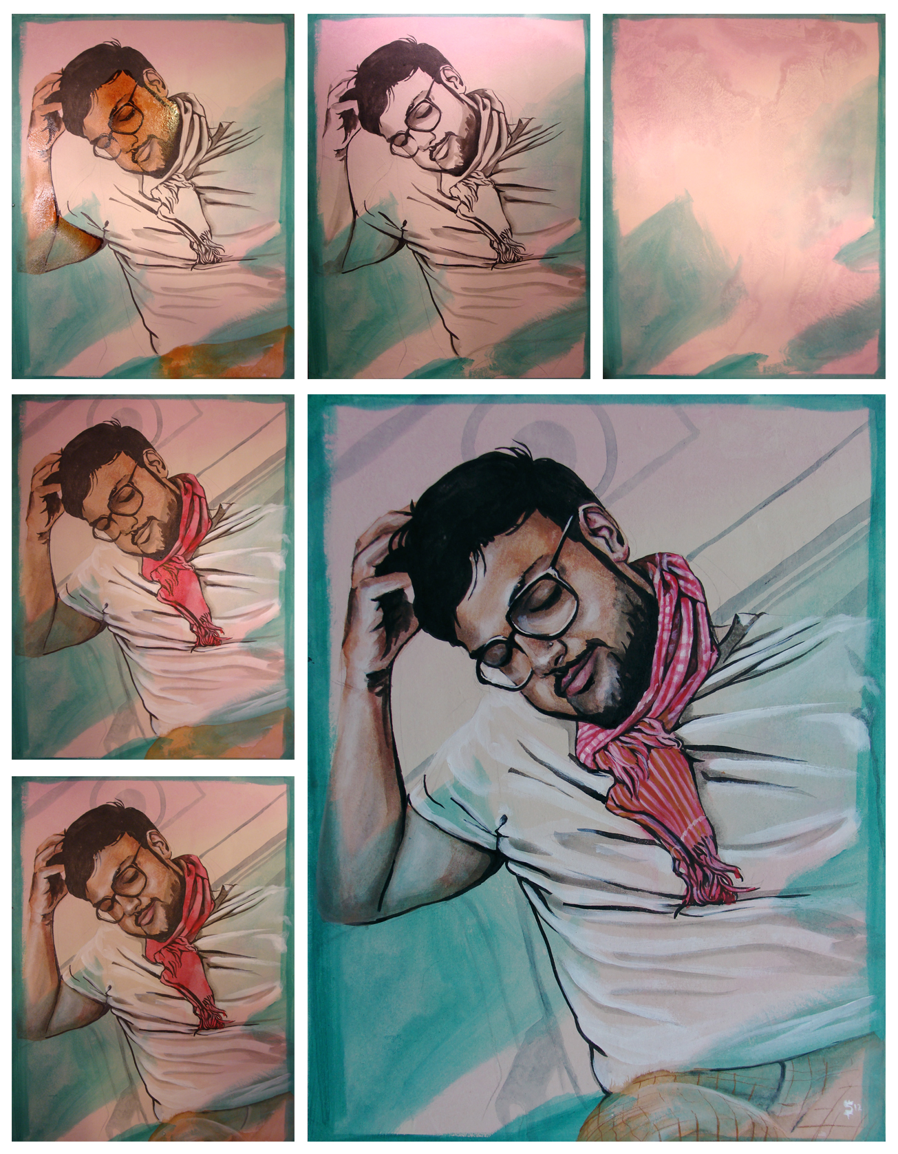
Here is the final illustration and below is the process that it endured.
I start with hard-board such as masonite and seal it with an acrylic wash. Then I draw the image on and do an ink wash of some of the major darks. After this is dried I lay in all of the base colors with heavy puddles of watercolor. As the water is sitting on the surface of the board I start to lay in white acrylic to layer in the highlights. Again I wait for the board to be dry and I finish the washes of color with more solid/defining layers.
Paul Chelko…Portrait
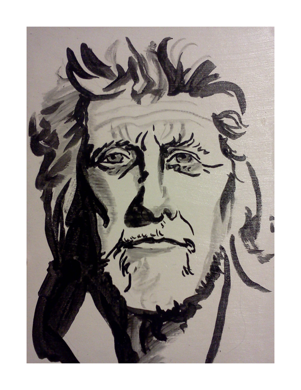
I must say that I am suddenly and properly honored to have done this little portrait of Paul Chelko. It was quite the accident that I came across his photograph on the cover of a 2007 edition of 'The Atlanta Magazine (which I could not find on their website- so it's possible I am confused as to the actual magazine).' Over and over I mentioned the character in his face. Sarah, my mentee, and I were practicing some techniques in painting at One Love Generation and I grabbed the magazine at the top of the towering pile for reference. As I walked over to our table where Sarah was eagerly awaiting the chance to paint. My eyes were trained on the photograph that was the cover of the magazine, analyzing the face we were about to use as practice. She exclaimed at the difficulty of drawing his face with a brush.
At the bottom of the post is an image of the portrait that Sarah did. She also painted an eye that would have been nice to grab a picture of. Her focus was a bit more centered on the painting of the eye than the portrait.
The following five images are the stages of the painting. It begins with an ink brush drawing, followed by washes of watercolor, highlights of white acrylic, dabbles of color in the cheeks and nose and retouching blacks with india ink.
Check it out. Enjoy. Share with your friends.
Sarah's version of Paul Chelko. I thought the line-work was brilliant and a beautiful image of what she is learning as she is becoming her own artist.
Commission Portrait
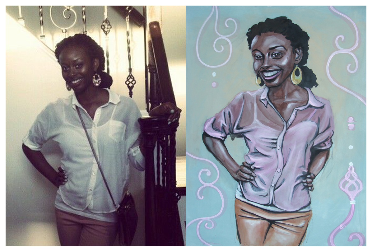
Recently I was commissioned to do this portrait. On the left is the reference photo I was given to work from and on the right is the resulting image. I was told that her favorite colors are pink and fall colors. I think pink stuck in my head. It doesn't hurt that it is one of my favorite colors. Looking back on it I see this as a great learning experience in technique. I have been experimenting with watercolor, india ink and acrylic.
Below is a series of images that walk through the process. The preparation of the surface is the most crucial part of the process so far. It will be apparent in the next fashion illustration how the watercolor reacts differently to the substrate.
The painting is on gessoed 1/8th inch masonite board (hard-board). I buy the board from Home Depot in 48x96" sheets and have them cut down to 18x24.
Fashion Illustration… George Kamau
Special thanks to George Kamau for allowing me to use him as model for this illustration.
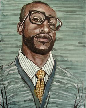
This is the second in the series of my new passion- though this calls for a drumroll I will not wait for your hands to start slapping your knees-
Fashion Illustration!
The process is one I stole from a verbal explanation of the artist Sterling Hundley's process (his outlandishly fantastic and award winning work here). There was an appropriate amount of hand waving and gesticulating so I was able to get the gist of it all. My good friend Caleb Morris (his amazing and ground-breaking work found here) was fortunate to receive a portrait of himself done by Mr. Hundley in demonstration.
I gleaned all that I could from Caleb's exuberant explanations and adapted what I learned to what I could make my hands comprehend.
It begins with a glaze of Acrylic for the foundation.
Afterward I draw a sketch with pencil.
Over the pencil drawing I ink in the appropriate amount of black with waterproof india ink.
Then comes the exciting part- and where the process pictures begin below-, I cover large areas with washes of watercolor. Since the base of the substrate is acrylic the water has nothing in which to soak. This leaves the wash open to perpetual changes. Also the pigment in the watercolor is searching for a place to settle while the water is evaporating, creating beautiful iterations and watermarks.
Highlights are pulled out by applying white acrylics over the watercolor.
Lastly I will go back into the black areas with fresh india ink to re-establish the darkest darks.
Fashion Illustration
Recently I have begun dabbling in the dandy world of men's fashion. It is really quite fantastic. Learning the differences between a quality tie and a quirky tie has been an adventure. Then remembering how to tie a 4 in hand vs. a Windsor vs. a Pratt has been down right awful. I have, this year, had my first trip to the cleaners to have a pair of vintage pants hemmed to my specifications. Overall the experience has been pleasant but in the future I will be heading to a professional tailor.
So it comes as no surprise that I have begun my very own series of fashion illustrations. My goal is to focus on men's fashion and the men that wear it. What are clothes if they are left on a rack?
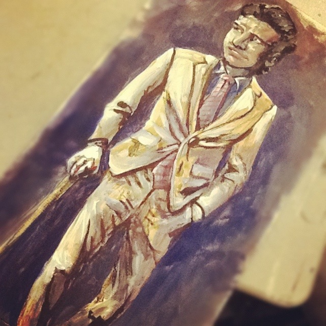
First is a study I painted in watercolor and pastel on Masonite board with reference from one of the many fashion blogs hat I follow.
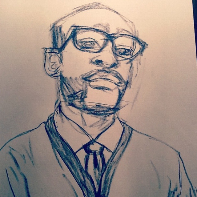
Below here is a focus on my favorite outfit at the time. This is the style and technique from which I will be modeling. It is a portraiture of the person and of what the person is wearing.
The shirt is Dinamit. The tie is Ralph Lauren. The cardigan is Old Navy.
Obviously the mush mash of brands is laughable from the list but the ensemble they create is vivid and strong.
The model here for one of my next paintings is my friend George Kamau. It will be painted in the same style and technique as the one above with watercolor, acrylic and ink.
Self Portraits...
I have been itching for a redesign on my business cards for a while. The old design ( found here ) is still nice, but definitely outdated. I received my first batch of them over a year ago. Back then I had consistently longer hair, and the card reflected this beautiful and untamed nature. There is also some outdated information that I cannot continue to keep tracking and using. Below is the sketch I did not too long ago of what I want. It's a quick sketch and I need to nail out more of the finer details, but the idea I believe is strong.
My good good friend Ruth Meharg suggested that I might print the cards on vellum so the portrait would show through on to the back side. I love this idea. I don't know how that would translate, especially with wanting information to be on printed on both sides. Also, the idea of creating a plate or woodcut for printing the type was thrown around. Any sort of print process is beautiful to me. What is likely to happen is a limited run of hand printed cards (for those very special people) and a mass printing from Zazzle to put up in shops and what not.
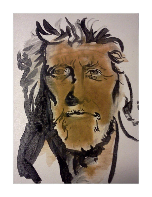
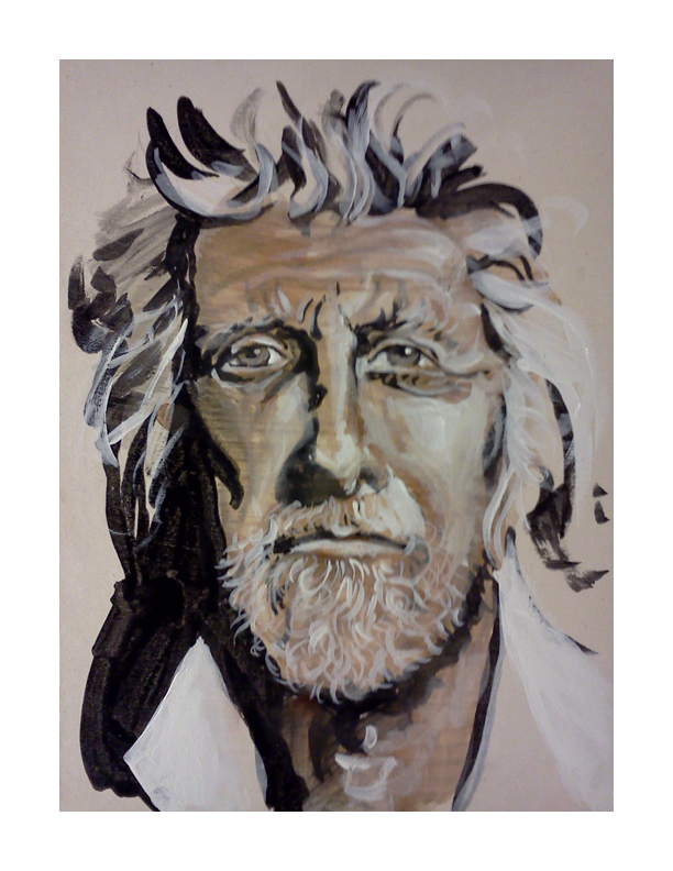
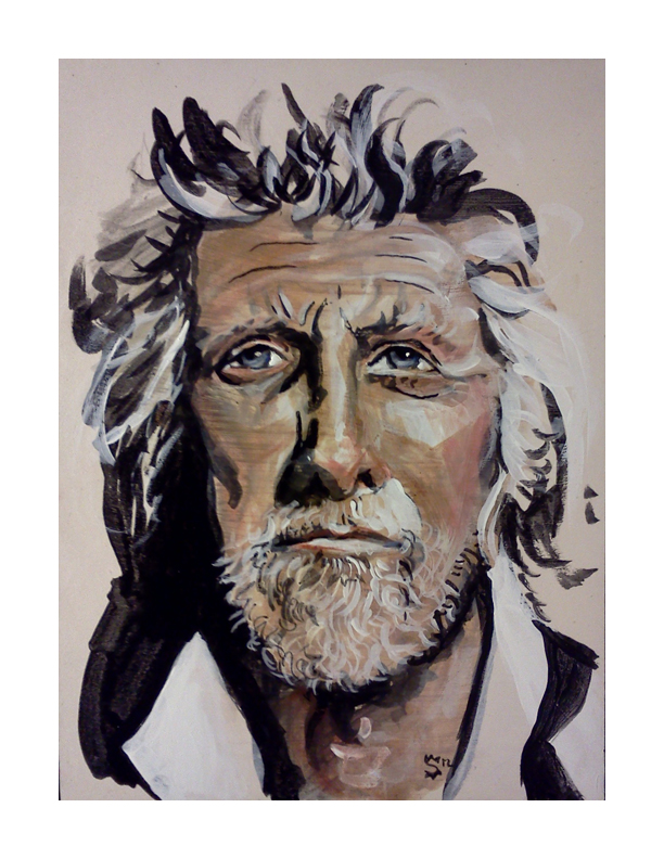
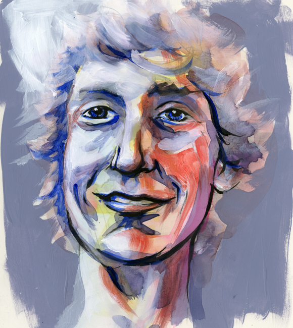
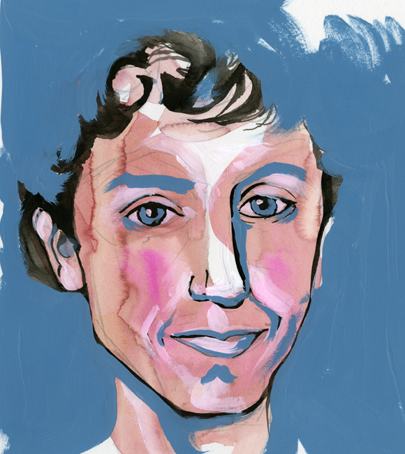
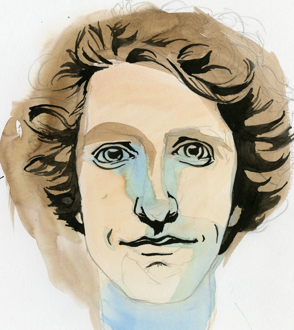
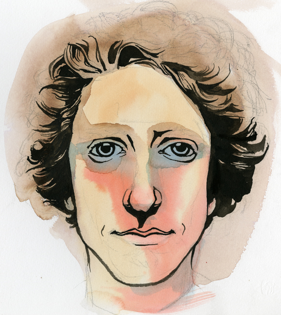
After developing the sketch I wanted to get some self-portrait ideas down to better visualize the final product. What followed is what you see below, in order that they were painted. They range in technique, but all contain some sort of mixture of watercolor and black ink. The first few also contain acrylic. None of these actually fulfill my desired look, but I think that I am getting close.
This first one was mostly acrylic and feels very patriotic… that darn red, white and blue...
Oooooo, what do I say about this one? It conveys a younger me-and the eyes are horribly offset from each other. I might as well toss this and never think of it again.
In spite of the odd nose, this is one of my favorites! It wouldn't work well for the business card, but bow ties get me every time…every time.
This is a success. A marvelous success! There is a hitch though, the colors are a bit moody. I was showing it to a few coworkers, and they started to tear...
Eyes are always aggravating me. The one on the right just started to run away. Blue made its way in again and sets an off mood to this self-portrait as well.
The Urban Animal Scientist...
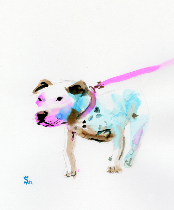
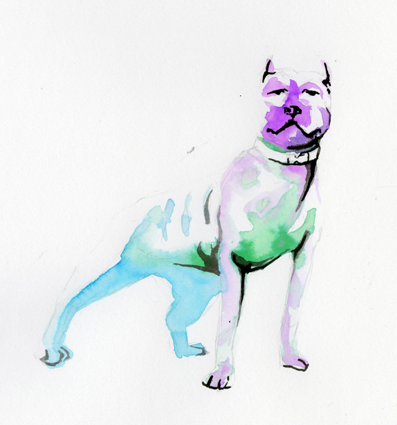
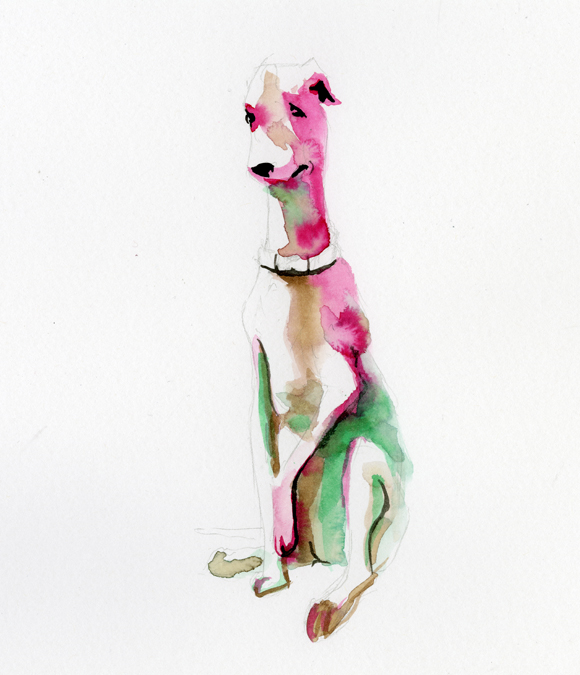
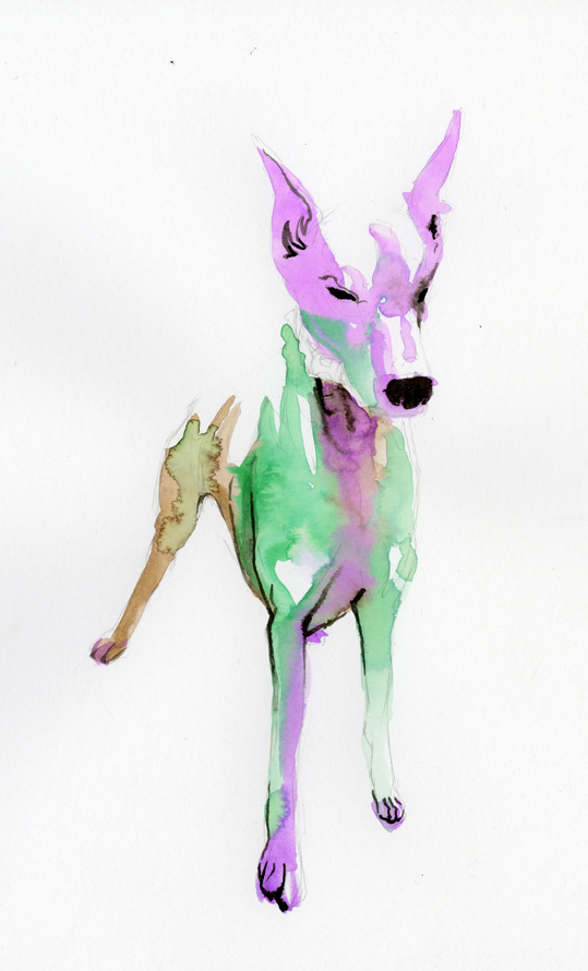
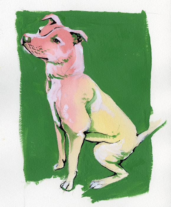
I have been experimenting with different imagery in collaboration with my friend The Urban Animal Scientist. The Urban Animal Scientist is an urban brand of dog collars, soaps, and now concrete dog bowls. Handmade right here in Atlanta these oversized collars are crafted to match the owner and the dog together in perfect fashion harmony. What started out a couple years ago as an idea and a passion has burgeoned into a great brand, a How Magazine featured website, and a hub for great collaboration to take place. Below is a sampling of my work in collaboration with The Urban Animal Scientist.
My goal was to leave a large portion of white space and to utilize simple bright colors to define the form of the dogs.
The main focus was on the collars and the leads. I wanted the dog to be the subject while using the color to lead the eye through image ending at the collars and leads. I used black india ink sparingly and purposefully. Marking the eyes, ears, nose and mouth.
On these last two the process changed slightly. Instead of leaving a mass of white space I decided to fill in everything with color. Everything began the same with the pencil drawing, the light washes of watercolor and the india ink for definition. This time though I did not leave any white space I instead filled in the white space with Titanium White gouache. Finally I would finish the painting with a mid tone acrylic to frame the dog and to add value within the form.
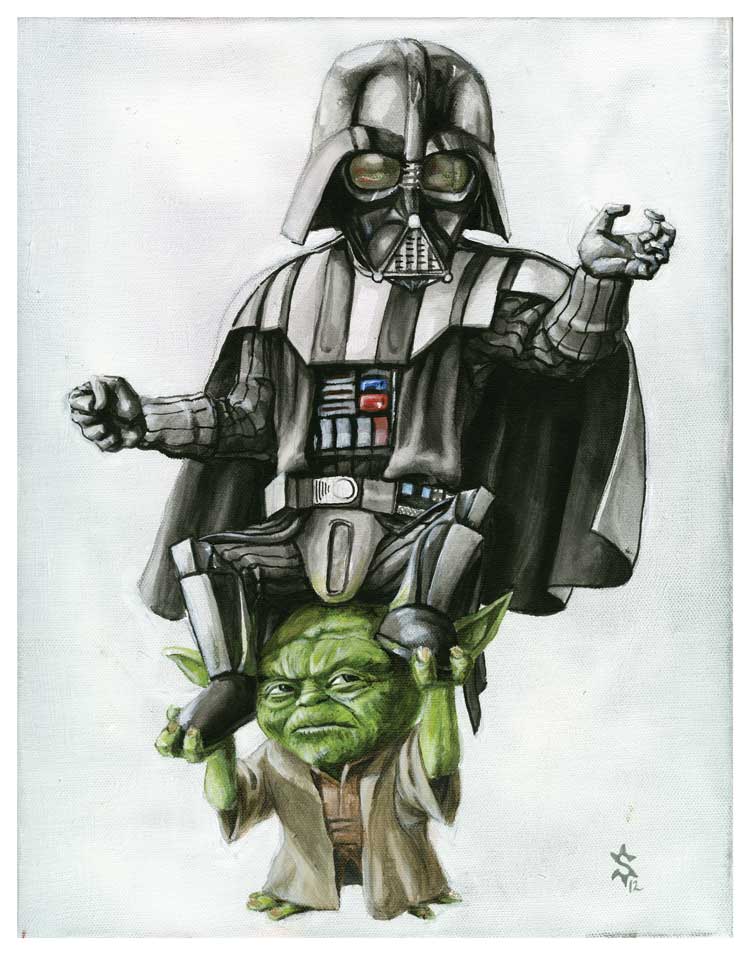
Yoda's Burden
Here it is. I hope that the title is description enough. If there is anything about this story that you would like to discuss please hit me up!
If you would like to purchase this item please follow the link to my etsy or just click on the image.
Cute, cute Whale. Now on Sale!
Check it out! Now on sale for 25 dollars.
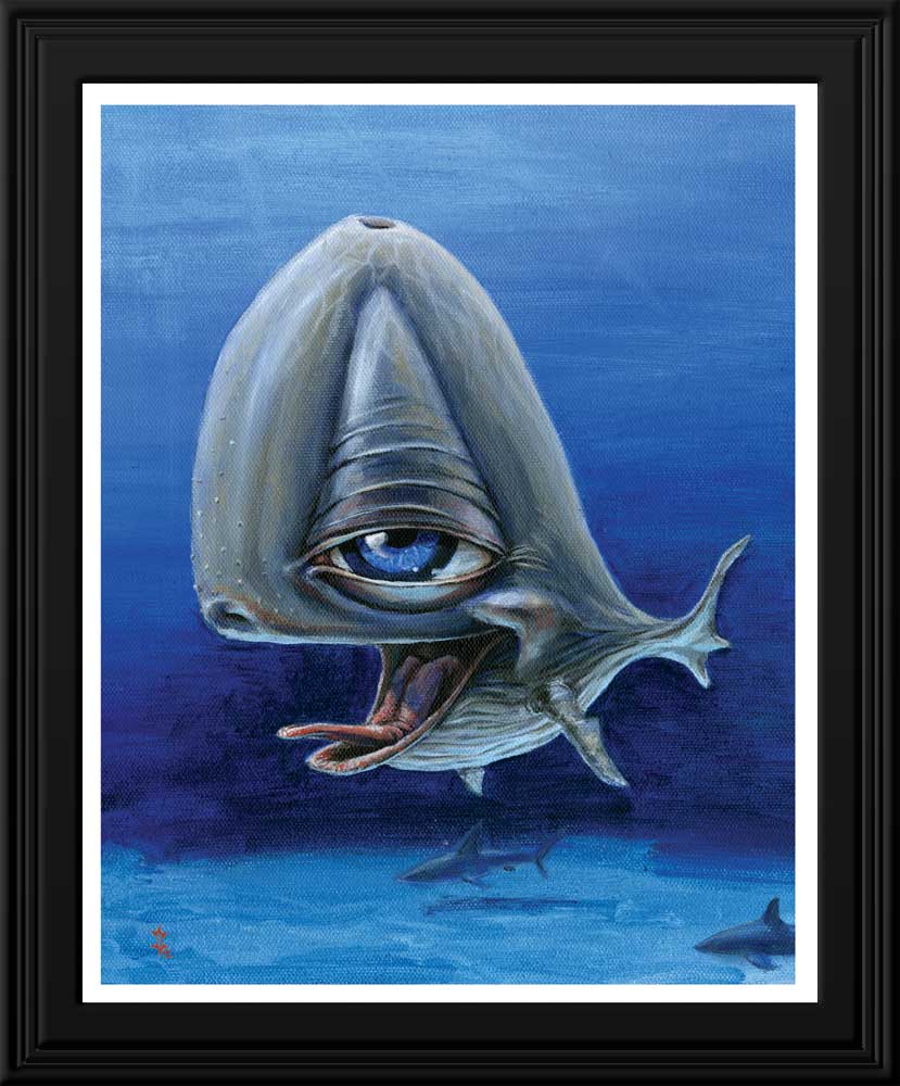
This 8x10 print is the perfect gift for your best friend! Or all of your best friends. Or even just a regular joe you meet on the street.
Your beautiful beautiful Whale will be printed on E-Surface Photo Paper (matte finish). As a professional paper, it boasts rich, sharp color that won't fade or yellow, creating beautiful prints that will last for years to come.
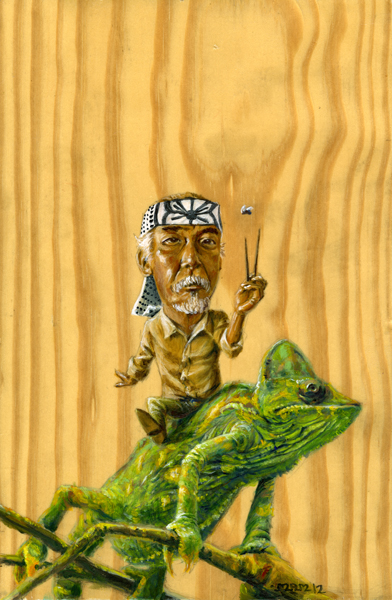
Mr. Miyagi...
So the Graveyard Tavern opening night was a hit! No it wasn't a firesale or anything of the sort, but by all means it was a success. We began setting up around 7 and were ready to go by 9- more or less. The support from friends was overwhelming but unfortunately there is no photographic evidence. The work will be up through the rest of the month so be sure to check it out. Buuut if you can't make it then pay attention to the blog in the coming weeks to see the works that debut the work of Sunflowerman on the Atlanta art scene.
Mr Miyagi (already sold =] ) was the headliner of the show. If you haven't made it out then here is a taste of what you missed.
Death Eaters
Below is a taste of a project I am working on dealing with resurrection. It's about life and death, sacrifice and selfishness.
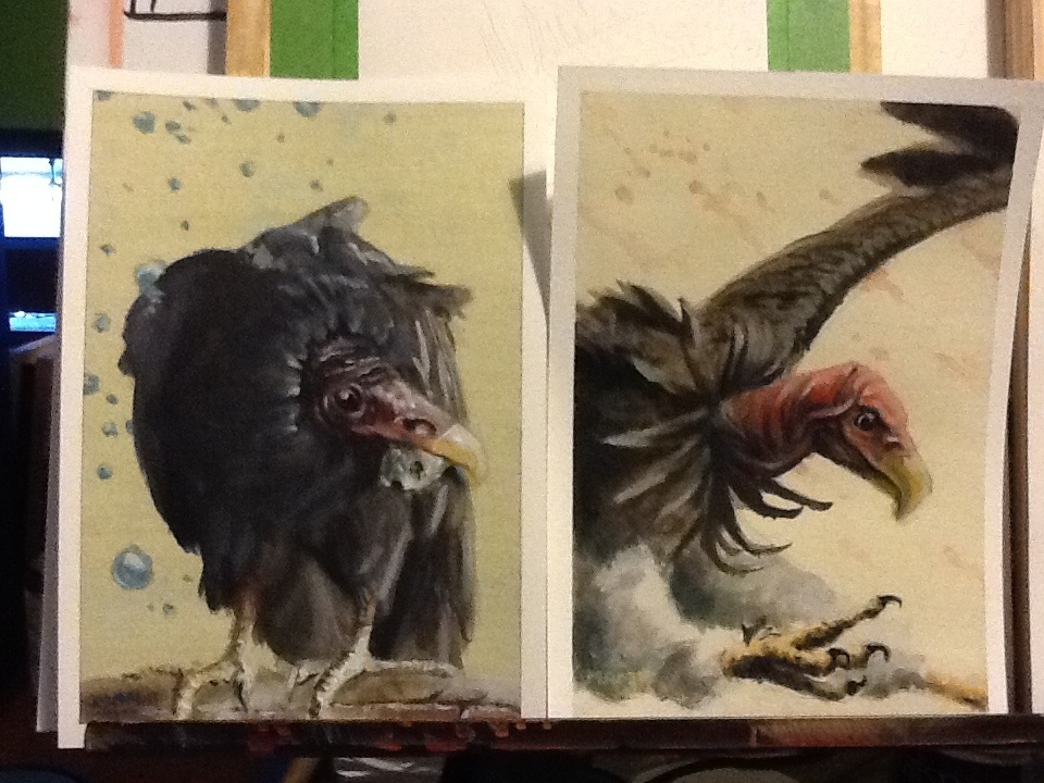
These little guys are 5x7 acrylic illustrations. Each is a small grisaille- initially painted in gray scale then covered in colored glazes. They are part of a myriad of similar sized and themed paintings that will be hanged together to tell a story.
