My Church is Pretty Sweet...
We buy Gold! lol
The funny thing about it all is that when the property was built (not by CCB) it would seem that our church building, and the such smaller building across the yard were under the same ownership. Now things are different, the gold people own the smaller building right on the corner, and we-I say we as an invested member of the congregation- own the building with the lawn.
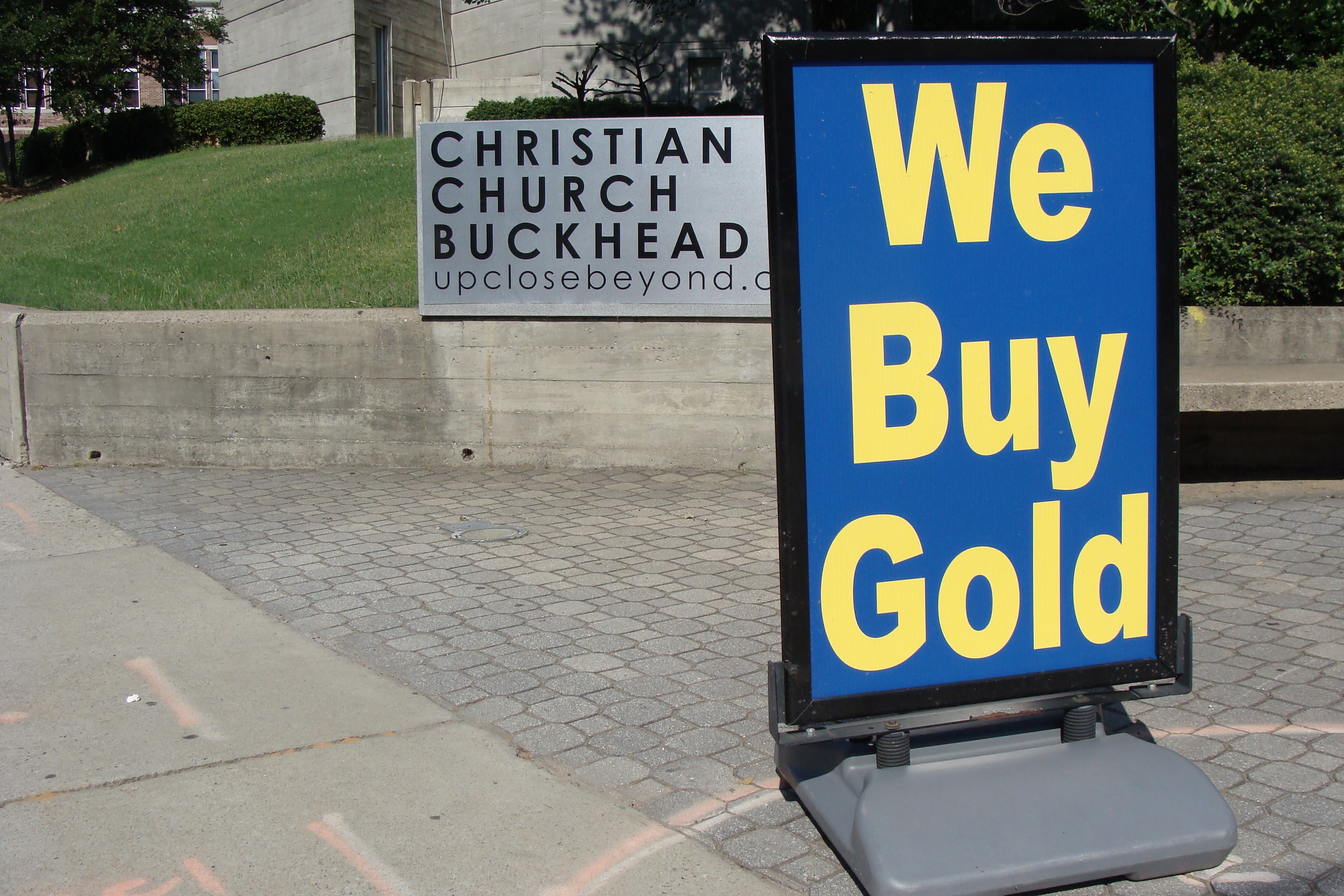 Christian Church Buckhead-Serving the Lord, and buying Gold
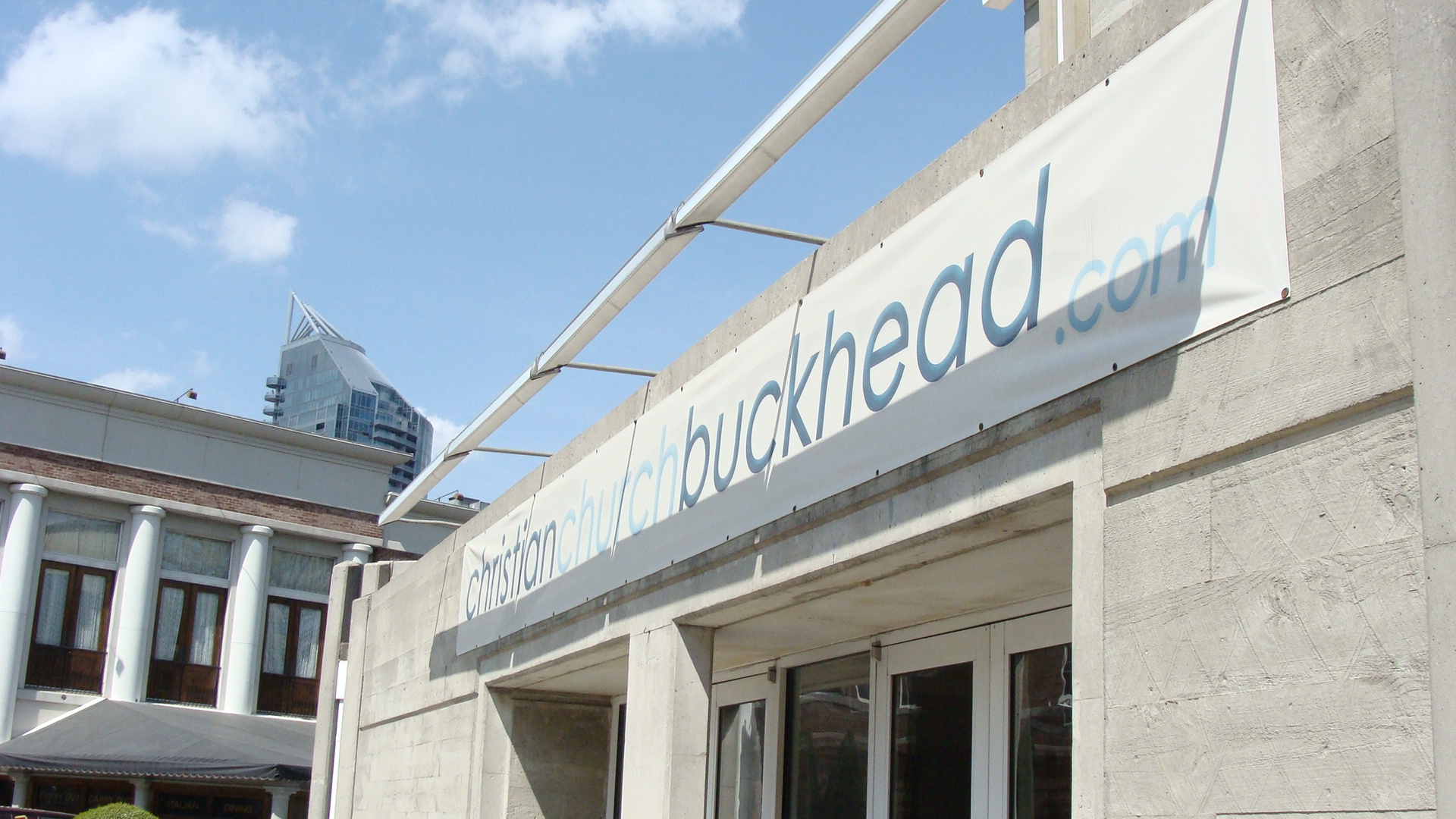
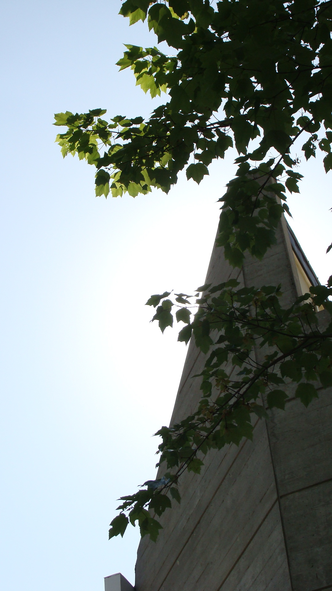 an image of the top of the church (with heavenly light shining down =])
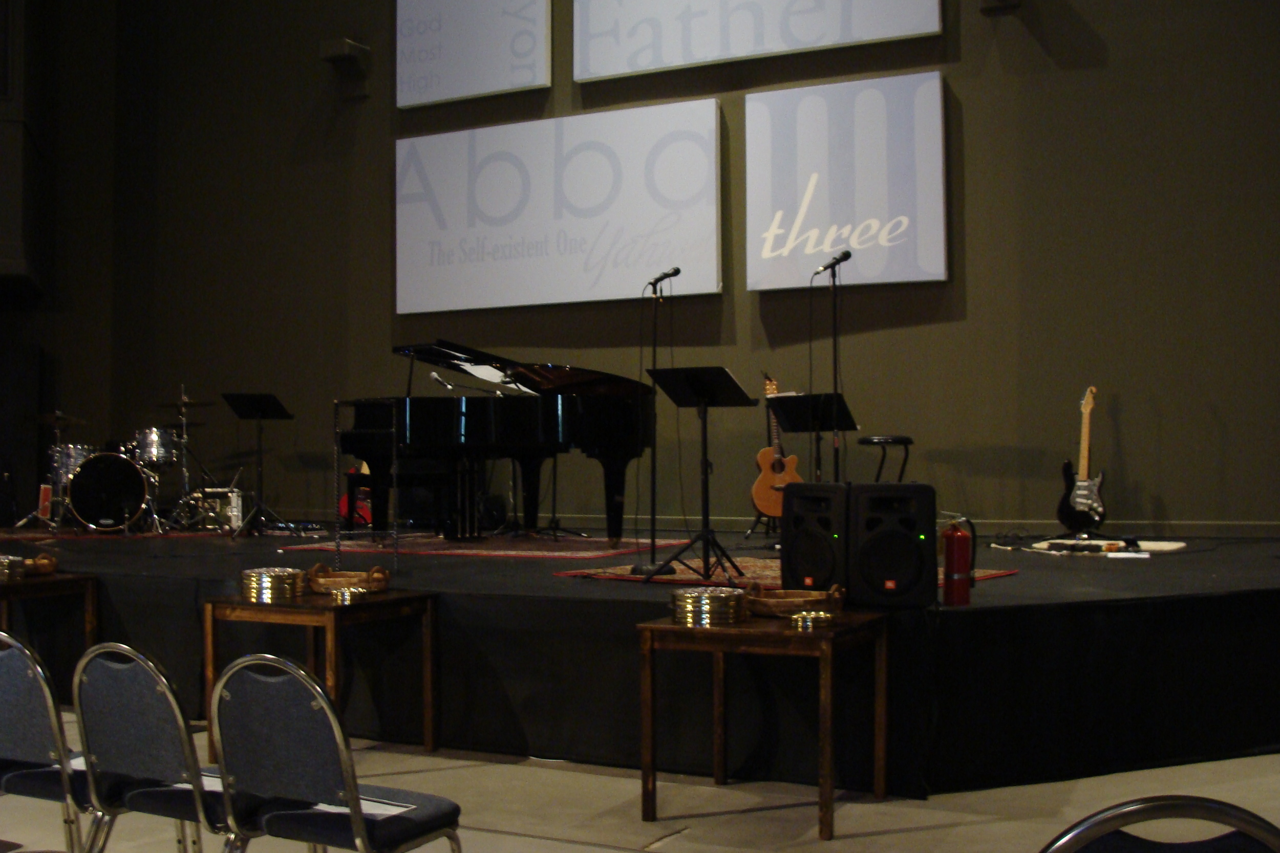 look upon our guts and know we're alive
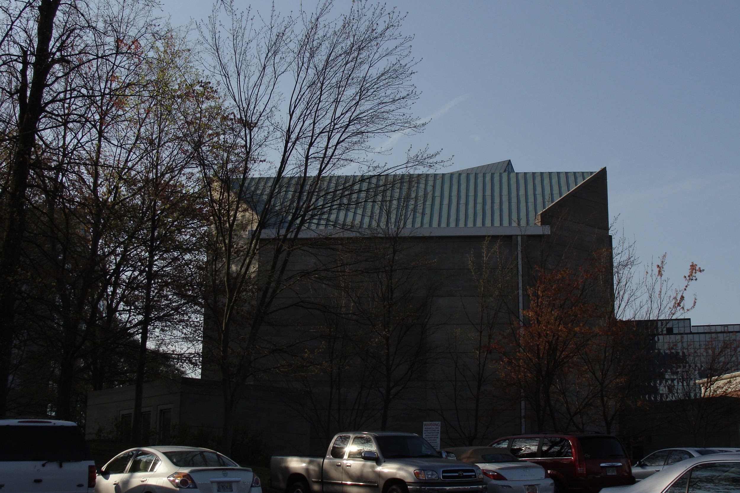 our butt-from the parking lot-which is shared with Maggianos
So you got a little taste o' what I do... pretty dang exciting huh?
Signage...
Here I have a series of 3X9 designs done for my Graphic Design 1 class. I'm not sure if these are going to be graded or not, they are not on the syllabus. They correspond to the assignments we have completed over the course of the semester- possibly to be used as signage for the projects posted from the semester. I am really excited about this sort of fake project because I have been able to play around with illustrator, which I now love.I admit that it-illustrator- did hold my deepest animosity at one point in time. Now I keep learning new uses for it, and how to manipulate it to my will mwahahaha.
'Graphic Design 1' is the second design I did of the series. I created the typeface, albeit not completely original, from scratch, and done specifically based on the shape of a circle, which is why the shape is repeated throughout the graphic.
These are the '5 Principles of Design-' Proportion, Unity, Emphasis, Balance, and Sequence. They are in no particular order other than what seemed to lend itself best to good composition. The colors are arranged in a way to try and trigger a response corresponding to each words meaning. Sequence is arranged in a rhythmic pattern, balance has the same weight of color on each side. Unity draws from each element in color and line weight. Emphasis is in the middle, and has red centering it directly in the middle of the word. Proportion was a difficult one, but each letter already lends itself to natural proportionality, and the colors are equally spaced and consistent in each letter of the word.
'Typeface' is probably my favorite out of the four designs. It is quite a bit different and unique in comparison, and is just plain more fun. Someone told me that it didn't look good, and I did another version of it that looked clean and neat and smooth, but boring and cold at the same time. The background is filled with the character of every typeface I used that each spells out 'typeface.' There is a lot of character in this design, pardon the pun.
 One of the final projects in the class was to do a 'Color Wheel.' Ironically, this was the first design I did for the signage series. This is where I first came up with the idea for the typeface, and was very proud of it from the beginning. The reflection was a joy to create, and the colors simply make me happy. It's super simple, and super sleek, it just works works works for me =]
After having typed all of this, I can't help but remember how much of this was not inspired by my creativity. God is the only one who inspires in truly creative and truly beautiful ways. Of course people can distort the creation God makes in man, but that's another discussion lol. There is nothing that I can do that is apart from God, and if it ever comes down to me being on my own, and doing things on my own, then nothing will be fresh or satisfying or enjoyable. Thank you Lord of Abraham, Isaac, and Jacob, for the blessings of your love and kindness.
