
AG4DM, Wristi and SevenFriday

Purchase a SevenFriday P2-1
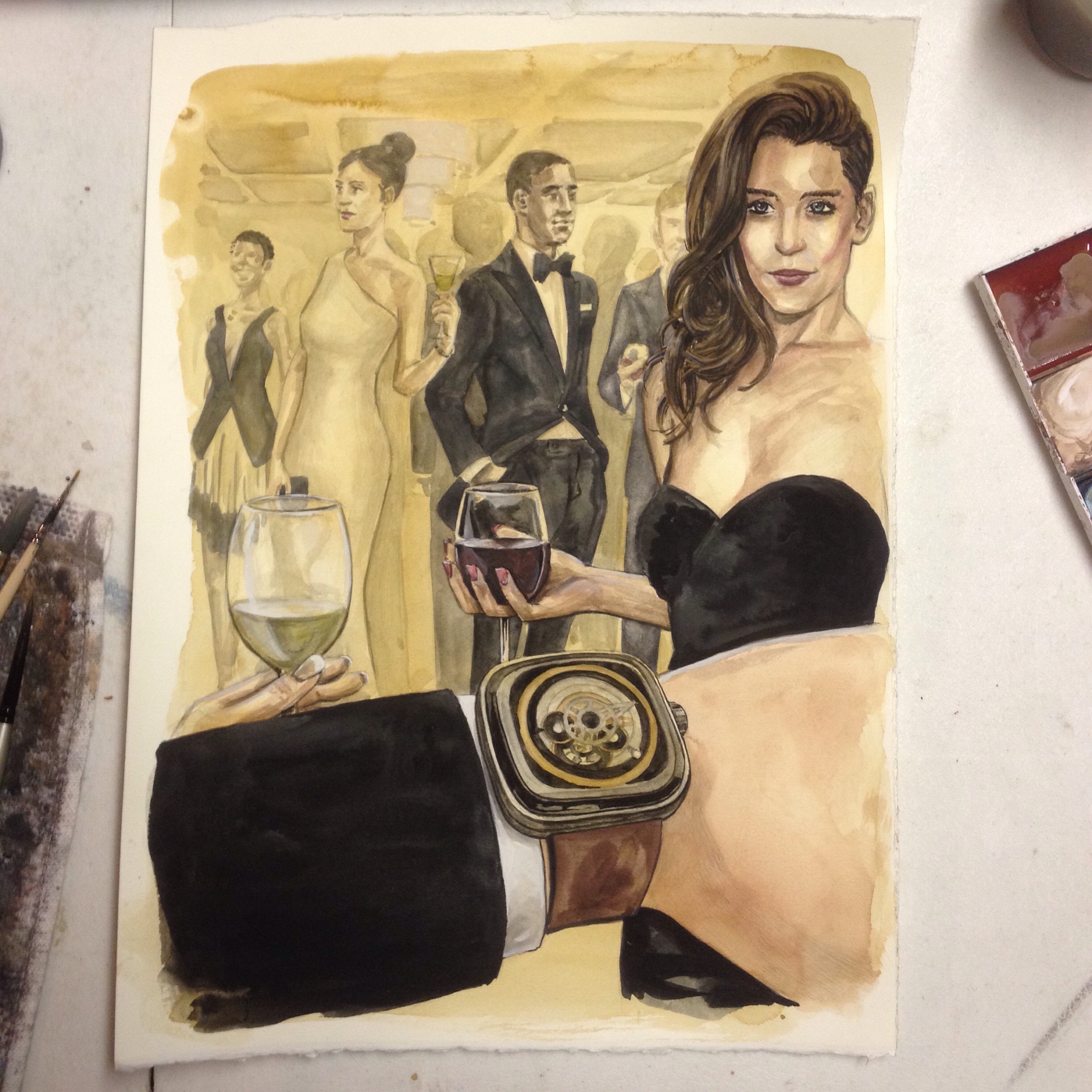
The first illustration in the Aesthetic Guide for the Dapper Man is the Grand Wrist of Wrists, the fortuitously named, the one and only Wristi modeling the young luxury watch brand SevenFriday P2 watch.
The Painting

The Process
Details
Slowly I layered in the details, starting on the largest space of color first with the largest brush. Beginning with the sultry lady's dress, Wristi's jacket, the man in the tuxedo, hair, wine glass. The shapes begin to get smaller and I compensate with a smaller brush.
First layers are in and then I begin on the background, intending to move from the back to the front. The very last detail to define is the P2. If I were to begin with the P2 I probably would have just stopped upon its completion.
The watch is the prize, the goal, the center of the painting. It's the cake and I wanted to eat it as well as own it. Above all, patience was my friend with this painting.


A Layer In Gold
Putting in the first layer of paint is daunting. What if I get the wrong color? What if I made a mistake in the drawing? Once the pencil is covered with paint it is really difficult to erase. Essentially, or practically, the pencil is sealed with the first layer.
That is not the intent of the first layer, though. The first layer is meant to set the tone and the mood for the overall painting. For the SevenFriday/ Wristi painting I wanted to bring out the golden color on the dial of the P2 watch. So everything begins with this color.


The Underdrawing
As a guide for the painting the under-drawing is created to define shapes and to suggest general values (lights and darks). Now, I can see the painting and all I have to do is complete it.


Color Study
With Color Studies it is a best practice to do more than a singular study. Which, is exactly what I did. A singular study. The P2 watch has a gold ring on the dial and I wanted to express that in the background architecture. The people will be in black and white while the ceiling will boast a chandelier and golden walls.

Rough Draft
This rough draft illustration preceded the color study above. There was a lot to be gained from this draft. The placement of people and the placement of colors were highly influenced by this draft.

The Thumbnails
The thumbnail drawings took me on a journey. Wristi is known for his iconic wrist shots and that is what had to be the focus of the illustration. Where it ended up, since this is the first of the AG4DM, is at a Met-Gala. It's not the familiar Austin paradise that Wristi most often shares with the world, but it bridges the luxury, the aspiration and the reality of Wristi and SevenFriday.


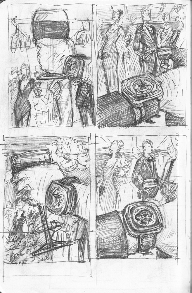
Thumbnails and Sketches are crucial to the effectiveness of the final illustration. They flush out the bad ideas and lead to the good ones.
With the Aesthetic Guide living on digital I have the added problem of making the images fit 16:9 as well as 1:1. The sketching phase allows me to play with compositions that might work well in both ratios.
I discovered with these sketches at the bottom that I couldn't have the hand holding the wine glass and showing the watch because the watch would read upside down. That is a no-no in the watch world.
The wrist ended up overlooking the party instead of being a part of it, but that's where the black jacket sleeve comes in. The wine cannot be in hand so the jacket sleeve is introduced to suggest the involvement of the wrist in the party.