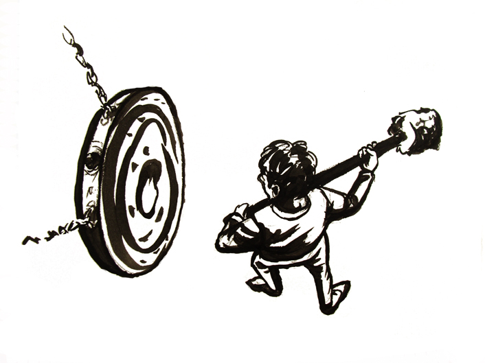
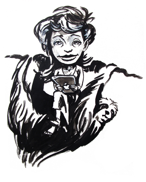
Fashion Illustrations… Dictionary Pages
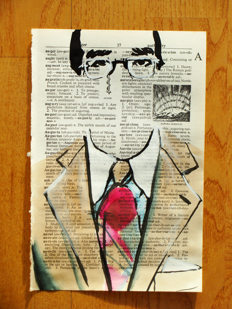
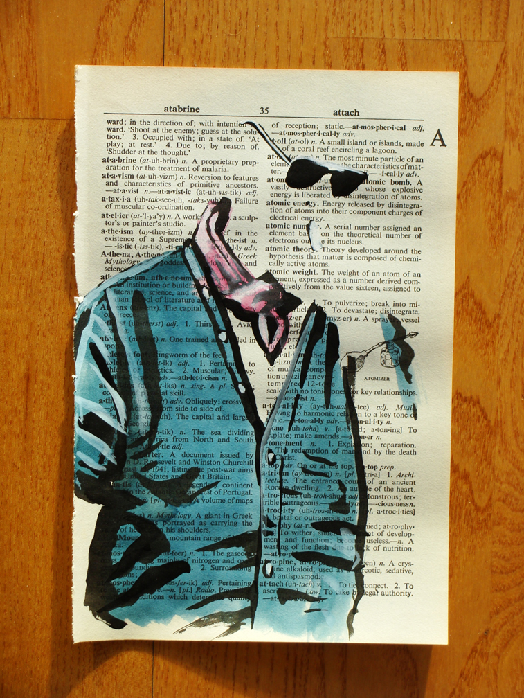
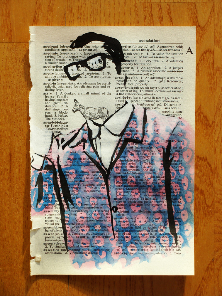
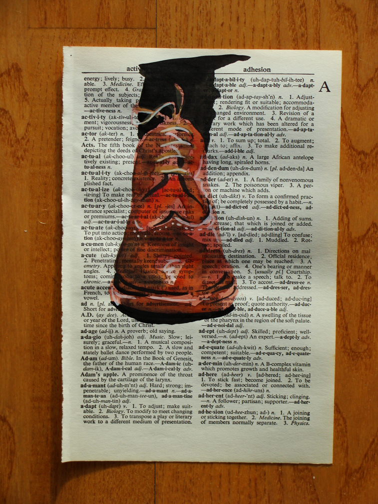
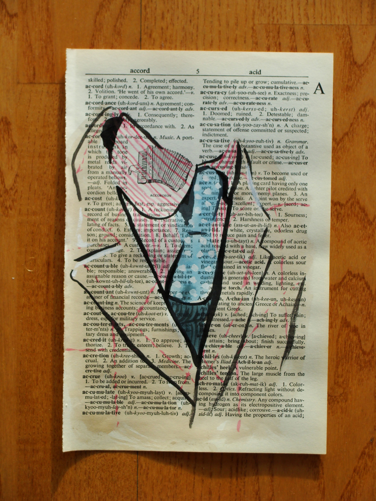
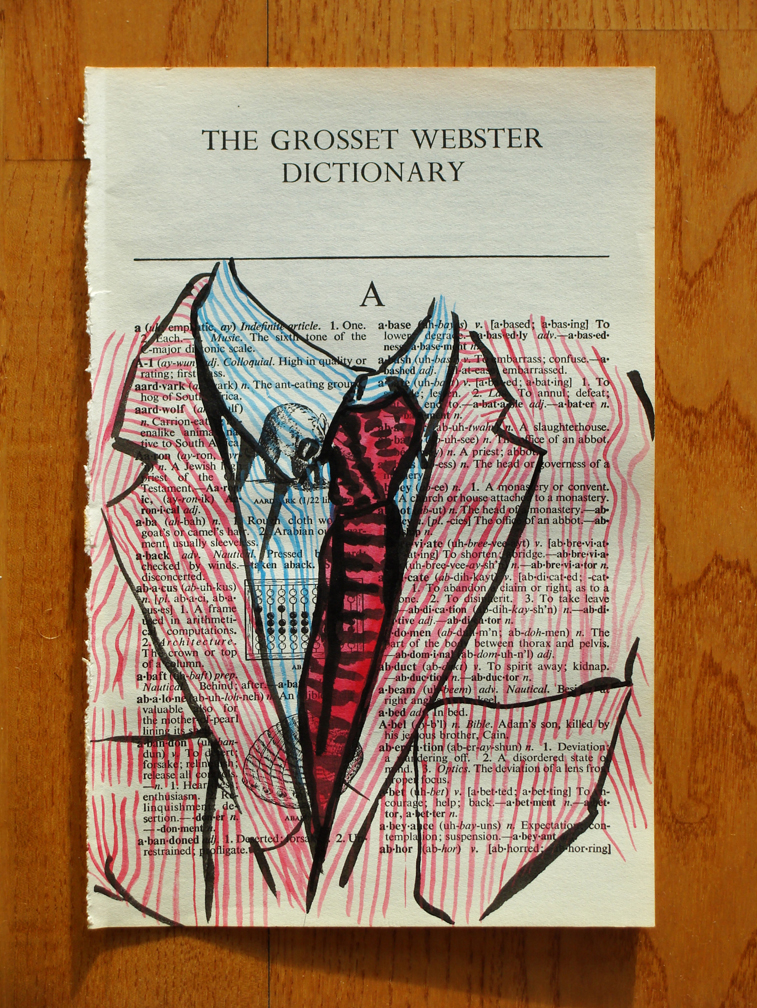
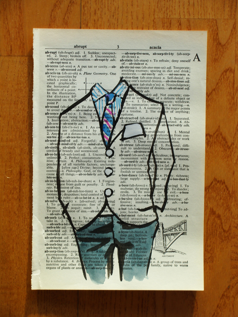
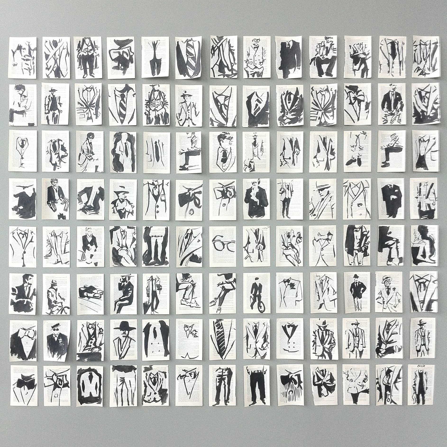
Here are more men's fashion illustrations placed on dictionary pages. It just keeps getting better!
This new collection takes the mastery of the ink and brush and highlights the great qualities of men's fashion. Sometimes the focus is on the cut of the jacket and sometimes it is on the color of the shirt and tie.
My goal is to highlight and focus on the spirit of men's fashion in an innovative and creative manner.
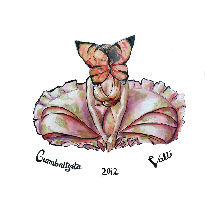
Fashion Illustration… Giambattista Valli
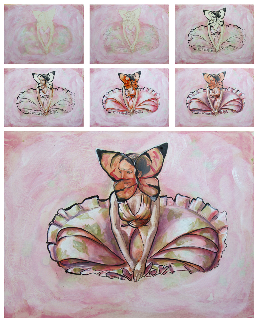
I was contacted by the wonderful people at D2G Apparel to do some illustrations based on the Paris Fashion week that ended on the 4th of this past month. While I have been focusing on mens' fashion lately I thought that it might be a nice diversion from the normal. Also, women are just much more fun to draw. The week was full of amazing projects and designs. The first day kicked off with the always lovely Versace, but what really peaked my interest was the work of Giambattista Valli. There was a yearning for nature and beauty together that conjugated in the floral arrangements adorned by the women of the runway. Flowers and butterflies and floral prints were all a rather literal interpretation, but powerful nonetheless.
I identified several aspects from the Valli line that would work there way into my interpretive illustration.
-nature -light reds and greens -floral print -controlled hair, pulled back and tight
Included below are the final illustration and the process of the painting.
Look to D2G Apparel in the next several weeks to where this image on a shirt.
Fashion Photo Shoot…
Just did a photoshoot with the great Shawn Cuni. He is a fabulous photographer. This is a little preview he sent over to me after the shoot. I am so pumped to get this next set of images and cannot wait to share them with everyone!
Thanks Cuni. umf.
Paul Chelko…Portrait
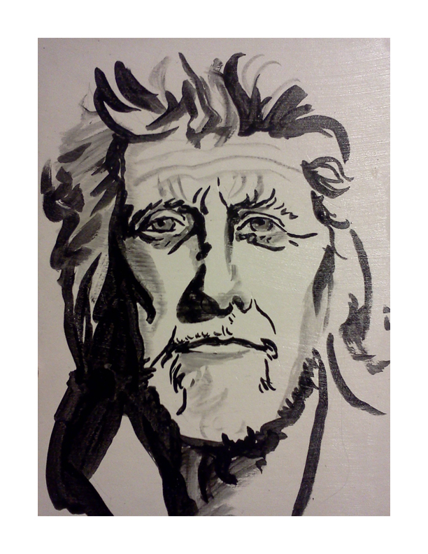
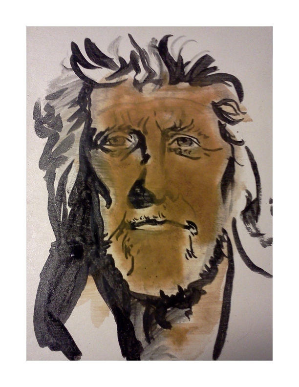
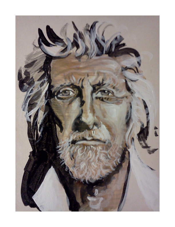
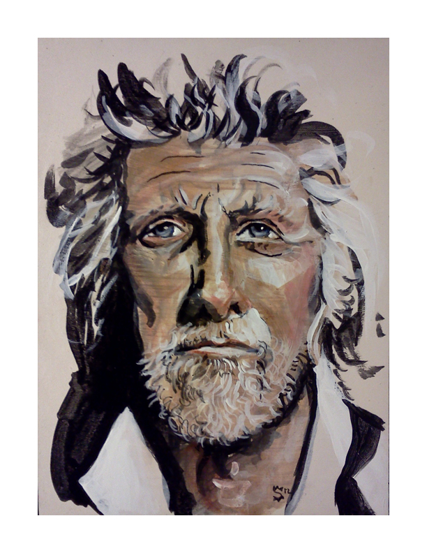
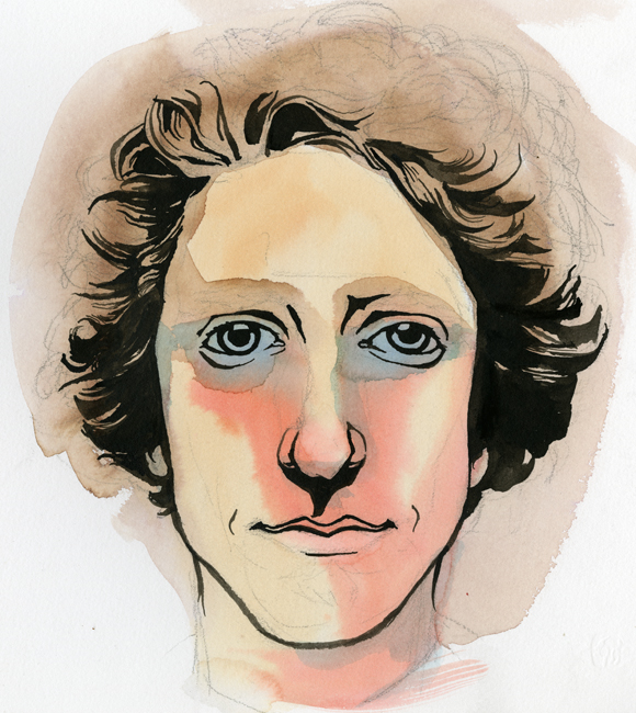
I must say that I am suddenly and properly honored to have done this little portrait of Paul Chelko. It was quite the accident that I came across his photograph on the cover of a 2007 edition of 'The Atlanta Magazine (which I could not find on their website- so it's possible I am confused as to the actual magazine).' Over and over I mentioned the character in his face. Sarah, my mentee, and I were practicing some techniques in painting at One Love Generation and I grabbed the magazine at the top of the towering pile for reference. As I walked over to our table where Sarah was eagerly awaiting the chance to paint. My eyes were trained on the photograph that was the cover of the magazine, analyzing the face we were about to use as practice. She exclaimed at the difficulty of drawing his face with a brush.
At the bottom of the post is an image of the portrait that Sarah did. She also painted an eye that would have been nice to grab a picture of. Her focus was a bit more centered on the painting of the eye than the portrait.
The following five images are the stages of the painting. It begins with an ink brush drawing, followed by washes of watercolor, highlights of white acrylic, dabbles of color in the cheeks and nose and retouching blacks with india ink.
Check it out. Enjoy. Share with your friends.
Sarah's version of Paul Chelko. I thought the line-work was brilliant and a beautiful image of what she is learning as she is becoming her own artist.
Fashion Illustration… George Kamau
Special thanks to George Kamau for allowing me to use him as model for this illustration.
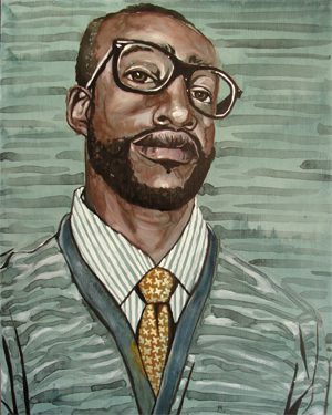
This is the second in the series of my new passion- though this calls for a drumroll I will not wait for your hands to start slapping your knees-
Fashion Illustration!
The process is one I stole from a verbal explanation of the artist Sterling Hundley's process (his outlandishly fantastic and award winning work here). There was an appropriate amount of hand waving and gesticulating so I was able to get the gist of it all. My good friend Caleb Morris (his amazing and ground-breaking work found here) was fortunate to receive a portrait of himself done by Mr. Hundley in demonstration.
I gleaned all that I could from Caleb's exuberant explanations and adapted what I learned to what I could make my hands comprehend.
It begins with a glaze of Acrylic for the foundation.
Afterward I draw a sketch with pencil.
Over the pencil drawing I ink in the appropriate amount of black with waterproof india ink.
Then comes the exciting part- and where the process pictures begin below-, I cover large areas with washes of watercolor. Since the base of the substrate is acrylic the water has nothing in which to soak. This leaves the wash open to perpetual changes. Also the pigment in the watercolor is searching for a place to settle while the water is evaporating, creating beautiful iterations and watermarks.
Highlights are pulled out by applying white acrylics over the watercolor.
Lastly I will go back into the black areas with fresh india ink to re-establish the darkest darks.
Self Portraits...
I have been itching for a redesign on my business cards for a while. The old design ( found here ) is still nice, but definitely outdated. I received my first batch of them over a year ago. Back then I had consistently longer hair, and the card reflected this beautiful and untamed nature. There is also some outdated information that I cannot continue to keep tracking and using. Below is the sketch I did not too long ago of what I want. It's a quick sketch and I need to nail out more of the finer details, but the idea I believe is strong.
My good good friend Ruth Meharg suggested that I might print the cards on vellum so the portrait would show through on to the back side. I love this idea. I don't know how that would translate, especially with wanting information to be on printed on both sides. Also, the idea of creating a plate or woodcut for printing the type was thrown around. Any sort of print process is beautiful to me. What is likely to happen is a limited run of hand printed cards (for those very special people) and a mass printing from Zazzle to put up in shops and what not.
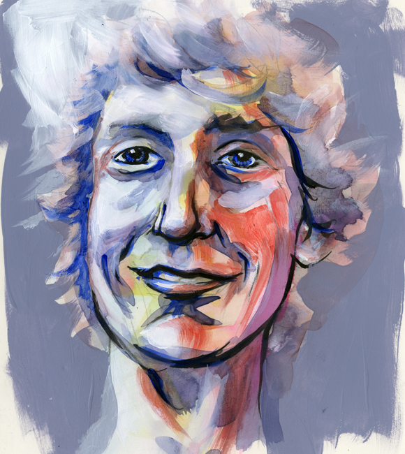
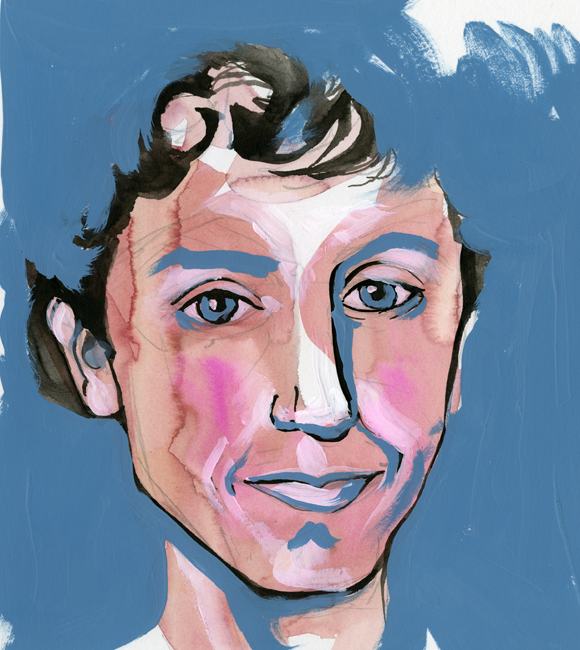
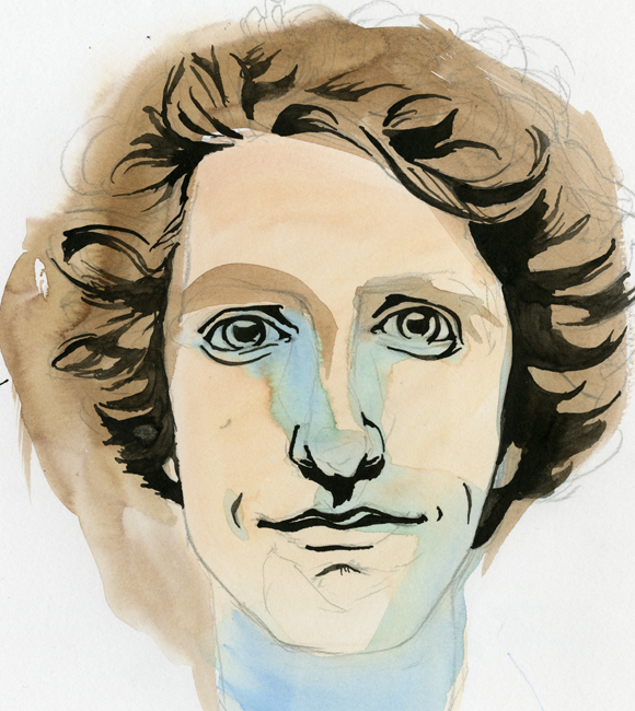
After developing the sketch I wanted to get some self-portrait ideas down to better visualize the final product. What followed is what you see below, in order that they were painted. They range in technique, but all contain some sort of mixture of watercolor and black ink. The first few also contain acrylic. None of these actually fulfill my desired look, but I think that I am getting close.
This first one was mostly acrylic and feels very patriotic… that darn red, white and blue...
Oooooo, what do I say about this one? It conveys a younger me-and the eyes are horribly offset from each other. I might as well toss this and never think of it again.
In spite of the odd nose, this is one of my favorites! It wouldn't work well for the business card, but bow ties get me every time…every time.
This is a success. A marvelous success! There is a hitch though, the colors are a bit moody. I was showing it to a few coworkers, and they started to tear...
Eyes are always aggravating me. The one on the right just started to run away. Blue made its way in again and sets an off mood to this self-portrait as well.
The Urban Animal Scientist...
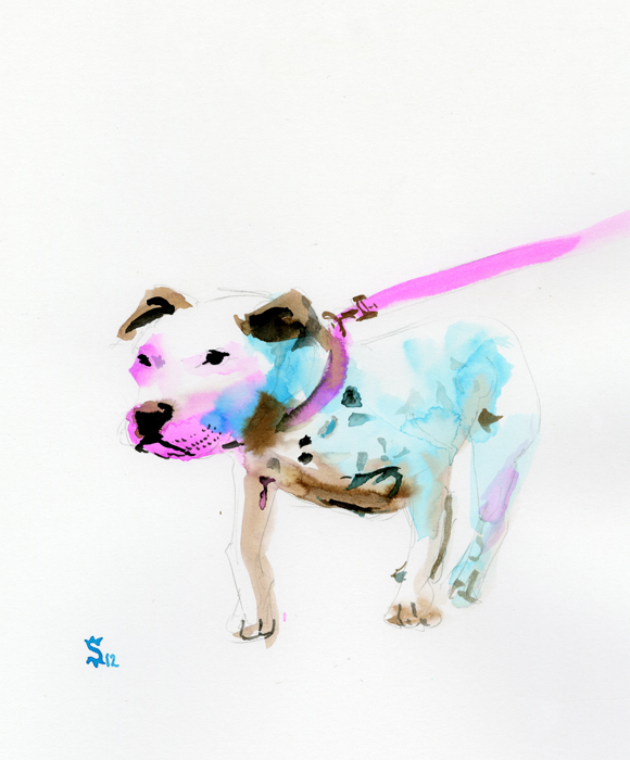
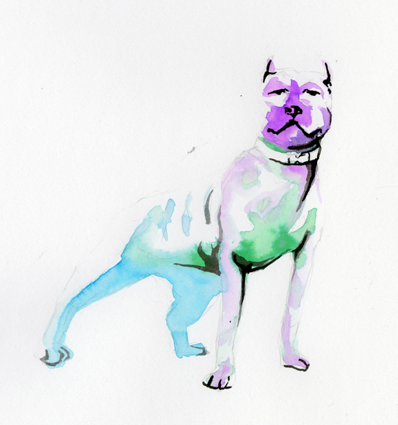
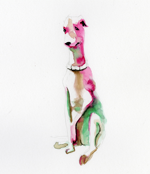
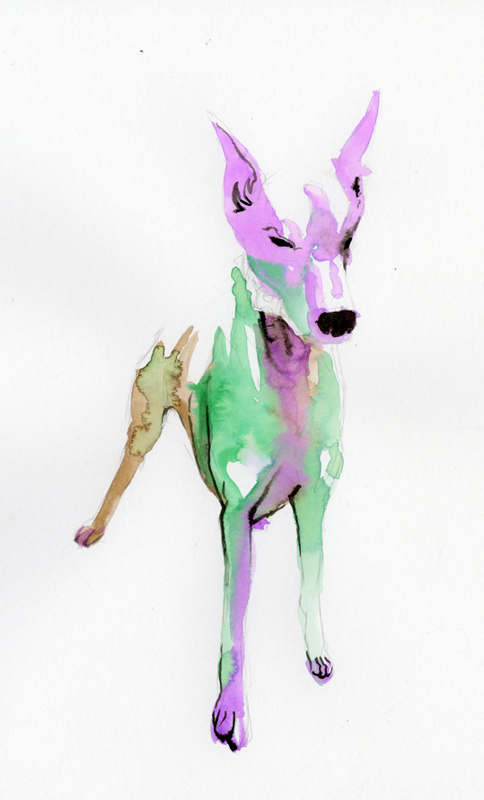
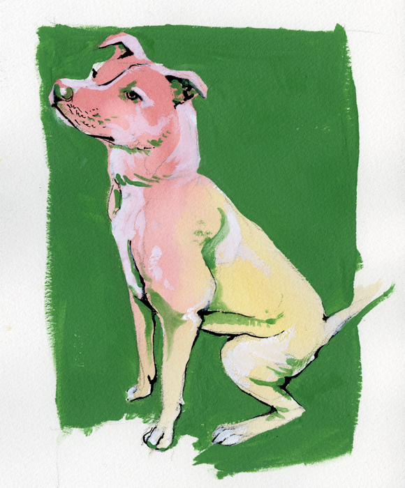
I have been experimenting with different imagery in collaboration with my friend The Urban Animal Scientist. The Urban Animal Scientist is an urban brand of dog collars, soaps, and now concrete dog bowls. Handmade right here in Atlanta these oversized collars are crafted to match the owner and the dog together in perfect fashion harmony. What started out a couple years ago as an idea and a passion has burgeoned into a great brand, a How Magazine featured website, and a hub for great collaboration to take place. Below is a sampling of my work in collaboration with The Urban Animal Scientist.
My goal was to leave a large portion of white space and to utilize simple bright colors to define the form of the dogs.
The main focus was on the collars and the leads. I wanted the dog to be the subject while using the color to lead the eye through image ending at the collars and leads. I used black india ink sparingly and purposefully. Marking the eyes, ears, nose and mouth.
On these last two the process changed slightly. Instead of leaving a mass of white space I decided to fill in everything with color. Everything began the same with the pencil drawing, the light washes of watercolor and the india ink for definition. This time though I did not leave any white space I instead filled in the white space with Titanium White gouache. Finally I would finish the painting with a mid tone acrylic to frame the dog and to add value within the form.
