AG4DM, Perry Ellis and Kirk Chambers
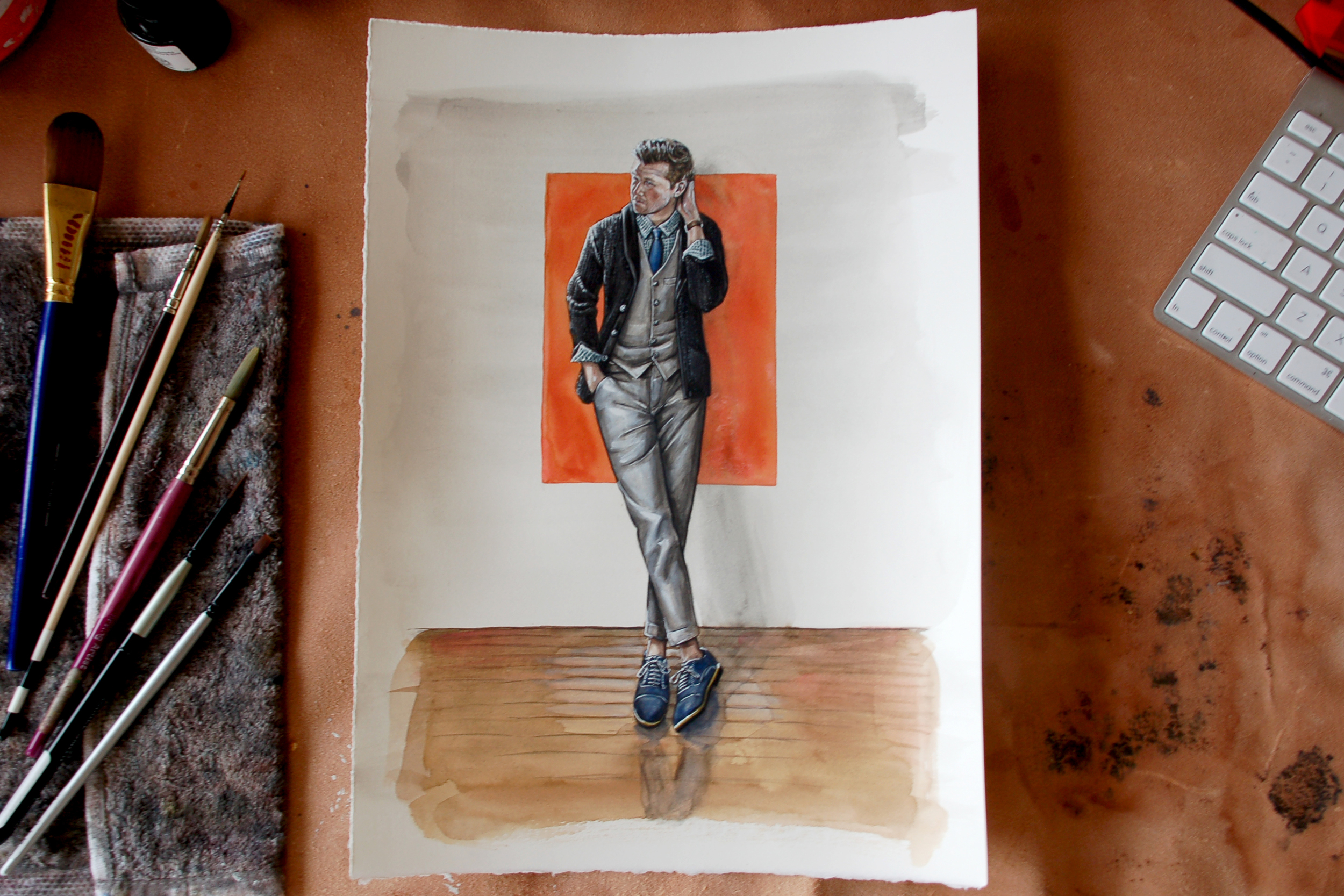
The second illustration in the Aesthetic Guide for the Dapper Man takes the classic American brand Perry Ellis styled on Kirk, one of the brothers behind Brothers and Craft.
THE Painting
The Drawing
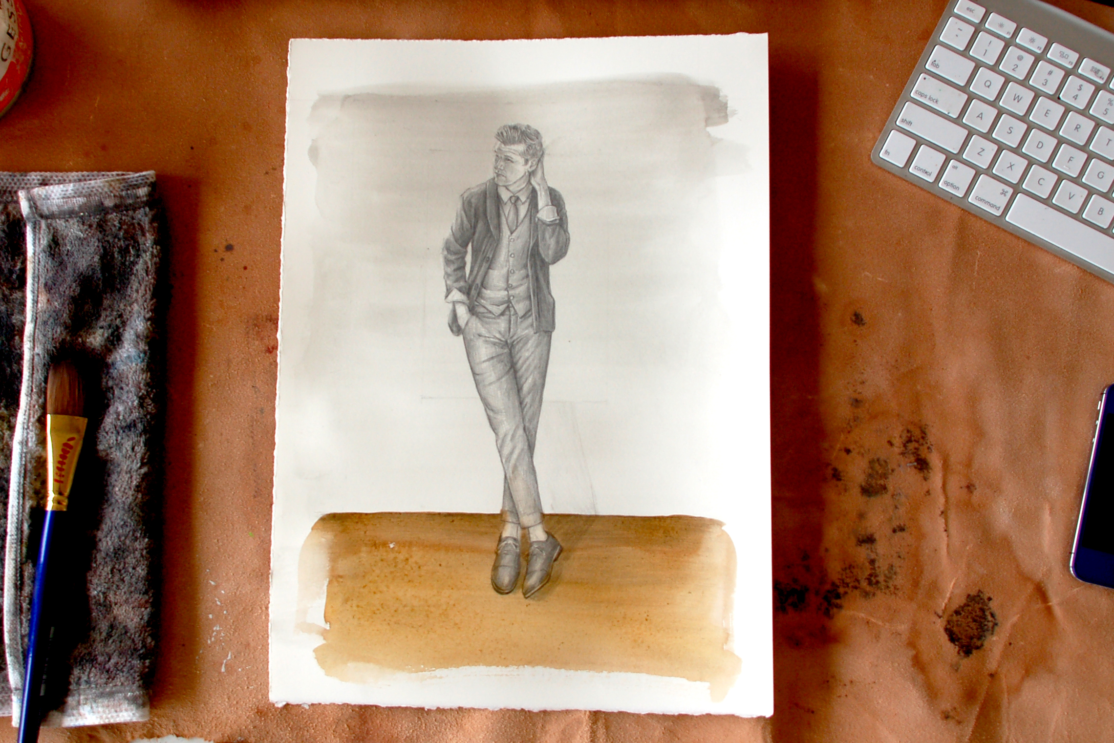
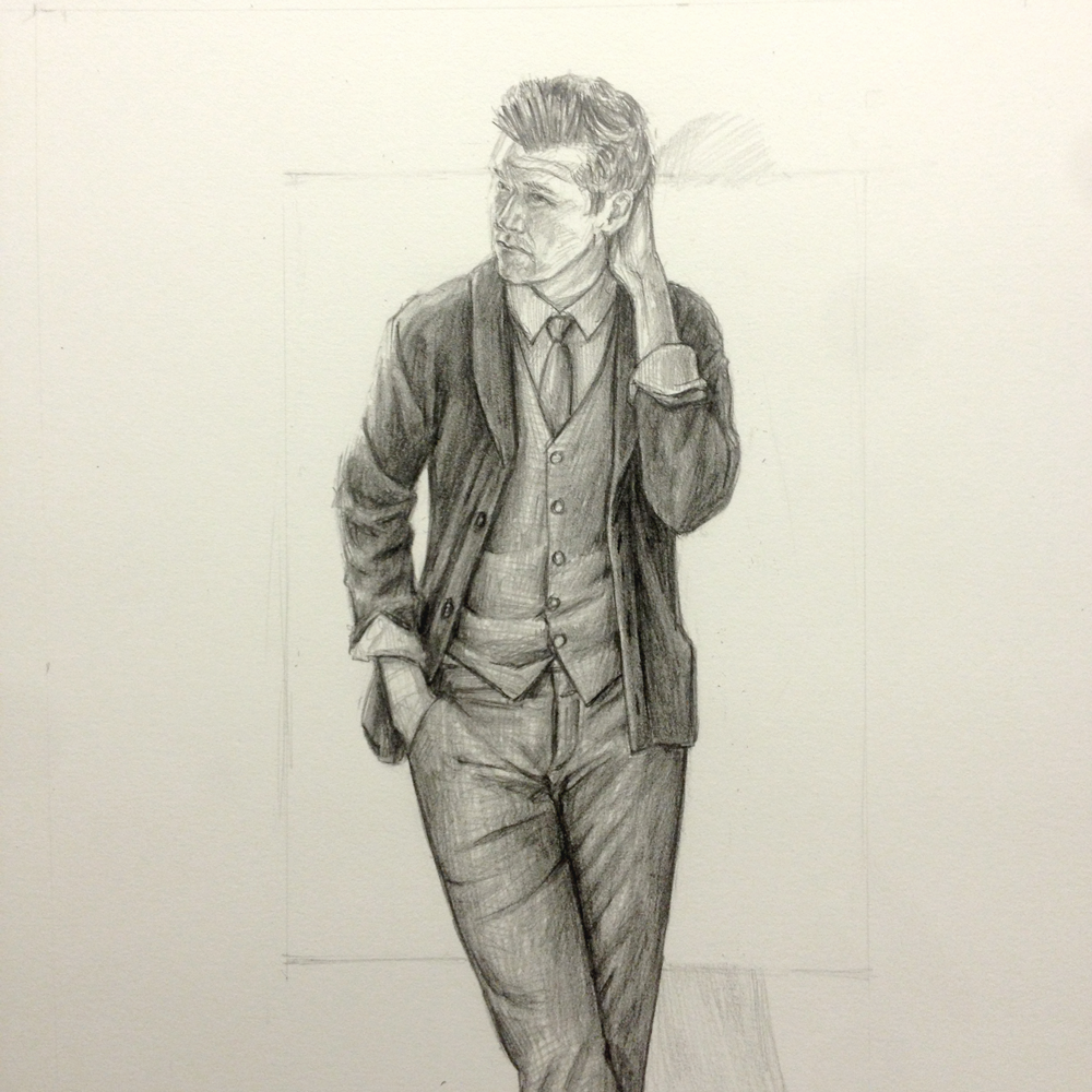
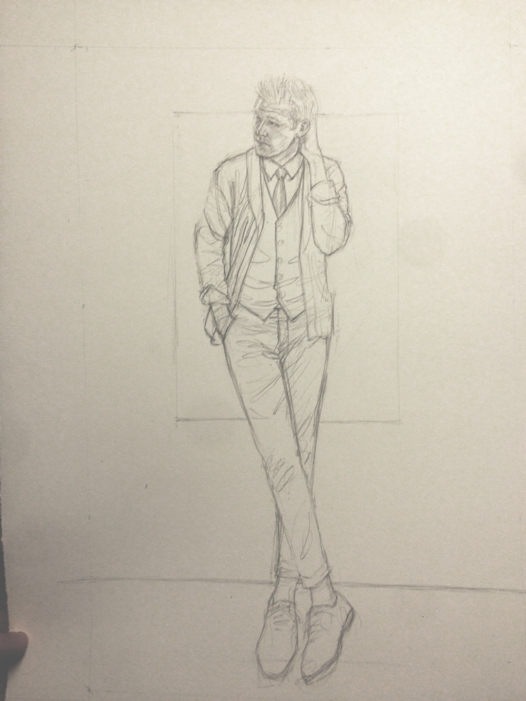
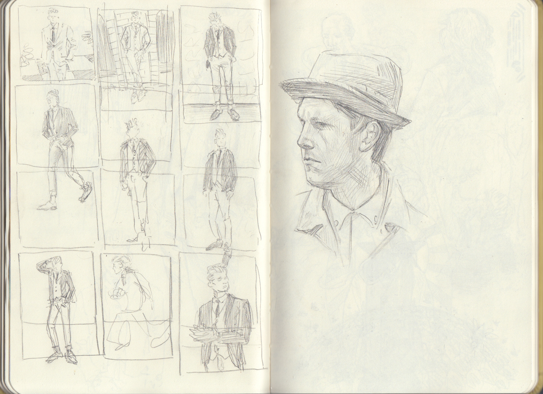
Drawing may be the most important step in the painting process. It lays the ground work for what will happen next. The drawing sets the proper boundaries for success.
Now I know where colors will go, where details will go, where values will go. Even if things change I at least have given myself a 'road-map' for success. I have given myself courage to complete the daunting journey of painting.
I laugh when I look at this first step in the drawing. The feet are comically large. After about 5 tries to get the proper proportions I was finally able to lay in the values and details.
Color Studies
Color is my Achilles Heel. It has consistently been the Resistance that works to destroy my art.
Testing is the foil to my foible.
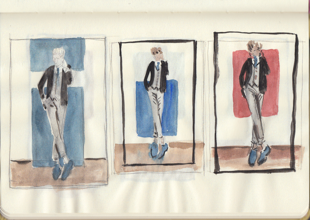
Testing and experimenting is highly valuable. It's like cooking a meal for the first time. You have to taste it as you go. Add a bit more salt. Spritz a bit of pepper. That is where the Perry Ellis illustration is right now. In a testing phase.
Let me know what your favorite background color option?
The Rough
I'm loving the relative simplicity of this illustration so far. The background is made up of simple, geometric shapes, all at right angles. It shoves all of the focus on the figure.
This way we get to focus on Kirk and the amazing Perry Ellis clothing.

